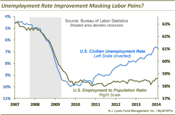
UPDATE: Employment:Population Ratio vs Unemployment Rate 2007-2014
Given the swell unemployment report today (it’s noisy, but we’ll take it), we thought we’d update the chart we’ve been tracking comparing the Employment:Population Ratio vs. the official U3 Unemployment Rate.
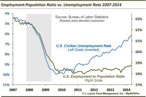
While the U3 has improved greatly in the last few years since the depths of the recession, the Employment:Population Ratio has been slow to get off the mat. In June it ticked up 0.1% to a still very low 59%. And it is still lagging the U3 improvement by a wide margin (the reasons are obvious and have been covered ad nauseum, everywhere.) We’d still like to see improvement here before we get too optimistic about the labor market.