Tightest Average True Range in NASDAQ 100 history
Yesterday we pointed out that the 3-day range in the Nasdaq 100 was currently the smallest in the index’s history. Today we look at another measure of volatility that is yielding the same conclusion. Average True Range (ATR) measures the distance between today’s high to low and yesterday’s close to today’s high and to today’s low. The ATR takes the largest of those 3 measurements and averages that number over whatever time period the user selects. The standard default is 21 days so that is what we are using here…no data-mining. We like to divide the ATR by the closing price (%ATR) in order to normalize the series so that we can make comparisons with historical periods when prices were higher or lower. Based on such comparisons, we are witnessing the lowest %ATR in Nasdaq 100 history.
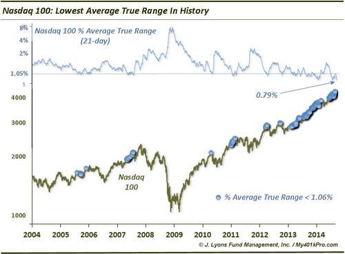
The current %ATR on the Nasdaq 100 is 0.79%. To clarify, that means that for the past 21 days, the Average True Range has averaged less than 0.8%. For reference, before 2013, there had only been 9 %ATR readings in NDX history under 1%, the lowest of which was 0.95%. Each of those readings occurred between 2010 and 2012. In case you’re not impressed yet, consider this:
The Nasdaq 100 once went over 4.5 years – from February 1999 to November 2003 – without a SINGLE DAY’s %ATR below 0.8%!
So what is the significance of such lack of volatility? It is said that periods of extreme low volatility beget periods of high volatility. Well, of course, at some point volatility will pick up. Unfortunately, the platitude doesn’t tell us when volatility will pick up and that is the million dollar question for traders. Historically, when volatility reaches an identified “extreme” low, one can begin to look for a volatility rise. A look at history can help to identify such extremes. However, as we noted in our post yesterday on the tight 3-day range, the “extreme” parameters change based on the trading environment.
From 1990 to 2004, for example, 21-day %ATR dropped below 1.2% on only 2 occasions. In January 1994, it led to a 6-month decline, albeit a shallow one. A reading in March 1995 preceded a substantial rally.
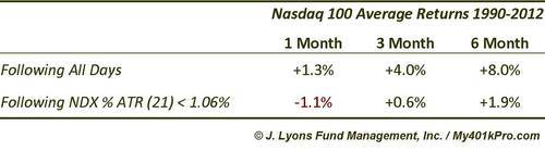
From 2005 through 2012, like we observed with the tight 2-day and 3-day NDX ranges, readings close to 1% were actually very good predictors of impending intermediate-term market tops or stagnation. Drops in %ATR below 1.06% (as indicated by the dots on the chart), preceded NDX tops in July and November 2005, mid-2007, April 2010, early 2011 and March and September of 2012. The NDX was able to continue higher temporarily following the 2007 and 2011 readings before experiencing serious corrections. Here are the results following %ATR readings below 1.06% from 1990 to 2012.
The current post-2012 environment, as we’ve discussed, is a whole other story. Low %ATR readings not led to any weakness whatsoever. Furthermore, almost the entire period since the beginning of 2013 has been characterized by low %ATR readings. We purposely enlarged the dots on the chart so that nearly the entire NDX price line since 2012 is covered.
So what do we do with this information considering the unprecedented nature of this environment? Your guess is as good as ours. We don’t believe that perpetual low volatility is possible – as much as the Fed would like to see that. Eventually, a volatility explosion is likely. When that will be, we don’t know. Sometimes, however, a simple recognition of the change in environment – and, thus, what isn’t working – is the most valuable information.