XOP: It is…The Most Interesting Chart In The World
It is forming a potential short-term head-and-shoulders pattern with a neckline at $73.
It once set 2 major long-term highs at $73.
It sits on a key Fibonacci Retracement line and its 200-day Simple Moving Average at $73.
Because of those factors, XOP is…The Most Interesting Chart In The World! OK, maybe the effect is lost a bit without the voice-over and the outlandish visuals, but at least to us, the chart of the SPDR Oil & Gas Exploration And Production (XOP) is very interesting at the moment. It is currently partaking in an epic battle at $73.
First, the short-term:

The ETF is forming a distinct Head-&-Shoulders pattern with a neckline at $73. This is a very bearish pattern and a break of $73 would target an area around $63.
But before one gets hog-wild bearish, check out the significance of $73 on a long-term basis:

XOP set major highs at the $73 level in 2008 and again in 2013. This theoretically provides serious support at that level.
Throw in the key 23.6% Fibonacci Retracement of the post-2011 rally and the 200-day Simple Moving Average, both right at $73, and the significance of the level is obvious.
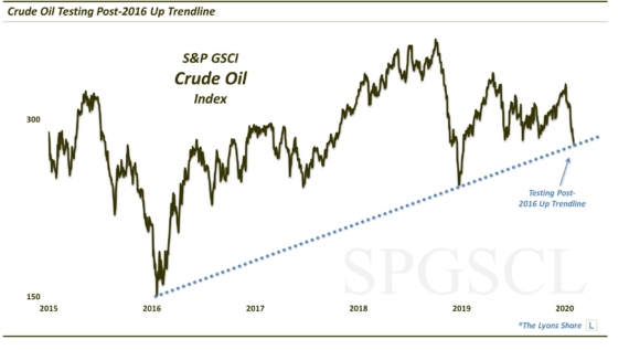
So how does one play it, should one be so inclined? Simple: XOP is bullish as long as it holds above $73. A break below is bearish. Oil has been getting pounded and has taken a toll on XOP. That is likely the wildcard. It is hitting some key support at the moment so it could be the impetus for a bounce in it, and in XOP.
Usually charts are somewhat muddled, with contradictory signals coming from all different directions. This one is as straightforward as they come. For XOP, $73 is the key.
__________
More from Dana Lyons, JLFMI and My401kPro.


