Good News/Bad News For Consumer Discretionary Stocks

Today we have 2 Charts Of The Day – 1 good and 1 bad – related to the consumer discretionary sector. This can be a key sector in gauging the health of both the stock market (via monitoring consumer discretionary stocks) and the economy (via monitoring consumer spending behavior. This post (as 99% of ours do) focuses on the stock side.
First, the good news. Back on
January 21, we pointed out a development of concern regarding consumer stocks. Historically, it has been bullish for the overall market when consumer discretionary stocks are leading consumer staples – and vice versa. This makes sense as it relates to the economic cycle during bull vs. bear markets, not that the economy necessarily has to move in lock-step with the stock market. It did hold true, however, in 2000 and 2007 as the broad stock market was topping out. The performance of consumer discretionary stocks peaked early on and led the way downward relative to consumer staples. It was this same negative action
that we pointed out in January as the discretionary:staples ratio was failing to make new highs along with the S&P 500. As of last week, that changed.
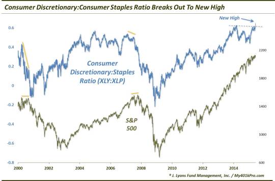
Specifically, the ratio between the Consumer Discretionary SPDR ETF (ticker, XLY) and the Consumer Staples SPDR (XLP) hit a new high last week. We had been concerned about this ratio since it had had failed to make a new high since March of 2014. Yes, that is a long time ago (relatively speaking) and the market has generally continued up during that time. But that is the nature, and challenge, with divergences. However, with last week’s new high in the XLY:XLP ratio, that is one red flag that can be taken down.
That said, it does not mean the market cannot form an initial top here that will be tested later coinciding with a divergence in the ratio. Furthermore, it is possible for the market to form a significant top without any divergence period. It’s just that,historically, it has given such warnings. So we can breathe a little easier with the recent development.
However, we did say we had bad news as well so perhaps investors’ breathing may still be somewhat labored. By charting the action in the actual prices of the discretionary and staples sectors, we observe a few things. First, despite the new high in the ratio between the two, the discretionary sector, as measured by the price of the XLY, has not achieved a new high since April. Secondly, a view of the action in the XLP last week gives us a clue as to why the ratio went to a new high. Consumer staples stocks got hammered. Thus, the new high in the XLY:XLP ratio was more a result of the negative performance in the staples than anything overly positive in the discretionary sector.
Further evidence of this lack of “overly positive” action from discretionary stocks can be seen in our 2nd chart. This one shows another ratio: that of the Rydex Unweighted Consumer Discretionary ETF (RCD) versus the weighted XLY. As the unweighted average places equal weighing on all of its constituents, it can be a good measure of the health of the overall sector. We like to see as many stocks as possible participating in a rally and, therefore, like to see unweighted averages or funds leading the way. This is not currently the case in the discretionary sector. In fact, the ratio between the unweighted RCD to the weighted XLY just hit a more than 2-year low.
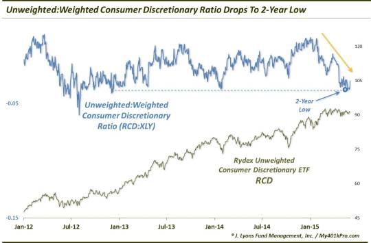
This situation again suggests that the relative high versus the staples was less a result of positive action in the discretionary sector than it was very poor action in the staples. So do we side more with the 2nd “bad news” chart over the 1st “good news” one since we can attach that asterisk to it? Not necessarily. A year from now, or 10 years from now, we likely aren’t going to look at the new high in the ratio and dismiss it as a product of just poor action in the staples. It is what it is: a new high. And that has generally been a positive thing for the broad equity market.
So we have genuinely good news and bad news in the discretionary sector. Is this unusual? Perhaps the specific combination of the 2 developments is quite unique. However, the fact that there are both good and bad inputs to consider is not unusual. In fact, that is the case every single day when analyzing financial markets. The task as a market analyst or participant is to parse the data, good and bad, and form an opinion or strategy. It is also a good reminder to be selective in choosing one’s investment inputs. Know what is most important in guiding your position.
Our process is based on quantitative, objective models. Therefore, the interpretation (after many years in developing the models) is now minimal for us. If we had to side with either the “good” or the “bad” charts in today’s post, it may be to the bad side. However, that may be colored by other criteria that we track that has us less than optimistic about the longer-term prospects for stocks. Nevertheless, there is certainly fodder for both bulls and bears here – as is always the case.
________
“Happy & Sad” photo by Farrukh.
More from Dana Lyons, JLFMI and My401kPro.
The commentary included in this blog is provided for informational purposes only. It does not constitute a recommendation to invest in any specific investment product or service. Proper due diligence should be performed before investing in any investment vehicle. There is a risk of loss involved in all investments.