Is This Chart Pattern Doubly Bullish For Muni Bonds?

A typically bullish chart formation may be present on multiple time frames on a popular municipal bond ETF.
As we are primarily equity managers, today’s Chart Of The Day is a rather rare foray into the world of fixed income for us. That said, the analysis is not necessarily outside of our regular M.O. First off, we are not making a recommendation on municipal bonds. In fact, nothing in these pages constitutes a recommendation to invest in any particular way. In particular, though, we are not espousing the benefits unique to muni bonds. Nor do we consider ourselves in any way to be experts on the structure or varieties of muni bonds. Today’s Chart Of The Day simply points out our interpretation of the price chart of a particular ETF that tracks the muni bond market.
Specifically, the ETF is the iShares S&P National AMT-Free Municipal Bond ETF, ticker MUB. The chart pattern potentially in force on the chart is a “cup-&-handle”. We have discussed this pattern in other posts in the past, including the fact that it typically is considered to be a bullish pattern. What does it look like and why is it bullish? The pattern involves 2 parts, generally showing the following characteristics:
The Cup: This phase includes an initial high on the left side of a chart followed by a relatively long, often-rounded retrenchment before a return to the initial high.
The Handle: This phase involves a shorter, shallower dip in the security and subsequent recovery to the prior highs.
The bullish theory is predicated on the idea that after taking a long time for a security to return to its initial high during the “cup” phase, the “handle” phase is much briefer and shallower. This theoretically indicates an increased eagerness on the part of investors to buy the security since they did not allow it to pull back nearly as long or as deep as occurred in the cup phase. Regardless of the theory, the chart pattern has often been effective in forecasting an eventual breakout and advance above the former highs.
What’s interesting about the MUB chart is that it arguably contains not one but two cups-&-handles currently.
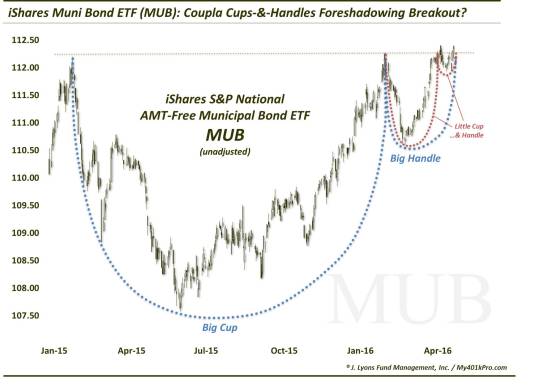
As the chart shows, the larger cup-&-handle spans the past approximate 16 months. The smaller cup-&-handle is contained within the handle of the larger one, spanning the past 3 months. Again, assuming this is an accurate interpretation of the chart, it has bullish connotations for MUB going forward.
First, the pattern typically resolves itself to the upside, i.e., a breakout in this case above roughly the mid-112 area. How far does the pattern imply the MUB might rally upon a breakout? That is certainly more of an art than science, but various technicians argue for a 50%-100% extension of the range of the “cup”. In this case, the “big” cup ranges from a high around the mid-112′s to a low near 107.50. Therefore, the range is about 5 bucks.
Based on the 50%-100% rule of thumb, a breakout would suggest the pattern would produce an advance of 2.50-5.00 above the top of the range. That may not seem like much, but in the bond world, it is a nice return. This is particularly so considering the fact that this chart is not adjusted for dividends.
No matter the market environment that exists, there are always bullish and bearish-looking setups in the market. Sometimes one needs to look outside of their typical investing neighborhood to find them. In this case, the muni bond chart is currently displaying a potentially bullish pattern – and on multiple times for that matter. If the typical history of cups-&-handles plays out here, muni bonds may be poised for a nice rally in the near future.
_____________
More from Dana Lyons, JLFMI and My401kPro.
The commentary included in this blog is provided for informational purposes only. It does not constitute a recommendation to invest in any specific investment product or service. Proper due diligence should be performed before investing in any investment vehicle. There is a risk of loss involved in all investments.