Exxon Mobil Stock Testing Epic Broken Trendline

Exxon Mobil is testing the underside of its 30-year Up trendline, which it broke one year ago.
Since we started our Chart Of The Day (ChOTD) series on Twitter about 3 years ago, folks have been asking us to post more and more charts. For the sake of education/sharing/community, we would love to publish all the charts that we find compelling on a daily basis. However, the reality is that time constraints prevent us from being able to share more. Thus, we have really made a concerted effort to post at least a ChOTD each day (I believe we’ve missed just one day in the past 2 years).
However, one low-maintenance way we have been able to share a few additional charts each week is through the highlighting of one the oldest and most basic of all technical analysis tools – the trendline. A trendline connects several key points on a chart (e.g., a series of tops or bottoms) and, as its name implies, traces out the current trend in a price plot. When connecting lows, the trendline can serve as support and when connecting highs, it can serve as resistance.
Trendlines can be found in almost any chart, if one looks hard enough. However, the best practice is to focus on those trendlines that connect multiple major junctures without materially violating the trendline. In other words, be honest with the trendlines you are drawing. If your goal is truthful price information, there is no reason whatsoever to cheat a trendline in order to fit your bias. In that vein, in our feature “Trendline Wednesday”, we offer a handful of the best fitting, most important and, often times, under-the-radar trendlines in the financial markets.
One of our all-time favorite trendlines can be found on the chart of one of the largest stocks in the world: Exxon Mobil (XOM). We first pointed it out over a year ago and have continued to monitor it since. The line (on a logarithmic chart) stems from the intraday low made during the crash of 1987. From there, it connects (and has supported) major lows formed in 1994, 2010 and early 2015.
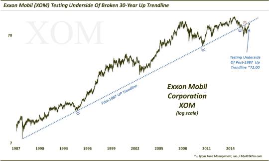
Now some will call this pure luck or randomness. We would respectfully disagree as the odds of these near-precision touches randomly occurring over a 3-decade span would be astronomically long.
After holding basically to the penny in March of 2015 (what luck), the trendline was finally broken a few months later in June. This break ushered in a 22% drop within months, into the August low. In the subsequent bounce, XOM rallied up to test the underside of the broken post-1987 trendline. As per classical technical analysis, the assumption was that the former support line was now resistance. And indeed, on November 3 of last year, the stock formed its high for the post-August rally at the trendline – again, basically to the penny. That is quite a bit of random luck.
This chart gives a closer look at the action around the trendline during the past 2 years.
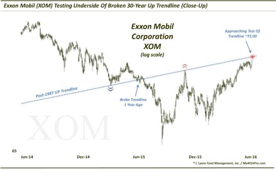
What are the practical ramifications here? XOM closed today at 90.72. The post-1987 trendline is crossing around the 92-even level at the moment. Therefore, should prices climb just a little bit more in the near-future, the stock could encounter another test of the underside of the trendline. The assumption, again, is that the trendline will act as resistance. This may also have an impact on the rally in energy/oil stocks – and even possibly the broader market given the market cap of XOM.
Of course, should prices break above, and hold above, the trendline, that could provide a floor under the stock and allow for a steeper trajectory of ascent. Either way, we will take cues from the trendline, again – in hopes of getting “lucky”, again.
________
More from Dana Lyons, JLFMI and My401kPro.
The commentary included in this blog is provided for informational purposes only. It does not constitute a recommendation to invest in any specific investment product or service. Proper due diligence should be performed before investing in any investment vehicle. There is a risk of loss involved in all investments.