Rising Rates Reaching Resistance?

The 4-month rally in bond yields may soon hit a snag in the form of potential chart resistance.
Today, we unleashed a veritable barrage of charts in this week’s edition of Trendline Wednesday on Twitter and StockTwits (follow us on both: @JLyonsFundMgmt). It wasn’t that we had intended to post many more charts than normal; rather, the markets dictated it. Nearly every asset and market segment, it seems, is testing an arguably key chart juncture, many in the form of trendlines. Ergo, the chart storm.
What is the significance of this? It certainly could point to the importance of the present juncture in the markets. We may be on the verge of a mass chart breakout/breakdown across asset classes – or a resumption of their respective primary trends. That remains to be seen.
One chart we did not post for Trendline Wednesday, but certainly could have, is the 30-year U.S. Treasury yield (TYX). In fact, as much as any chart, the TYX is presently being impacted by key trendlines. That’s why it makes today’s Chart Of The Day.
Back in June, we posted a piece titled “Has Everyone Moved To The Bullish Side Of The Bond Boat?”. In it, we pointed out that while the consensus for many years was that interest rates had nowhere to go but up, rates had in fact done nothing but continue to decline. However, as we pointed out in the post,
“…for the first time in a long time, it feels as though the sentiment pendulum has begun to shift. No longer, it seems, does the investment community view rising rates as an inevitable and imminent path. And perhaps it will be just that widespread shift in expectations to the bullish side of the bond boat that will allow for the long-awaited bottom in interest rates.”
Part of our newfound openness to the possibility of rising rates stemmed from a near record short position in bond futures among Commercial Hedgers. That, along with other factors, suggested a significant degree of risk of a rise in yields, at least for the time being. 2 weeks later, bond yields bottomed out at an all-time low around 2.10 and began their ascent.
It hasn’t exactly been a blistering pace, but yields have trended upward for the past 4 months. Presently, the TYX is nearing a convergence of 2 trendlines around the 2.65% level that may slow down the rise, at least temporarily.
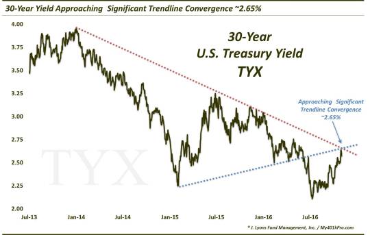
As the chart shows, one trendline stems from the high in yields over the past 5 years, set right at the beginning of 2014. That Down trendline connects the TYX tops in summer 2015 and late 2015. Presently, the trendline sits around 2.65%.
The other trendline, also presently near 2.65%, is the rising trendline stemming from the prior TYX low in early 2015 and connecting the lows in February-May 2016. The TYX broke down below this trendline in June, leading to the aforementioned drop to an all-time low around 2.10%.
Whether brief or longer-lasting, this confluence of trendlines may present some resistance to the 4-month rise in interest rates. Should the TYX break above this area, we also have a fair amount of potential resistance in the form of Fibonacci analysis just north of 2.80%. So, while the tide may or may not be turning long-term in rates, the chart does seem to present a fair amount of potential resistance to a continual rise in rates over the near-term. Contributing to that argument, perhaps, is the fact that what was a headwind for bonds in terms of the huge Commercial short position in bond futures has been almost entirely erased. Keep an eye out for a potential Chart Of The Day there.
For now, we’d keep an eye on the 2.65% level as a tell for the direction in bond yields.
_____________
More from Dana Lyons, JLFMI and My401kPro.
The commentary included in this blog is provided for informational purposes only. It does not constitute a recommendation to invest in any specific investment product or service. Proper due diligence should be performed before investing in any investment vehicle. There is a risk of loss involved in all investments.