
How Concerning Is The Nasdaq’s Ugly-Looking Reversal? (UNLOCKED-PREMIUM)
The following post originally appeared on April 6 for premium members of The Lyons Share.
Wednesday’s reversal lower from 52-week highs in the Nasdaq looks ugly on the chart, but how ominous is it really?
One reason that chartists find their craft so appealing is the optics. They can tell a great deal about a market or security merely by looking at the chart. At times, however, they can get into trouble by making assumptions about the optics that are not borne out by reality. In other words, looks can be deceiving.
Take yesterday’s dramatic reversal lower in the stock market, for example. Specifically, the NASDAQ was well into new all-time high ground at one point during the day. However, by the end of the day, the index has lost all of its gains and then some, closing well into negative territory. Upon a glance at the day’s bar or candlestick on its chart, one might understandably be concerned about residual negative consequences stemming from the day’s action. Such concern over the event may be reinforced by the popularity of ominous-sounding descriptors like “key reversal” or “bearish engulfing”, etc. The problem is, despite the widespread acceptance of such terms, historical evidence often fails to back up their reputations.
That indeed may be the case with yesterday’s action in the NASDAQ. At least we did do some historical research in attempting to ascertain whether or not the reversal was indeed a red flag – or significant in any respect. As such, we tried to pinpoint historical reversals in the NASDAQ occurring under similar conditions as yesterday. Specifically, we looked for all days since 1992 meeting the following criteria:
1. The NASDAQ trades at least 0.5% higher intraday, and
2. It trades above its 52-Week High Close, and
3. It reverses to close lower by at least 0.5%.
As it turns out, yesterday was the 43rd day in the past 25 years meeting the above criteria.
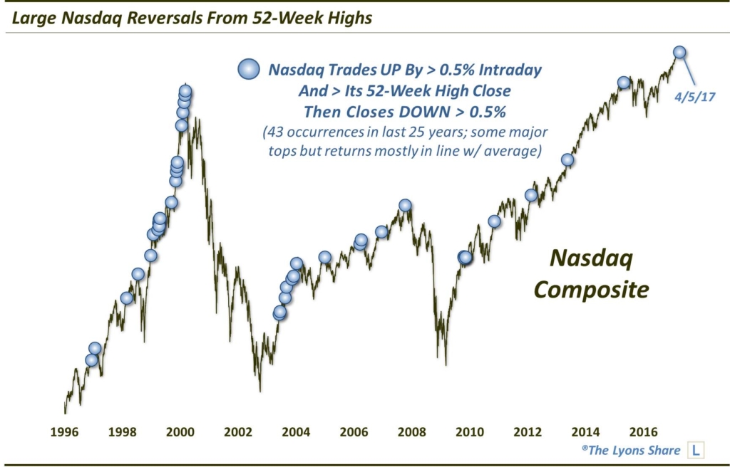
Here are the dates of the prior occurrences, broken down by year:
1/7/1993
12/12/1996
1/23/1997
3/2/1998, 7/21/1998, 12/30/1998
1/27/1999, 3/31/1999, 4/7/1999, 4/13/1999, 4/14/1999, 4/27/1999, 9/15/1999, 11/9/1999, 11/17/1999, 11/23/1999, 11/29/1999
1/24/2000, 2/9/2000, 2/25/2000, 3/2/2000, 3/7/2000
6/6/2003, 6/19/2003, 8/22/2003, 9/5/2003, 11/14/2003, 12/3/2003
1/9/2004
1/3/2005
3/21/2006, 4/7/2006, 12/18/2006
10/11/2007
10/21/2009, 10/23/2009, 10/26/2009, 11/12/2009
11/9/2010
2/15/2012
5/22/2013
4/27/2015
4/5/2017
As one can probably glean from glancing at the chart, and perhaps the dates, several of those events occurred at inauspicious points — specifically, cyclical or intermediate-term tops. Those include 1/23/1997, 7/21/1998, 3/7/2000, 1/9/2004, 1/3/2005, 4/7/2006, 10/11/2007 and 4/27/2015.
That said, one may not be able to tell from the chart that median returns following the events were actually roughly in line with the average random day, at least after the first week. Here are the median returns following all of the events.
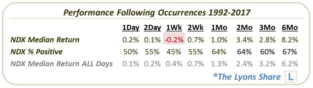
As we mentioned in the opener, often times, looks (and inclinations) can be deceiving when put to the historical test. As such, this bearish engulfing reversal appears much less scary than one may have assumed.
That said, there is a reason why we broke down the list of dates by year. The year 1999 was especially prolific in the presence of these reversals. Combined with early 2000, fully 37% of the occurrences over the past 25 years took place in just a 14-month span. And while we do not like to arbitrarily parse portions of data sets, there are times when the data from a specific period will skew the overall results from the larger period. In this case, the events from 1999-2000 serve to skew overall returns higher than typical for the rest of the study period. That can be seen somewhat by breaking down the results by those occurring up until 2000 and those occurring since.
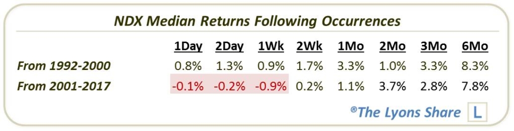
Clearly, returns following occurrences since 2000 have been a bit weaker, with median returns in the negative up to one weak. By 2 months, though, the difference is gone. I guess all we would say here is that when considering historical data, it is not inappropriate to place slightly more weight on recent events, nor is it inappropriate to slightly downgrade a period with over-sampling.
Overall, a historical look at similar types of reversals that we saw in the Nasdaq yesterday yields some fodder for both bulls and bears. Perhaps most importantly, though, it fails to confirm the widely accepted notion that yesterday’s type of action is a reliable predictor of further trouble in the market, despite the ugly candlestick and its scary-sounding descriptions.
_____________
Disclaimer: JLFMI’s actual investment decisions are based on our proprietary models. The conclusions based on the study in this letter may or may not be consistent with JLFMI’s actual investment posture at any given time. Additionally, the commentary provided here is for informational purposes only and should not be taken as a recommendation to invest in any specific securities or according to any specific methodologies. Proper due diligence should be performed before investing in any investment vehicle. There is a risk of loss involved in all investments.