Are Bonds A Better January Barometer For Stocks?
The seasonal stock market platitudes surrounding the market’s performance in January have been pretty much covered ad nauseam at this point, particularly given the ominous implications of the few down days to begin the year. That is not to discredit the coverage or dismiss the findings. The correlation of January’s first few days’ performance to the rest of the year certainly has evidence to back it up. Of course, the question remains whether there is causation as well, and furthermore, whether there is any reasonable expectation of actually profiting from the relationship.
We’ll leave that to each investor to decide. We are onto a different but related topic today. Contrary to the ubiquitous January stock market seasonal studies, we do not recall coming across anything similar related to the bond market. Perhaps it is because there is no relationship or anything too interesting in the findings. However, given the steep drop in yields (and rise in bond prices) to begin the year, we thought we would at least explore the issue. What we found was pretty interesting – in an unexpected way.
First, the decline in the 10-Year Treasury Yield (TNX) to begin the year has been the steepest in history (going back to 1962, the beginning of our daily data). In fact, it is double the next largest historical decline. Over the first 4 days of the year, the TNX has dropped almost exactly 10%. The next closest was 2008, at just under a 5% decline. So this year is pretty much unprecedented in that regard. If we widen the net a little bit, we find that of the 54 years since 1962, only 9 have seen yields fall by as much as just 1% during the first 4 days. So was there any correlation to the rest of the year’s performance in the bond market? In a way, yes, however, it was a rocky road to get there:
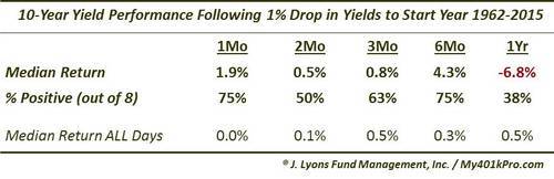
A month later, the median yield following those 8 occurrences was 1.9% higher, with 6 of the years seeing a higher yield. By 6 months out, 6 of the 8 years again saw higher yields and by a wide median margin of +4.3%. This compares with the median 6-month change following all days of just +0.3%. (By the way, as yields from 1962 until now are, relatively speaking, little-changed, the historical median returns for all periods is close to unchanged).
It was after 6 months that the TNX began to fall, and precipitously so. Those second 6 months saw yields drop by over 10%, on a median basis. That means that one year following the initial 4-day drop in yields to begin a year, the TNX was down a median -6.8%. Despite the median drop, however, just 5 of the 8 occurrences were lower a year later. Therefore, to suggest a relationship between the action of the TNX in the first 4 days of the year and the rest of the year would be very tenuous.
However, when we looked at the 9 years in which these 1% yield drops to begin the year took place, things got more interesting. The years were:
- 1966
- 1968
- 1987
- 1998
- 2001
- 2007
- 2008
- 2014
- 2015
If you are a stock market observer, those years likely stick out at you. Here they are plotted on a chart, along with the S&P 500 and the 10-Year Yield:
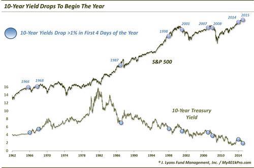
This is the reason the years stick out to us:
- 1966: cyclical (and secular) stock market top
- 1968: cyclical stock market top
- 1987: market crash
- 1998: bear market correction
- 2001: cyclical (and secular) stock market top
- 2007: cyclical stock market top
- 2008: cyclical stock market top
- 2014: –
- 2015: ?
Obviously, things did not work out too well in the stock market during the years in which yields dropped to begin the year. Here are the median returns in the S&P 500 following those occurrences:
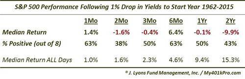
We added a 2-Year column to emphasize the dubious timing of these yield drop occurrences. Only 4 of the 8 years showed a positive return in the S&P 500. 1 of them, 1968, saw the stock market top out for essentially the next 14 years. 2 others, 1987 and 1998, saw mid-year corrections of -36% and -23%, respectively. The only year to really escape unscathed was last year. Will 2015 escape this curse again? Only time will tell.
So is this just a big coincidence? Well, it probably is not surprising to see some of the same years that saw stocks drop following drops to begin the year also saw bond yields drop to start the year. After all, in times of stress in the stock market, yields often drop. However, the near-unanimity in these beginning of the year bond yield drops in predicting stock market troubles ahead is pretty amazing to us. Again, only last year really bucked the trend. This year’s drop twice the previous record is almost as if it is doubling down on last year’s escape.
I guess we’d say that, if you believe that there is a causal, or at least relevant, relationship between poor January starts for stocks and the rest of the year, this probably adds fodder to your beliefs. For us, it is another one of the “hmmm’s” that have been building in the markets lately. While we can’t explain it, we can’t explain it away either. At a minimum, long-term stock bulls would probably like to see this barometer pointed in the other direction.
________
“32 Antique Ships Barometer” photo by Jason Short.
More from Dana Lyons, JLFMI and My401kPro.