ChOTD-5/12/14 Relative Nasdaq Volatility At A 10-Year High (UPDATED: Long-Term Chart Added)
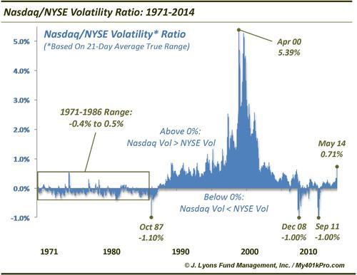
Today’s ChOTD takes a look at another of the growing examples of divergences in the market. This one shows the volatility of the Nasdaq Composite relative to that of the NYSE Composite (to measure volatility, we used a 21-day average of the Average True Range, in % terms). After a marked rise over the past few weeks, this spread is at a level it hasn’t been at since 2004.
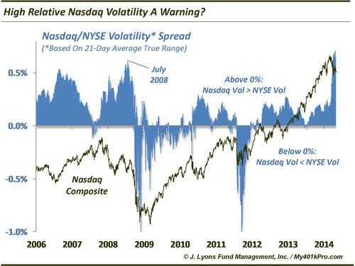
So should we be concerned? In general, a rise in volatility among riskier issues (i.e., Nasdaq stocks) has not been a welcome situation for the market. After exhibiting roughly similar volatility (i.e., 0% on the chart) for 20 years, relative Nasdaq volatility began rising in the mid-90’s. By 2000 and the dotcom bubble burst, relative Nasdaq volatility had exploded higher, at times reaching a spread of over 5% (i.e., the average daily range in the Nasdaq over the previous 21 days was 500 basis points greater than on the NYSE!) Relative Nasdaq volatility remained elevated until the mid-2000’s as the bubble excesses were worked off. As the chart shows, it eventually rose over 0.5% again in mid-2006 after which stocks rallied for another year. In 2007, it began rising again as the market began to top out, eventually peaking over 0.5% again in July 2008, just before the market collapsed.
Recently, the spread rose from less than .0.2% in mid-March to over 0.7%, the highest level since 2004. While it is not a cut-and-dry negative omen for the market, the uptick in volatility in riskier stocks is not a welcome sign, particularly once it leaks into other segments of the market. Think of these stocks as the talented but volatile athletes on a team. As long as they maintain an even keel and are performing well, the team (ie., market) is happy and productive. However, once they go off the rails, it can exert a negative influence or even poison the entire team. It remains to be seen if this negative influence will spread to the rest of the market but currently, the risky stocks are off the rails.
Note: Incidentally, the relative volatility spread was more helpful and timely in identifying the two best lows of the past 6 years. On December 1, 2008 and September 23, 2011, spread hit precisely -1.00%, meaning the average daily volatility over 21 days was exactly 100 basis points greater on the NYSE than the Nasdaq. Risk was wrung out of the “risky” stocks and the market spent very little time below the levels of those days before bottoming and launching big-time rallies. (Ed: As shown in the chart below, the 1987 Crash low was also pegged with the spread hitting -1.10% at the low on October 19.)
UPDATE > Long-Term Chart: