For The VIX, It’s All About The Recovery

The faster VIX spikes are retraced, the better.
(Correction made in the levels stated in the 2nd to last paragraph at 12:35 CST on 7/2/2015.)
We mentioned in a post yesterday on 90% Down Days that one of the challenges for risk managers is to correctly distinguish a minor market “dip” from something that is developing into a more serious decline. One potential aid in addressing that challenge comes from the behavior of the S&P 500 Volatility Index, the VIX. As most market observers are likely aware, the VIX tends to rise during market declines. And it tends to spike sharply higher during especially steep selloffs. We have found that the behavior in the VIX following such spikes may be useful in informing us about the nature of the selloff, i.e., is it a dip or a serious correction?
Anecdotally, we have observed that swift but short-lived market dips tend to see the VIX spike higher but recover (i.e., drop back down) in fairly short order, whereas declines of a more serious nature tend to see the VIX persist in an elevated status. Being of a quantitative nature, we were interested in testing this observation, however, these types of phenomena are difficult to quantify. But since anecdotal observations in the market can get one in serious trouble, we took a stab at it. This study was by no means an exhaustive, optimized effort, so others very well may come up with a better way of parsing the data. However, we did come up with a basic set of criteria that ended up corroborating our observation regarding the behavior of the VIX – and in a pretty interesting manner, at least for us data geeks.
Here is the criteria we looked at.
- We first identified spikes in the VIX of at least 50% (at its intra-day high) above the prevailing 1-month low close.
- We then measured the maximum drop in the VIX
on a closing basis over the next 5 days from the high point in step 1.
- Finally, we measured the drop in step 2 as a % of the spike in step 1, a calculation we refer to as the VIX’s retracement.
Since the inception of the VIX, we identified 84 such days meeting the criteria in step 1. There were a few occurrences that were in somewhat close proximity to each other but we tried to weed out any redundant dates. Thus, the vast majority of the events are completely unique.
We then sorted these events by the percentage of
the initial 50%+ spike that the VIX was able to retrace over the subsequent 5 days. Again, it was our sense that those VIX spikes that were largely and quickly retraced were indicative of merely a minor dip in stocks. On the other hand, the instances where the VIX remained persistently high following the initial spike seemed to augur for a more serious decline. The data seems to back up those notions.
From the first glance, it was apparent that the VIX spikes that were quickly and substantially retraced resulted in a more mild stock decline and, thus, better returns going forward. One tricky thing was to delineate the parameters that constituted a substantial versus an unsubstantial retracement. As it turns out, there were a few somewhat natural levels of separation in terms of the VIX’s retracement. Therefore, we ended up dividing the sample into 3 categories marking substantial retracement, moderate retracement and inadequate retracement.
The parameter that we found to indicate a substantial retracement came at an interesting level, at least to us: 62%. You may recognize that as essentially the golden Fibonacci level (61.8%) that we talk about so often. We have found it to be the most significant number when dealing with the movement of financial markets. Thus, the fact that it came up in this study, shouldn’t be a surprise. And frankly, it gives us more confidence in the study’s relevance. Meanwhile, the level we identified as being inadequate as a retracement was about 26%, not far from another Fibonacci number, 23.6%. The moderate retracement area, therefore, came between 26% and 62%.
Here is a chart of all 84 instances, separated by the level of VIX retracement in the 5 days following the initial VIX spike.
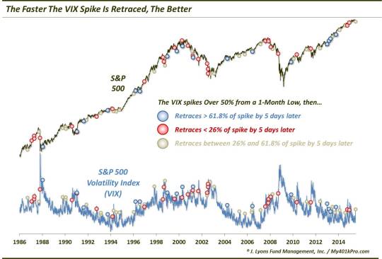
While it is a busy, and long-term, chart, you may be able to notice the proximity of many of the instances of large retracements (blue dots) near many market lows and VIX tops. Conversely, many of the red dots (signifying very little retracement) occurred prior to continued stock market weakness and a continued rise in the VIX. But while we like a good chart, it doesn’t really do the study justice in its presentation. Let’s look at the raw numbers instead.
First off, here are the returns of the S&P 500 following the 17 instances when the VIX was able to retrace its initial spike by over 62% during the subsequent 5 days.
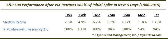
Returns following such large and swift retracements were spectacular and spectacularly consistent. The sample showed nearly unanimously positive performance over every time frame in the test.
(Note: the 1-Week, i.e., 5-day, figures indicate the performance during the 5-day period in which the VIX retracement is measured. Therefore, that time frame is not relevant as it occurs within the study sample. But while the 1-week numbers impact the subsequent performance figures, the forward returns show a persistence in the trend that renders that impact minimal.)
Meanwhile, the category of occurrences that showed very little in the way of a 5-day retracement following the VIX spike fared relatively very poorly.
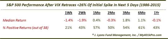
The median returns following these periods when the VIX was unable to quickly retrace its initial spike were negative out 2 weeks, 2 months and even out to a year. Therefore, the inability of the VIX to retreat following its initial spike has often been a sign of more weakness to come.
The 3rd category, reflecting a moderate VIX retracement, showed forward returns that were, unsurprisingly, in between the prior two data sets.
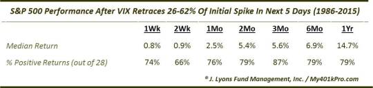
In general, the returns were very good. This is likely just reflecting the fact that given the VIX spike, the stock market had dropped considerably, providing investors with typically favorable entry points.
So what’s the takeaway? In an effort to help determine whether a market dip is just that, a dip, or something more serious, we enlisted the aid of the VIX. We had a notion that market selloffs in which spikes in the VIX were quickly retraced were typically short-lived events. Conversely, those times when the VIX refused to quickly come back down following a spike up were indicative of a larger, more serious decline to come. While all market events are unique, the retracement levels we identified may be an aid in determining over the next few days whether Monday’s market rout was an isolated event or a sign of more damage to come.
One good thing is that as of today’s close, the VIX has been able to retrace about 40% of its recent spike. That puts our current circumstances safely above the “inadequate retracement” category. If, by Tuesday’s close, the VIX is able to close below roughly the 14.67 level, i.e., an approximately 62% retracement of its spike, it would be a further positive sign that perhaps the recent weakness is a relatively contained and short-lived event.
As it turns out, it is apparently true what they say about it being not about whether you fall, but whether you get back up. In the VIX’s case, it is not about whether it goes up, but whether it falls back down, and how quickly.
_____________
Photo of Ricardo Montalban as boxer Johnny Monterez in “Right Cross” from MGM.
More from Dana Lyons, JLFMI and My401kPro.
The commentary included in this blog is provided for informational purposes only. It does not constitute a recommendation to invest in any specific investment product or service. Proper due diligence should be performed before investing in any investment vehicle. There is a risk of loss involved in all investments.