High Yield Bond Rates Indicating Heightened Risk

This piece is a quick compliment to yesterday’s post on the 4+ year low in the iShares High Yield Bond ETF, HYG. Some took exception (understandably) to the fact that our chart was not adjusted for dividends. Obviously for a high yield bond fund this can make a considerable difference. We only showed it because we use unadjusted charts on a regular basis as they tend to respond well to various charting techniques (indicating that many others are using them as well). Well, to show that the recent slump in our high yield bond fund charts isn’t merely attributable to dividends, today we present a chart of high yield rates. And high yield rates (as represented by the BofA Merrill Lynch US High Yield Master II Effective Yield), which move opposite bond prices, hit a 3-year high yesterday.
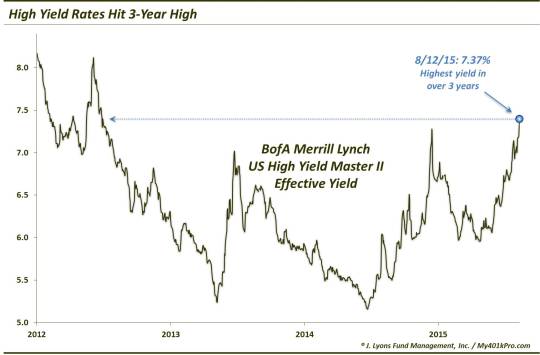
So what’s the big deal? High yield bonds represent the poorest quality companies in the bond space. If the credit of these companies is suffering, it’ll show up in the rates. It can also be a strain on the economy and an indication of economic trouble. Additionally, It is one of the reasons we initiated a bearish battle against high yield bonds exactly a year ago.
The bottom line is, this is another red flag for the economy and equity market, even if it hasn’t shown up in the major indicators.
______
“man on wire” photo by Alan.
More from Dana Lyons, JLFMI and My401kPro.
The commentary included in this blog is provided for informational purposes only. It does not constitute a recommendation to invest in any specific investment product or service. Proper due diligence should be performed before investing in any investment vehicle. There is a risk of loss involved in all investments.