Internal Combustion: Anatomy Of A Market Top-Part 1

This piece originally appeared as the August issue of the J. Lyons Fund Management, Inc. Newsletter at www.jlfmi.com.
Over the past few months, we have detailed the systematic deterioration in the internals of the stock market. This trend recently reached depths historically seen only near major market tops.
This is Part 1 of a 1 or 2-Part series on factors that are characteristic of a cyclical top in the stock market. It should really be a 3-Part series but, like Star Wars, we skipped over the 1st part of the story. Part 1A would have covered what we term the “background” conditions of the market. These background conditions – including valuation, sentiment, stock allocation, long-term price vs. trend, etc. – convey the general market environment that exists. These conditions are not catalysts or actionable indicators. Rather they reflect the market’s backdrop, instructing us as to which cyclical trends are likely to develop, at some point. Now, the status of these background conditions can persist – and for a long time. Indeed, we have been discussing the overbought/extended/high-risk nature of various of these indicators for years already. So, in a way we have covered the true Part 1 of this “Market Top” series, just not in a formal sense (our
Newsletter may have been the closest to an actual “Part 1”).
This piece covers the “internals” of the stock market. Internals (or breadth) refer to the level of participation among stocks throughout the entire equity market. It includes metrics like the number of stocks that are advancing versus declining, the amount of volume in advancing stocks versus declining stocks, the number of stocks that are making new 52-week highs versus new lows, etc. In our view, strong internals, i.e., widespread participation among stocks, is an important ingredient of a healthy market.
As a bull market ages, it tends to “thin out”. That is, it advances despite an ever-decreasing level of participation among all stocks. This thinning can persist for a while, and is not necessarily an immediate threat to the existence of the bull. However, eventually this “divergence” comes to a head as the relatively few (usually mega-cap) stocks still carrying the market higher are unable to continue to do the heavy-lifting. And when those stocks roll over, the foundation among the broad market of stocks does not exist to prevent a significant decline. This end-game development among the internals is quite possibly in motion as we speak.
Does this mean the end of the bull market is near – or here? Not necessarily. No one can know that and we are not going out on a limb to make such a call. However, the deterioration in market internals has reached truly historic depths – the kind typically associated with cyclical stock market tops. Over the past few months, we have systematically journaled on our blog the veritable procession of breadth failures. Here is a sample of the profusion of evidence that we noted.
Disclaimer: While this study is a useful exercise, JLFMI’s actual investment decisions are based on our proprietary models. Therefore, the conclusions based on the study in this newsletter may or may not be consistent with JLFMI’s actual investment posture at any given time. Additionally, the commentary here should not be taken as a recommendation to invest in any specific securities or according to any specific methodologies.
NYSE Advance-Decline Line: The Grand-Daddy of Breadth Indicators
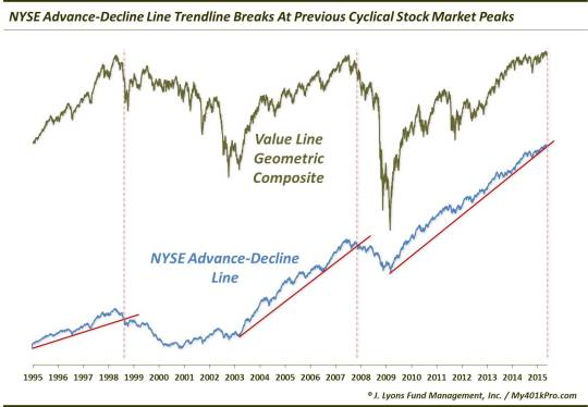
In our view, the grand-daddy of all breadth indicators is the NYSE Advance-Decline Line (A-D Line). The A-D Line is a cumulative running total of the differential of advancing stocks minus declining stocks on the NYSE on a daily basis. If we could have just one breadth indicator for purposes of analyzing the cyclical state of the stock market, it would be the NYSE A-D Line. It provides as good a picture as anything of the health of the broad market. And recent developments here do not paint a picture of good health in the market.
For one, on May 27, we noted that the NYSE A-D Line suffered a breakdown below its UP trendline from the 2009 low.
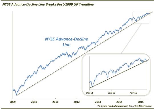
While similar trendlines for most indices remain intact, it is not unusual for the A-D Line to suffer a breakdown first. It has often preceded breaks in the major averages, serving as a warning sign that all is perhaps not well. Note similar warnings prior to the past 2 cyclical tops.
Secondly, while the trendline break was a red flag, it wasn’t the first warning sign to appear in the A-D Line – nor was it the most significant. That distinction goes to the development we noted on May 21. Specifically, the NYSE A-D Line failed to confirm the new 52-week high in the S&P 500 earlier that week. That is, the index made a new high while the A-D Line failed to do so. This is what we call a negative divergence.
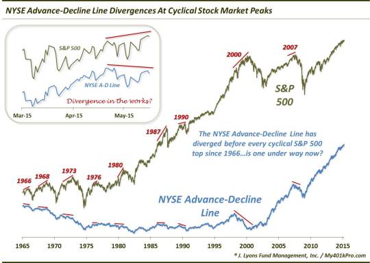
So why is this significant? As mentioned in that post, the NYSE A-D Line has negatively diverged before every single cyclical market top since 1966. Now most of the prior divergences had significantly more lead time than this one. However, there have been other close-range divergences so this would not be unprecedented. That said, it would not be out of the question to see the S&P 500 eventually make another higher high concurrent with a more prominent divergence in the A-D Line.
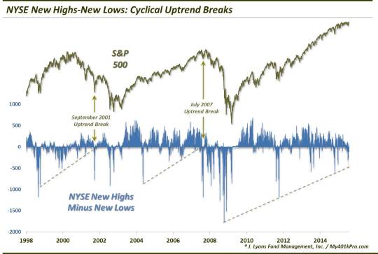
New Highs-New Lows: Cyclical Breakdown
Another of the most popular gauges of market internals relates to the number of stocks making New 52-Week Highs or 52-Week Lows. One way to track the data is to simply subtract the number of New Lows from New Highs on a daily basis. This series tends to trend over a cyclical cycle, thus providing us with signals of various significance based on the series’ behavior.
This New Highs-New Lows indicator has been in an uptrend, in terms of higher lows, since it bottomed in 2008. However, as we pointed out in an August 21 post, like the A-D Line, this metric has also suffered a noteworthy breakdown, falling below that post-2008 Up trendline.
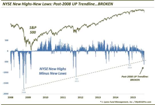
It is possible that this breakdown is occurring within the context of an intermediate-term washout. After all, the August 21 low reading occurred partly as a result of ZERO New Highs on the NYSE. That is a development normally only associated with a capitulatory phase of a major decline (indeed, of the prior 50 Zero New High days, the S&P 500 has been a median 31% below its 52-week high, versus the current 7.5%). Therefore, the market may possibly see a mean-reversion bounce soon. However, the bigger-picture ramifications should not be missed. Similar trend breaks have ushered in an eventual acceleration in losses during the prior 2 cyclical declines.
The Junkie Market: Too Many New Highs AND Lows
NYSE
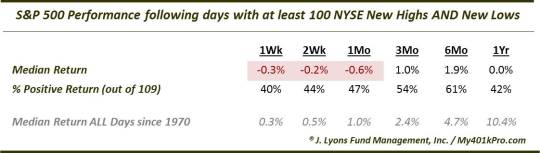
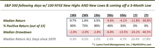
While we just witnessed an extreme low number of New Highs (e.g., 0), another recent ominous development pertained to the abundance of New Highs and New Lows. Whatever the reason for this dynamic, such conditions have occurred at less than auspicious times. On July 16, we noted the occurrence in recent days of more than 100 New 52-Week Highs AND 52-Week Lows on the NYSE.
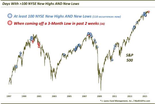
Historically, this development in the market’s internals has not been kind to the market going forward.
This was especially true when coming off of a recent 3-month low.
Nasdaq
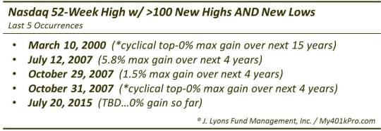
On July 27, we noted the same situation on the Nasdaq exchange.
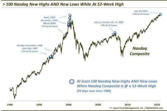
These events were similarly unkind to the Nasdaq market, especially the past 5 such occurrences.
NYSE AND Nasdaq
On August 7, we highlighted those occasions in which the NYSE and the Nasdaq exchanges each saw an abundance of both New Highs and New Lows.
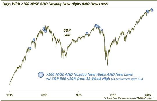
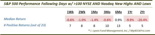
As expected, the forward returns in the S&P 500 were quite depressed following these occurrences, particularly in the longer-term.
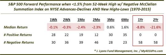
The Summation Of All Fears
Another way of measuring the cumulative state of market internals is via the McClellan Summation Index. The Summation Index is actually an oscillator that expresses the longer-term status of advances-declines, new highs-lows, etc. as either positive (above a zero line) or negative (below the zero line). While it is an oscillator, the Summation Index can, and usually does, remain positive for an extended period during favorable markets and negative for an extended period during difficult markets. Thus, it is fairly atypical of the McClellan Summation Index on either the NYSE advances-declines or the NYSE New Highs-New Lows to go negative when the S&P 500 is close to its 52-week high. It is especially unusual to see both of them below the zero line with the S&P 500 near its highs.
Yet, as we noted on July 30, this was precisely the situation in recent weeks. This may be the single most instructive chart in illustrating the deteriorating breadth situation juxtaposed against the close proximity of the major averages to their all-time highs.
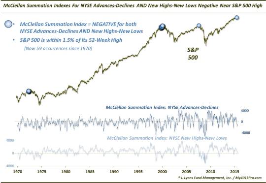
Again, this type of negative breadth divergence has been a bad harbinger of things to come, eventually, for the market. A look at the forward performance of the S&P 500 following these events gives you an idea why we say this may be the most instructive data point in describing the negative divergence between prices and internals – and its potential consequences.
Losing Weight: Even The Leaders Are Thinning
Despite this preponderance of evidence pointing to the deterioration of the market’s internals, the major averages, as well as a select few sectors, continued to hold near their highs. The reason is that a relatively few (mainly mega-cap) stocks kept those areas propped up with their substantial weighting in the indices. However, as the relatively few strong areas of the market began to weaken, there was precious little support left to prevent a significant correction. We recently detailed such signs of deterioration even among the stronger areas of the market.
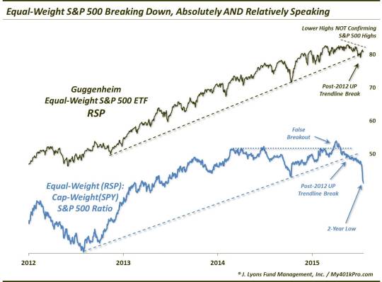
Equal-Weight S&P 500
We pointed out the first example of this on May 28 with respect to the S&P 500. Though the cap-weighted index was coming off a recent 52-week high, the equal-weight index was beginning to lag. As the name implies, this index applies an equal weighting to each of its components. This provides a more accurate look at the health of the broad market segment than does a cap-weighted index which can mask internal weakness if the largest stocks are still performing well.
This has been precisely the situation beginning with the equal-weight S&P 500 index failing to confirm the cap-weighted index’s new high in May. Additionally, after attempting a relative breakout versus the cap-weighted index earlier in the year, the equal-weight S&P 500 broke down below its post-2012 uptrend, recently hitting a 2-year low.
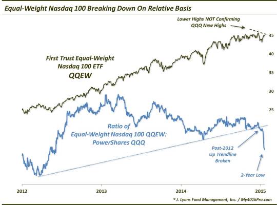
Equal-Weight Nasdaq 100
The technology-heavy Nasdaq 100 (NDX) has been one of the stalwarts of this bull market, hitting a 52-week high as recently as a month ago. However, the equal-weight NDX has also noticeably thinned out, as we indicated on July 22. As with the equal-weight S&P 500, the equal-weight NDX failed to confirm the cap-weighted index’s new high in July and has broken down below its post-2012 uptrend to a 2-year low.
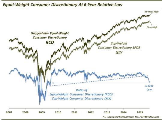
Equal-Weight Consumer Discretionary
Lastly, even the leading sectors of the market have been showing weakening internals. One example is the consumer discretionary sector, which was at an all-time high as recently as 2 weeks ago. However, looking at the sector on an equal-weight basis, one can see that the strength was due to some of the larger-cap names in the sector. On a broad, equal-weight basis, the sector has been losing steam over the past few months. Like the examples above, the equal-weight consumer discretionary index failed to confirm the cap-weighted index’s recent high and has now fallen to a 6-year low on a relative basis.
July 20: The Turning Point?
Internal deterioration can last for some time before it has an impact on the major averages. However, when the divergences become as pronounced as they have, there is a certain point where they come to a head. Every cycle is different, but, at times, this inflection, climax, turning point, etc. can be narrowed down to a specific day. Such days are characterized by the major averages rising to or near a new high, but accompanied by egregiously poor breadth, relatively speaking. It’s as though the market has run out of gas in its push to make one more high. Some examples of such days occurred in August 1987, July 1990. March 2000 and July/October 2007 as well as near various tops in the 1960’s-70’s.
Obviously, these days are only identifiable in hindsight. However, we did make reference to the possibility that July 20 was one such “turning point day” in a post we titled “The Thinnest New High In Stock Market History”. Here is some of the evidence we used to back up that claim.
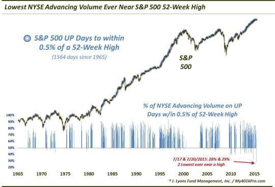
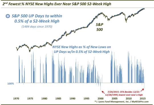
NYSE
On July 20, the S&P 500 rose to within 0.12% of its 52-week high. Since 1965, there had been 1,564 days on which the index closed higher to within 0.5% of its 52-week high. Among those days:
July 20 had the lowest % of NYSE Advancing Issues (31.7%) of all near-highs on the S&P 500
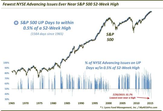
July 20 had the lowest % of NYSE Advancing Volume (28%) of all near-highs on the S&P 500
July 20 had the 2nd fewest NYSE New Highs vs. New Lows (35%) of all near-highs on the S&P 500
Nasdaq
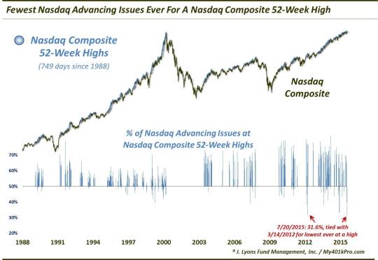
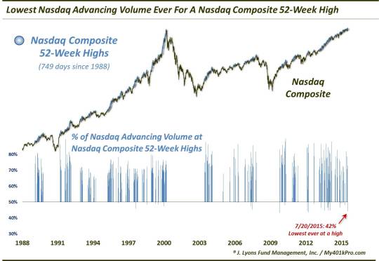
On July 20, the Nasdaq Composite closed at a 52-week high for the 749th time since 1988. Among those days:
July 20 had the lowest % of Nasdaq Advancing Issues (31.6%) of all Nasdaq new highs
July 20 had the lowest % of Nasdaq Advancing Volume (42%) of all Nasdaq new highs
July 20 was the 2nd time ever with more Nasdaq New Lows than Highs at a Nasdaq new high
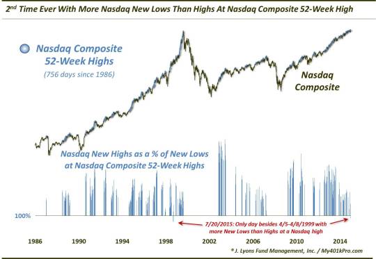
To reiterate, based on the evidence above, we labeled July 20 the thinnest new high in stock market history (at least for as far back as we have data on market internals). Despite the new highs, or near highs, in the major averages, the level of participation among the broad market in attaining this new high was staggeringly and unprecedentedly low. Thus, the foundation underlying the new high was extremely weak, leaving the market exceedingly vulnerable once the relatively few advancers finally succumbed.
Indeed, neither the S&P 500 nor the Nasdaq Composite have exceeded their July 20 close since.
Conclusion
The not-formally written first part (1A?) on the Anatomy Of A Market Top would pertain to “background” conditions in the stock market. These conditions, such as valuation, investor allocations, long-term price versus trend, etc. orient us as to the “big-picture” market environment. Identifying the environment enables us to anticipate the types of large-scale moves that arise out of the given climate – eventually. Currently, the background conditions are as risk-laden as they come. Together, they form a market environment that has historically given rise to cyclical tops in the stock market. However, these background conditions can last for an extended period, years even, before the expected large-scale move unfolds. The fact that we have written about these elevated background conditions for several years now attests to their potential persistency. Something needs to change within the market’s structure to effect a cyclical decline.
The first change often occurs below the surface. In Part 1 here, we explain how the deterioration of the market’s internals typically occurs in the lead-up and development of a cyclical market top. Weakening breadth, i.e., advancing versus declining issues, new highs vs. lows, etc., even as the major indices continue to make new highs, is the first sign of tangible trouble in the market. That said, this dynamic too can persist for an extended period. Indeed, such negative divergences have been occurring for as long as 12 months now.
However, eventually these divergences reach a head. And the most egregious cases have historically occurred within close proximity to major, cyclical market tops. The deterioration of the broader market is so great that the resultant foundation of support below the surface of the popular market cap-weighted averages is nearly non-existent. Once the relatively few leaders propping up the market begin to collapse under the weight, the inevitable cyclical decline can commence.
That is when Part 2 of the Anatomy Of A Market Top occurs: the breakdown of prices. This looks to be unfolding as we speak, so stay tuned…
Dana Lyons
Partner
The commentary included in this newsletter is provided for informational purposes only. It does not constitute a recommendation to invest in any specific investment product or service. Proper due diligence should be performed before investing in any investment vehicle. There is a risk of loss involved in all investments.
Copyright © 2015 J. Lyons Fund Management, Inc. All rights reserved.
_______________
More from Dana Lyons, JLFMI and My401kPro.