“Less Than Meets The Eye” Nasdaq Rally – Part 100

As we’ve demonstrated in previous posts, the quality of the recent Nasdaq rally has been less than impressive.
A common theme among our recent posts – and in fact, since the spring – has been the underlying deterioration of the broad market. The number of stocks demonstrating positive price action has gradually gotten smaller and smaller, even as the major large-cap averages have remained within arm’s length of all-time highs. Last Monday, we noted this phenomenon based on the relatively low number of advancing stocks versus declining issues, even as the Nasdaq 100 (NDX) was rallying sharply. Today’s Chart Of The Day points out the dichotomy between the NDX, which is up sharply in recent weeks, and the lackluster number of New Highs versus New Lows on the Nasdaq exchange.
Specifically, the NDX is up almost 13.5% over the past 30 days. Meanwhile, as of today, there were over 100 more Nasdaq New Lows (180) than New Highs (20). This has also been an unusual combination throughout the NDX’s history. Going back to 1990 (the chart begins in 1995 as there were no occurrences prior to 1996), there have been just 22 days on which the NDX showed a 30-day gain of over 10% with over 100 more New Lows than New Highs.
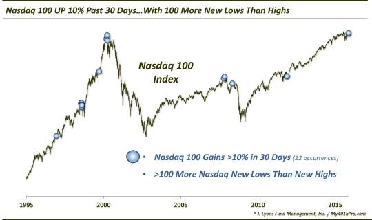
As the chart indicates, several of the prior events occurred at most inopportune times, ushering in either cyclical or secular bear markets. Here are the months that witnessed such events (*preceded bear market):
- December 1996
-
July-August 1998*
- September 1999
- March-April 2000*
- October-November 2007*
- May 2008*
- November 2011
The 1996, 1999 and 2011 occurrences saw the NDX roll right over this “red flag”. Each of these dates saw 2-month gains of at least 10% afterward. Furthermore, the drawdown was minimal going forward at less than 4% for any of those dates over the next 12 months.
The other dates were another story entirely. Each of them led to bear markets (i.e., 20% declines) within 1-4 months time. Following that weakness in the intermediate-term, the occurrences in the late-1990′s bull market blowoff period were able to recover swiftly. Their strong recoveries make for a most unusual performance table based on this study.
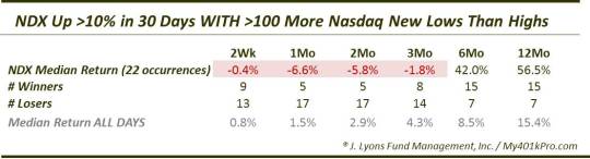
As the table shows, the most consistent time frame was the short to intermediate-term between 1-2 months. And the consistent result was weakness, with just 5 winners out of 22 days and median returns of around -6%. Fast-forwarding just a bit to the 6-month time frame, the story changes. At that point, the median return following these events is…+42%!!
Again, those positive longer-term results are heavily skewed by the large cluster of events occurring in the late 1990′s. Now, we really should have included just the first occurrence within a cluster. However, seeing the results, we wanted to present them so that folks may get an idea of the absolute frenzy that marked that late-1990′s period.
Consider this: from the 1996 occurrence to the 1998 occurrence, the NDX essentially had doubled. At the 1999 occurrence, the index had doubled again. And by the 2000 occurrence, the NDX had doubled yet again!
One point there, that we have made in other posts, is that following the short to intermediate-term, there seem to be binary outcomes. This reflects two entirely different market regimes. The late-1990′s displayed a roaring bull market among the major large-cap averages that steamrolled over every breadth divergence or concern that arose for 2 years. The period since has been marked mostly by a secular bear market in which the averages had a difficult time maintaining their uptrend once breadth had deteriorated to the extent seen here.
So once again, the expected outcome of the most recent wave of deterioration in market internals will likely depend on one’s view of the current market regime. Are we in an environment that can continue to largely dismiss these breadth warnings, ala the late 1990′s? Or are stocks fated to eventually succumb to the weakening internal foundation as in the post-2000 period?
We know where we stand (…the clue is in the picture at the top of the post).
________________
More from Dana Lyons, JLFMI and My401kPro.
The commentary included in this blog is provided for informational purposes only. It does not constitute a recommendation to invest in any specific investment product or service. Proper due diligence should be performed before investing in any investment vehicle. There is a risk of loss involved in all investments.