What Does Record VIX Deflation Mean For Stocks?

The S&P Volatility Index recently dropped at a record pace off of its February highs; is this good news or bad news for stocks?
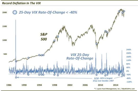
This chart and post are a few weeks late in coming because, frankly, we totally missed this. Thanks to a recent Barron’s publication, however, we became aware of the following statistic: in the 25 days subsequent to the February low in stocks/high in volatility (ending on March 18), the S&P 500 Volatility Index (VIX) saw its largest ever decline over that time frame, dropping precisely 50% (technically, the aftermath of the 1987 crash saw a bigger drop, but the VIX calculation was a bit different then – so we’re going to stick with the *record* label).
Honestly, we missed this milestone because it is a complete surprise to us. It really doesn’t seem like we just witnessed the greatest ever collapse in volatility – but the statistics don’t lie. This was the first time (outside of 1987) the VIX had ever fallen by 50% in a 25-day span – though, there were a few other close calls over the past 30 years. For research purposes, we loosened the criteria a bit to see what lessons might be learned by previous events.
Thus, taking a look at VIX drops of at least 40% yields 12 other (unique) occurrences since 1986:
So, indeed, what can be gleaned, if anything, from these events? Well, instinctively, we’d be inclined to view the development as a bullish one for stocks. From looks at VIX declines in previous posts, including last July and October, we know that, in general (but not always), sharp declines in the VIX from elevated levels tend to be bullish for stocks in the intermediate to longer-term.
Looking at the performance of the S&P 500 following the prior 12 40% declines yields the following aggregate statistics:
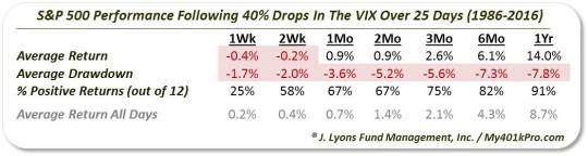
After the first few weeks following the VIX drops, we can see that the returns have been pretty good for stocks, particularly in the longer-term. Furthermore, these statistics pertain to the VIX and S&P 500 status as of March 18. Thus, we are already beyond the rocky first couple of weeks.
All is not necessarily roses, however. One potential caveat (beyond the rocky short-term performance) pertains to the prevailing secular market cycle. If you’ll note on the chart, the first 7 incidents occurred during the secular bull market of the 1980′s-1990′s. Unsurprisingly, returns for those dates beyond 1-month were almost unanimously spectacular. On the other hand, the next 5 occurrences took place during the post-2000 secular bear market (our view is that it is still in effect). These incidents were not without some tribulations in the intermediate-term. Consider the 6-month drawdowns following the last 5 signals:
- 12/26/2008: -22.5%
- 4/20/2011: -17.4%
- 10/28/2011: -9.8%
- 11/17/2014: -3.4%
- 10/7/2015: -8.4%
That may not be enough evidence to overwhelm the bullish ramifications of this signal. However, it does at least give a little pause in issuing the all-clear sign here.
All-in-all, the rapid retreat in the VIX should be a positive factor for stocks in the intermediate-term. However, considering the track record of recent signals, don’t be surprised to see the stock market experience some deflation itself along the way.
__________
More from Dana Lyons, JLFMI and My401kPro.
The commentary included in this blog is provided for informational purposes only. It does not constitute a recommendation to invest in any specific investment product or service. Proper due diligence should be performed before investing in any investment vehicle. There is a risk of loss involved in all investments.