Heavy Metals Sending A Warning To Economy, Markets?
The prices of industrial metals have dropped to a near-record low level relative to precious metals, a trend that has had larger negative consequences in the past.
It seems that one of the fads among market technicians recently is the utilization of “ratio’ charts. That is, the comparison of one one asset’s performance relative to another. But while these ratios can make for interesting conversation, their practical value is more questionable.
For one, it can be difficult, or impossible, to accurately construct and execute a real-world strategy based on them. Secondly, while the ratio line may have the appearance of a discernible pattern, it may still lack any instructive value if there is no reasonable relationship between the two assets being compared. For example, it may be that the ratio of soybean meal to Netflix stock has the appearance of a bottoming pattern. However, does that provide any thematic instruction at all? And what’s to say that the ratio of 2 completely unrelated assets isn’t totally random – and subject to change course on a dime and without notice?
That said, we do not think that the use of ratios is devoid of value totally. In fact, we have found a lot of value in selective ratios, as long as the assets bear at least some remote relation to each other. Plus, the cool thing is that technical analysis can at times be successfully employed on ratios, typically in the form of support, resistance and trendlines.
Such is the case with today’s Chart Of The Day. The chart is the ratio of industrial metals to precious metals, specifically the S&P GSCI Industrial Metals Index to the
S&P GSCI Precious Metals Index. And it is actually a ratio chart that we like, for several reasons.
- The 2 two price series are from the same asset class and, thus, at least somewhat relatable.
- While not always the case, each asset contains an implied message regarding the state of the economy or markets at large. The industrial metals are said to be a barometer of economic demand. Meanwhile, precious metals are very often a safe haven during times of turmoil.
- The implied messages of the 2 assets are for the most part contrary in nature. Often times, the market forces that will prop one of them up will push the other one down. Thus, combining the 2 into a ratio can visually accentuate the message that markets are sending.
- The bonus is that the ratio is at a very interesting juncture at the moment.
Let’s take a look at the chart.
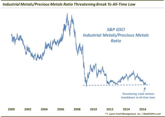
As indicated on the chart, the ratio is knocking on the door of all-time lows. Note how, as we said, the ratio takes to basic technical analysis as it found support at the very same level in 2009, 2011-2012 and again earlier this year. If this “triple bottom” of support is broken, the ratio may be primed for a swift and deep move lower.
Whether that occurs or not is to be determined. However, it is not premature to point out the clear relative weakness in the industrial metals recently. Whether due to absolute weakness in industrial metals or strength in precious metals – or most recently, both – the ratio has been on a steady decline since November 2014. Of course, the inference is that either economic demand is weak or investor nervousness is high – or, again, both. Time will again tell if this ratio is truly sending out a distress signal regarding the economy and financial markets.
Speaking of markets, there is a reason why we deal solely with data contained therein, as opposed to economic data. Econ data is soft and malleable and subject to repeated revision. On the other hand, with markets, you get a price. There is no seasonally-adjusted price or non-gaap price. There is just one price and it is what it is, wherever and whenever it is.
What that means is that markets can be measured, and inter-market relationships more easily observed. In this case, there has been an observable and interesting relationship between the industrial metals/precious metals ratio and the equity market – and one with perhaps more practical application than mere economic forecasting. Check out the ratio chart when we add the S&P 500.
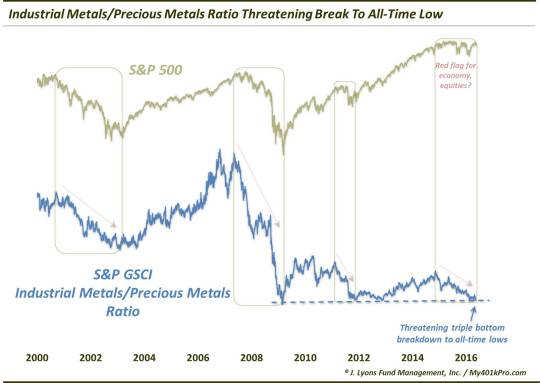
As one can see, while the absolute performance of the 2 series is quite different, the direction of each of the slopes is most often aligned. That is, when the ratio has been rising, stocks have also generally risen in lockstep. On the other hand, when the ratio is declining, stocks have generally fallen as well. Witness the 2000-2002, 2007-2009 and 2011 declines. This is an important point given our present set of circumstances.
Again, the industrial metals/precious metals ratio has been declining steadily over the past 18 months. Meanwhile, the S&P 500 has been mostly running in place. Based on their relationship, over the past 15 years at least, one of those trends would seemingly need to bend. With the ratio so close to new all-time lows, and a possible acceleration of the decline upon a breakdown, the S&P 500 could be vulnerable to a sympathy decline.
In sum, while they are widely overused and misused, ratio charts comparing one asset to another can be an instructive tool under the right circumstances. When the 2 assets are relatable and their combination informative, we can learn a lot about the assets themselves as well as the broader economic and market environment.
In this case, the vast under-performance of industrial metals compared to precious metals may be a warning sign regarding the strength of economic demand and/or investor skittishness. Furthermore, if recent history is a guide, the stock market may have a difficult time defying gravity much further as the industrial metals continue their relative deterioration.
________
More from Dana Lyons, JLFMI and My401kPro.
The commentary included in this blog is provided for informational purposes only. It does not constitute a recommendation to invest in any specific investment product or service. Proper due diligence should be performed before investing in any investment vehicle. There is a risk of loss involved in all investments.