This Chart Pattern Is ‘Preferred’ By 9 Out Of 10 Technicians

The chart of a preferred stock ETF is demonstrating a potentially bullish cup-and-handle formation.
While most major averages continue to churn somewhere between their post-2015 downtrend lines and the 2015 highs, numerous bullish setups in individual names and sectors continue to pop up. By bullish “setups” we are referring to chart patterns that have reliably preceded upward moves in the past. Now, by “reliably”, we mean a majority of the time, not all of the time. Nothing works all of the time. However, there are identifiable patterns that suggest greater odds of further gains going forward on a particular chart. One of those patterns is a “cup-and-handle”, and we have identified a present example of it in today’s Chart Of The Day.
We’ve noted the characteristics of cups-and-handles and the potential theory behind their bullish implications in the past. Let’s reiterate those points as applied to the chart of the PowerShares Preferred Portfolio ETF, ticker, PGX (unadjusted for dividends).
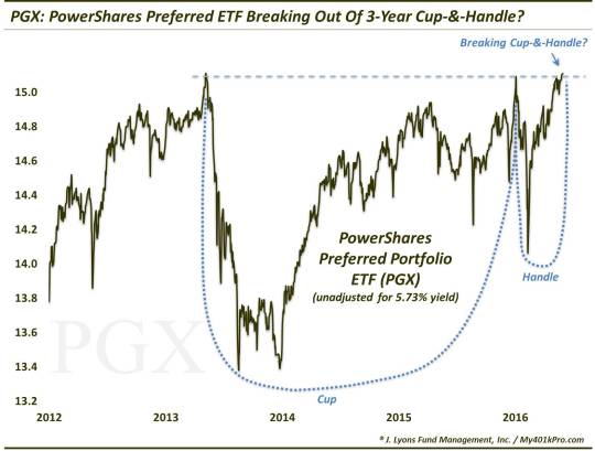
The Cup: This phase includes an initial high on the left side of a chart (e.g., the 2013 high in PGX just over $15), followed by a relatively long, often-rounded retrenchment before a return (e.g., early this year) to the initial high.
The Handle: This phase involves a shorter, shallower dip in the stock and subsequent recovery to the prior highs (e.g., the January-May period in PGX).
Now, PGX may not be a textbook cup-and-handle pattern with the rounded cup. However, rarely does one find a perfectly textbook cup-and-handle, or other chart pattern for that matter – except in the textbook. All we care about is whether the conditions satisfy the 2 criteria and, in our view, they do.
The bullish theory is predicated on the idea that after taking a long time for a stock to return to its initial high during the “cup” phase, the “handle” phase is much briefer and shallower. This theoretically indicates an increased eagerness on the part of investors to buy the stock since they did not allow it to pull back nearly as long or as deep as occurred in the cup phase. Regardless of the theory, the chart pattern has often been effective in forecasting an eventual breakout and advance above the former highs.
How high does the pattern suggest prices will go upon a breakout? As we’ve mentioned before, we are not big fans of setting targets. We prefer to deal with price should it reach a certain level as opposed to expecting or relying on price to hit said level. That said, there are rules of thumb pertaining to how far price may go upon a breakout above the highs (i.e., top of the cup). Such targets vary between 50%-100% of the top-bottom range of the cup. In the case of PGX, such a move would be roughly a 6%-12% advance.
Now, you may be thinking that’s not much of a move to get all excited about. However, considering the very low beta in preferred issues, that’s nothing to sneeze at. Remember, preferred shares are a hybrid between stocks and bonds. They provide a fixed dividend that takes priority over payouts on common stock. And they are among the various higher yielding instruments that have successfully served as competition for low-rate fixed income securities for several years now. So a 6%-12% high-confidence move would be very welcomed indeed for an income-focused investor. Speaking of income, neither the chart, nor the 6%-12% take into account PGX’s hefty yield of 5.73%!
Theoretically, preferred stocks and funds should continue to do well under the perpetuation of the “lower for longer” interest rate policy. However, even if the Fed should surprise and hike rates in June again, it may not be a death knell for preferreds. If you recall, the last time we mentioned these issues was in late December following the last rate hike. That post pointed out that, following a brief, sharp dip by preferred issues coinciding with the rate hike, they wasted no time in recouping those losses, even moving to new highs in very short order.
So our advice would be, don’t sweat what the Fed is or isn’t going to do or say. Any pertinent data or events will be filtered through the market anyway. Focus instead on the action in prices and the market. There are still plenty of constructive price patterns to be found out there. That includes preferred stock funds, whose potential cup-and-handle pattern is likely preferred by 9 out of 10 stock bulls.
________
More from Dana Lyons, JLFMI and My401kPro.
The commentary included in this blog is provided for informational purposes only. It does not constitute a recommendation to invest in any specific investment product or service. Proper due diligence should be performed before investing in any investment vehicle. There is a risk of loss involved in all investments.