2016 Charts Of The Year

This post originally appeared as the J.Lyons Fund Management, Inc. December 2016 Newsletter at jlfmi.com.
As 2016 draws to a close, we again take a look back – in chart form – at the noteworthy events that took place across the financial markets this year. It was certainly another exciting year with many potentially major shifts taking place and plenty of weighty questions to be addressed. Has the secular bear market in bond yields finally ended? Has the deflationary spiral in commodities, including oil and gold, hit bottom? Is the U.S. Dollar embarking on another major leg higher? Is the Euro on its way to parity – and beyond? Will the “Trump Rally” in industrial metals, construction and infrastructure signify a sustainable development? Will the inexorable bull market in U.S. equities continue to greater heights? Does the fact that the Cubs won the World Series mean we are all doomed? Clues to these questions (except for that last one) and more may be found in our 2016 Charts Of The Year.
These charts aren’t necessarily our most popular ones (see The 5 Most Viewed Charts Of 2016 for those). Consider these our “editor’s picks”. The charts range from those that had the most impact on the markets in 2016 to those that may have the most impact on 2017 to those whose impact is totally unknown to us. They don’t necessarily include after-shots of the big movers of the year. However, you will see “before” shots of many of the big movers. After all, we are money managers and the objective behind these charts is to identify potentially profitable moves before they happen. Finally, there is our chart of the year for 2016. We would love to know which charts you feel should have been included so feel free to send along your feedback. We thank you again very much for your viewership this year and wish you all a very healthy and prosperous 2017.
So, without further ado, here are our 2016 Charts Of The Year:
Disclaimer: While this study is a useful exercise, JLFMI’s actual investment decisions are based on our proprietary models. Therefore, the conclusions based on the study in this newsletter may or may not be consistent with JLFMI’s actual investment posture at any given time. Additionally, the commentary here should not be taken as a recommendation to invest in any specific securities or according to any specific methodologies.
2016 Charts Of The Year
(in [mostly] chronological order – click on the titles to visit the respective posts):
What’s Next For Stocks After Record New Year Week 1 Hangover? – January 11
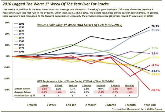
With nearly a year gone by, investors may forget that 2016 actually saw the weakest start to a year in the history of the Dow Jones Industrial Average – with a loss of more than 6% during the first week. The fact that stocks rebounded strongly from their tough start, and avoided the fate of many previous poor-starting years, has likely also helped investors to forget.
BREAKING!: The Bull Market? – January 7
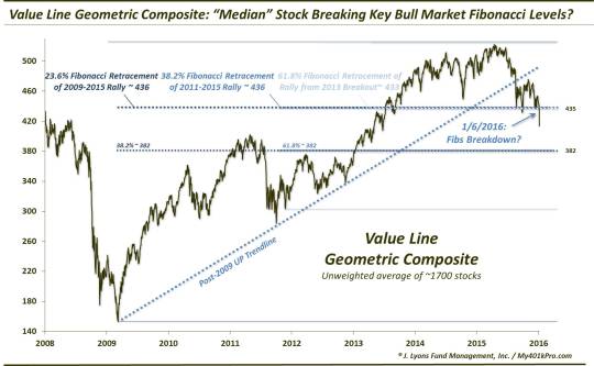
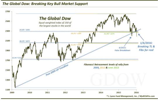
The early-2016 thumping, on top of the late-2015 weakness, had stocks threatening critical levels (e.g., trendlines, Fibonacci Retracements, etc.) related to the potential survival of the post-2009 bull market. On January 6, several key indices, including the Value Line Geometric Composite and the Global Dow Index, convincingly broke such levels. This break had us wondering if it was the final blow to the bull market. It also, based on our work, opened up a further immediate 10%-12% of downside in the indices.
UPDATE>>Just 2 Weeks After Breakdown, Key Index Hits Ground Floor – January 21
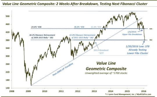
Well, it took just 2 weeks for the Value Line Geometric Composite to achieve that further 12% drop. On January 20, the index reached the next level of major Fibonacci Retracements that we had ear-marked. As it turns out, that day would mark the low for the year in the Value Line Geometric Composite.
Key Global Equity Index Takes Elevator Down To Support – January 22
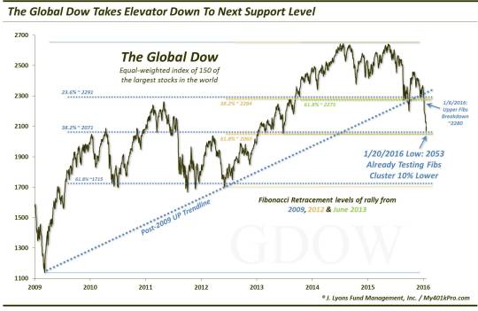
Similarly, it took just 2 weeks for the Global Dow to fulfill its 10% of immediate risk to the downside. As with the Value Line, the Global Dow would form its low for the year on January 20…along with a mid-February retest.
New Lows Hit ‘Wash-Out’ Territory – January 21
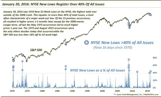
This was the most viewed post/chart on our blog in 2016. As beleaguered investors wondered when the blood-letting in the stock market would stop, signs of capitulation began to pile up in late January. Included among them was the preponderance of New Lows on the NYSE, which soared to over 40% of all issues on January 20. While not perfect, this level has very reliably signaled truly “washed-out” conditions in the past. And as with past incidents, this marked the very low for the decline, and for the year.
Gold Stocks Hit Lowest Levels. Ever. – January 14
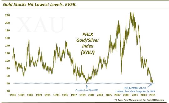
Coming into 2016, no one was more depressed than gold bugs. The PHLX Gold/Silver Index (XAU) began the year mired in a 5-year slump that saw it lose over 80% of its value. On January 14, the XAU would close at its lowest level in the over 30-year history of the index. Enough said.
Gold Stocks At Key Juncture? – January 26
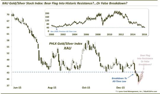
After a further, swift plunge, the XAU would bounce back to challenge its January 14 breakdown level. In one of our most popular posts of the year, we wondered if the breakdown level would send gold stocks on a fresh leg down – or if the XAU would reclaim the level, creating a potentially explosive false breakdown. It turned out to be the latter as, prior to some year-end weakness, the XAU went on to nearly triple its value by August.
Jamie Dimon Banking On Financial Stocks Bouncing Here – February 12
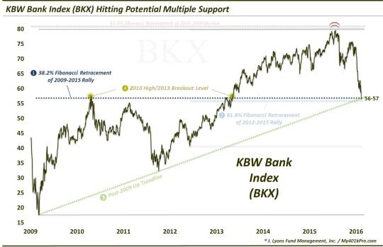
U.S. stocks tested their January lows in mid-February as many sectors reached key chart support. Included among them was the KBW Bank Index (BKX). Coinciding with Jamie Dimon’s high profile purchase of JP Morgan stock, the BKX tested its post-2009 UP trendline and other key levels. It would end up being a very well-timed purchase as both the BKX and JPM stock formed their low for the year on February 11, preceding rallies of over 60% in each of them.
Brazil’s Bovespa Is Once Again…The Most Interesting Chart In The World – March 1
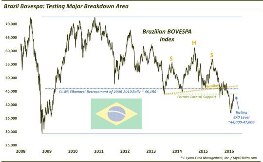
Our vote for international stock market of the year goes to Brazil. Representative of the woeful performance in emerging market equities in recent years, Brazil came into 2016 in the midst of a 5-year bear market. In early January, it would break below major 3-year support, tumbling to 7-year lows. However, like the XAU, the Brazilian Bovespa would bounce back to test its breakdown area in early March. And like the XAU, the Bovespa would reclaim that level, creating a false breakdown and launching it on an eventual 75% rally, low to high.
The Line In The (Oil) Sand – March 8
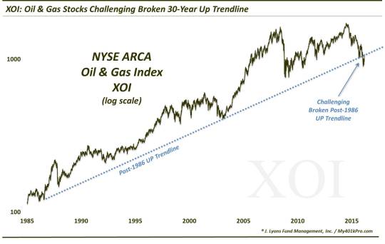
Another beleaguered area of the market coming into 2016 was the oil complex. Both the commodity and the oil stocks were victims of the devastating deflationary spiral gripping commodities for the past 2 years. In early 2016, the NYSE Oil & Gas Index (XOI) actually broke below its 30-year trendline stemming back to its 1986 lows. In a key development, the XOI would go on to recover that trendline and has fought to remain above it all year.
Did THIS Just Breathe New Life Into The Bull Market? – April 14
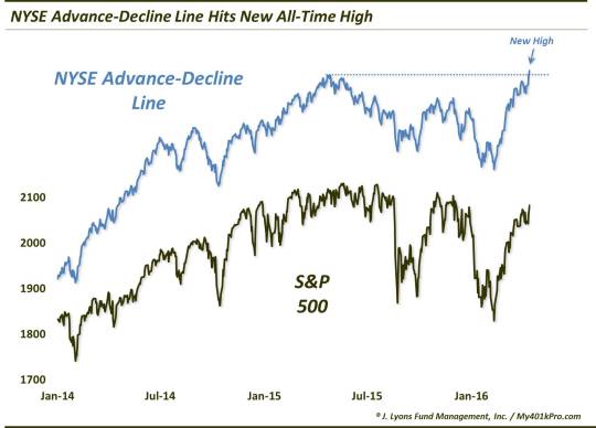
One reason we surmised that the 2015 stock market top might have marked the end of the post-2009 bull market was the divergence of the NYSE Advance-Decline Line at the May high in the S&P 500. Failures of the A-D Line to confirm new highs have been present at every cyclical market top in the last 50 years. For that reason, we noted that bulls should breathe a little easier upon the A-D Line reaching a new high in April of this year. That suggested that the S&P 500 would go on to make at least one more new high before the bull market was over – which, of course, it has.
Will The (Falling) Buck Stop Here? – May 3
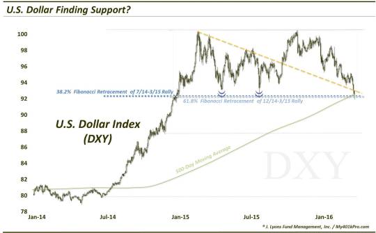
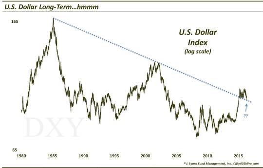
One of the biggest developments of the year in the financial markets was the post-election breakout to 13-year highs by the U.S. Dollar. Back in the spring, however, folks weren’t so positive on the Dollar as it had been stuck in the mud for 12 months. In our view, the year-long consolidation was a healthy digestion of its furious 2014 rally. The question was where would the Dollar bounce? To us, the test of the intersection of its broken post-2015 and post-1985 Down trendlines that we noted on May 3 was as good a place as any. As it turns out, that was the low day of the year in the Dollar and preceded its eventual breakout.
Has Everyone Moved To The Bullish Side Of The Bond Boat? – June 13
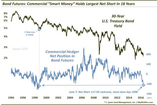
Another potentially huge development this year was the possible reversal of the 35-year secular downtrend in yields. As we noted in this June post, while yields continued to fall, it seemed that investor psychology regarding rates was changing. As the near-record net-short position in bond futures by the “smart money” commercial hedgers suggested, the investment community no longer seemed to view rising rates as an inevitable path as they had for over a decade. And perhaps, we surmised, it would be just that widespread shift in expectations to the bullish side of the bond boat that might allow for the long-awaited bottom in interest rates…eventually. 2 weeks after that post, bond yields would hit an all-time low before jumping 50% into the end of the year.
A Wake Up Call For International Stocks – June 17
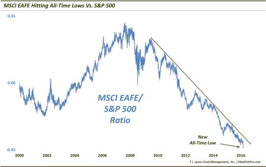
One trend that did not reverse this year was the under-performance by international equities versus their U.S. counterparts. In fact, it accelerated, as noted by this chart showing the ratio of the international MSCI EAFE index to the S&P 500 hitting an all-time low. Eventually this will reverse as well – just not this year.
Not Your Everyday Pounding – June 24
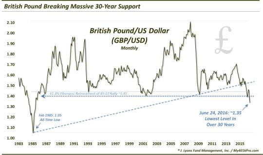
One of 2016’s defining exogenous events that had the biggest impact on markets was Brexit. The surprising vote by Britain to leave the European Union sent shock waves through the markets, some short-term and some more meaningful. One of the more meaningful reactions was the drop in the British Pound below major support down to 30-year lows.
Europe’s Bull Market Hanging In The Balance – June 27
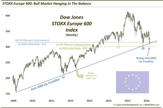
Like the EAFE, European equity markets have been a perpetual under-performer for years, or even decades. In the Brexit aftermath, the broad-based Dow Jones STOXX Europe 600 plunged lower to test its post-2009 bull market Up trendline, as well as some key Fibonacci levels. The level would hold, for now, as the STOXX 600 bottomed the day after our post. However, it still has not invalidated a potentially ominous-looking pattern that proved to be the index’s undoing in 2001 and 2008.
Will Epic Line Of Resistance Turn Support For Japanese Stocks? – June 28
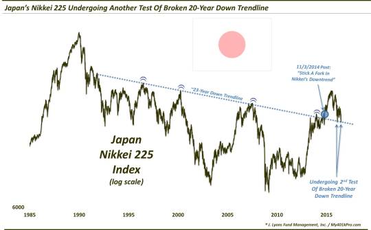
One international market that had been a perpetual under-performer for decades is Japan. However, in the past few years, its Nikkei 225 index has attempted to finally reverse its bear market that had defined it since its 1990 top. In 2014, the index broke its multi-decade Down trendline. In both February and June of this year, the Nikkei came back down to test the broken trendline, holding both times. Could this be the onset of a major shift higher in Japanese equities?
Was The 52-Week High Worth The Wait? – July 9
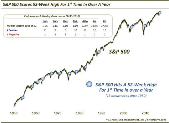
After topping out in May 2015, the S&P 500 would not hit a 52-week high again until this past July. As the chart shows, prior precedents suggest the new high was worth the wait. Since 1950, all 12 similar long waits resulted in gains over the next 1 and 2 years.
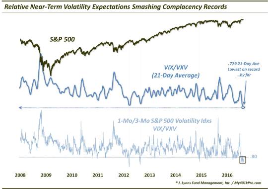
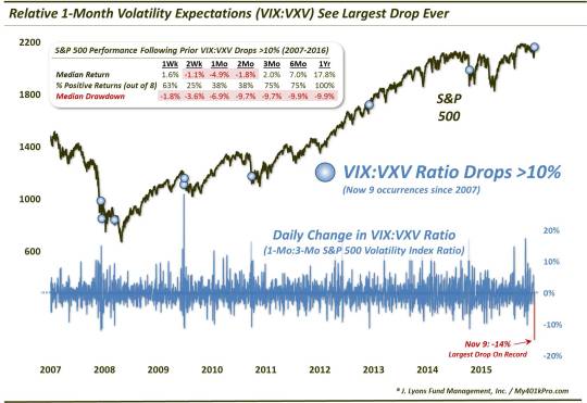
Investor Complacency Is Smashing Records – August 19
As investors waited for stocks to finally break out to new highs, sentiment remained consistently depressed. In fact, one of the factors we thought argued for eventual new highs in the indices was the still somewhat fearful investor sentiment. Only when new highs were achieved, we theorized, would sentiment finally improve. Upon July’s breakout, sentiment did indeed improve – and then some. By August, not only were investors no longer fearful, they were complacent to historic extremes. At least that was the signal being sent by looking at the term structure of the S&P 500 volatility indices. By mid to late-August, the 1-month volatility expectations (VIX) relative to the 3-month (VXV) had dropped lower, and stayed lower, than any point in the data’s history. This was a red flag for stocks.
Here Comes The Rising Rate Ruckus Again – August 26
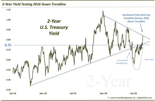
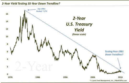
The long-awaited rising rates theme applied to short-term rates as well, like the 2-Year Treasury Yield. Obviously more influenced by the Fed’s ultra-low Fed Funds rate, the 2-Year Yield had been trudging along rock-bottom ever since the massive Fed intervention began in 2008. Every twitch higher since had been summarily beaten down. In August, we felt the 2-Year Yield might actually get some traction to the upside if it could surmount the Down trendlines stemming from both early in the year – and 1981. In doing so, the 2-Year Yield could also create a false breakdown following its post-Brexit plunge. It took until after the election, but the 2-Year Yield was indeed successful in breaking above that key area. When all was said and done, the 2-Year Yield had doubled off of its post-Brexit low – and had finally given the rising rates crowd some evidence to back up their mantra.
Stock Market Levitation Hits Historic Heights – August 31
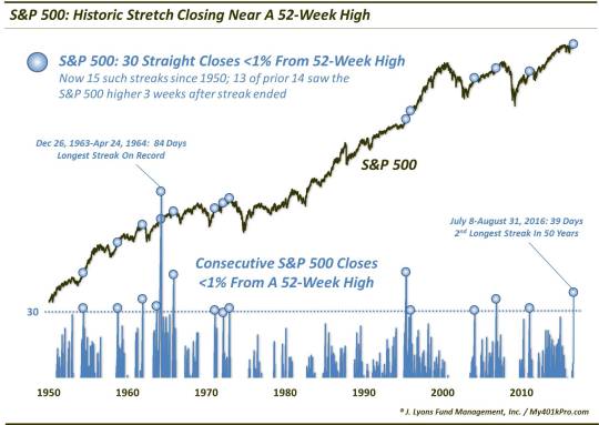
In between bouts of extreme volatility (e.g., early-2016, post-Brexit, post-election), the stock market also experienced historic stretches of calm during 2016. We noted one remarkable such stretch in late August whereby the S&P 500 closed 39 consecutive days within 1% of its 52-week high. This was the 2nd longest such streak in 50 years – and took the term dog days of August to a new level.
Stocks’ Trading Range Now Beyond Compare – September 6
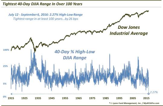
Another remarkable measure of stocks’ periodic bouts of inactivity during the year occurred during the same time frame as the previous chart. Specifically, from mid-July to early-August, the Dow Jones Industrial Average saw a 40-day stretch in which its entire high-low range was a mere 2.27%. If you think that’s tight, you’re right. In fact, it was the tightest in at least 100 years. From periods of calm come volatility surges, they say, and the rest of the year would certainly see an uptick in volatility, as the next chart demonstrates.
1 > 40 – September 12
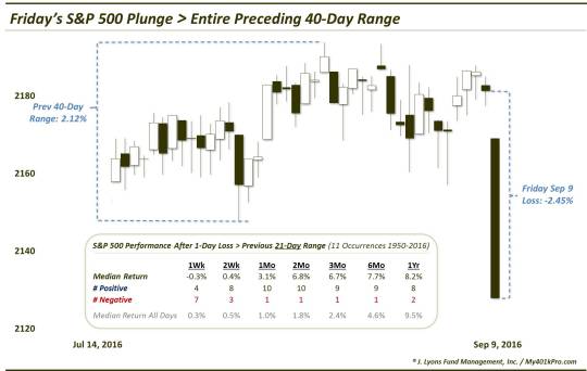
On September 9, the Dow broke out of its tight 40-day range – with a vengeance. In one of the more incredible statistical anomalies of the year, the September 9 loss of -2.45% was greater than the entire 40-day range preceding it. This was just the 4th such example we could find of such an explosive range break. As the chart shows, however, similar historical events showed a consistent tendency to bounce back.
The B.R.I.C.’s Are Rebuilding – September 7
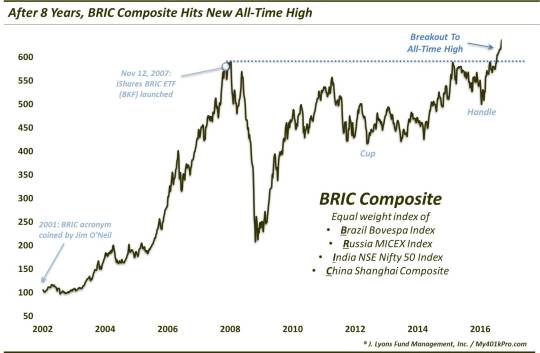
As mentioned regarding Brazil, most emerging market equity markets have been dead money for at least half a decade. This includes the so-called “BRIC’s”, i.e., Brazil, Russia, India and China, a grouping made popular due to their simultaneous strong performance in the mid to late-2000’s. The group, as a whole, began to come to life again this year so we constructed a composite of the 4 countries in order to track the collective performance. As it turns out, in late summer, the BRIC Composite moved to all-time highs, finally surpassing the highs of 2007 and 2015. Of course, these markets have benefited from the effects of their weak local currencies. However, this was a re-emergence, nearly a decade in the waiting, that bears watching.
Brexit Disaster Propels British Stocks To Record Highs – October 5
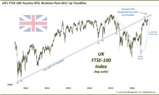
If there is any group of people that had a worse 2016 than bears in almost any non-currency asset, it would have to be prognosticators, pundits and pollsters. That’s because they got pretty much all of the major events wrong in 2016, whether it was the U.S. presidential election, Brexit, etc. Brexit was a particularly stunning misfire as it seems nobody correctly predicted the result of the referendum. To make matters worse, the forecasters badly erred in their predictions as to how markets would react in a Brexit scenario. Far from the disaster that had been predicted for British markets, the U.K. FTSE-100 reversed its initial post-Brexit plunge and was actually higher within a week. Furthermore, by 3 months later, it had rallied some 23% off of its initial post-Brexit low – and touched a new all-time high. Obviously some of that move was due to the pound getting, er, pounded. But Brexit was far from the financial armageddon for Great Britain that it was predicted to be.
Can Biotech Stocks Stay “Trendy”? – October 14
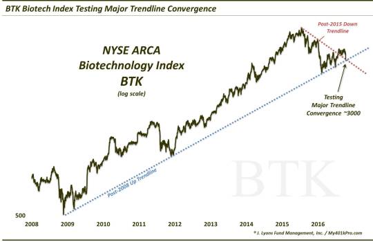
The hottest sector the planet for 2 and a half years before topping (popping?) in mid-2015, the biotechs spent 2016 in straight up survival mode. In February, the NYSE Biotech Index (BTK) had dropped as low as 42% off of its 2015 peak. It finally found a bottom precisely on its post-2009 Up trendline line. It has spent the rest of the year, right up to the bitter end, repeatedly testing that trendline. You know what we say about the more times and more frequent a trendline gets tested – the more likely it is to break. Additionally, given the shallow trajectory of the BTK bounce, especially compared to its rapid descent, and given its steep discount to its all-time high even while many sectors are at new highs, and the future looks dicey for the biotechs. That said, if this once-trendy sector can somehow manage to re-ignite its former ascent, it could be a boon to the market.
Traders Breathe Unprecedented Sigh Of Relief Following Election – November 11
Well, like Brexit, the forecasters missed badly with the U.S. presidential election as well. They missed badly with the market reaction too. While it was supposedly common thought that a Donald Trump victory would result in a substantial stock market correction, it didn’t work out that way. Instead, stocks embarked on a blistering rally and relative near-term volatility expectations collapsed at an unprecedented rate. Market 2 – Forecasters 0.
Market Insanity Ensues Post-Election – November 10
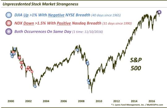
It wasn’t just that markets’ reactions to the election were unexpected – many of them were also just plain strange. In fact, the week following the election will probably go down as the most bizarre trading week we have ever witnessed. Commodities and currencies were moving at hyper speed in all directions, most of the bond market was crashing and, depending on the sector, stocks were either soaring or plunging. And while we did not write a post on it, the chart above perhaps best sums up the craziness following the election. As it shows, November 10, 2 days after the election, will go down as one of the most bizarre data days in stock market history. That’s because the Dow closed the day higher by more than 1%, yet there was negative breadth on the NYSE. At the same time, the Nasdaq 100 closed down more than 1.5%, yet the breadth on the Nasdaq was actually positive. That is a combination that may never occur on the same day again.
Rising Rates (Really) Reaching Resistance? – November 22
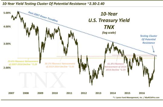
As mentioned, among the reactions following the election was one of the largest and swiftest jumps in bond yields in history. Yields sliced through any and all perceived resistance for the duration of the month. By late November, the 10-Year Treasury Yield (TNX) arrived at what we surmised would be the spot to at least slow down the interest rate advance. Around the 2.40%, the TNX encountered the post-2007 Down trendline which contained the entirety of the central bank-induced extraordinary low rate environment. Also in the vicinity were Fibonacci Retracement lines from all the key points since the 2007 high. Even this level was unable to slow down the newfound, veritable rising rates trend. In breaking the resistance related to the post-2007 regime, it places yields back within the confines of the post-1981 secular bear market regime. Thus, it likely sets up another date with the most notorious trendline still in effect in all of the financial markets – the post-1981 Down trendline in yields.
Is Industrial Metals Surge A Sign Of Growth In Economy, Market? – November 30
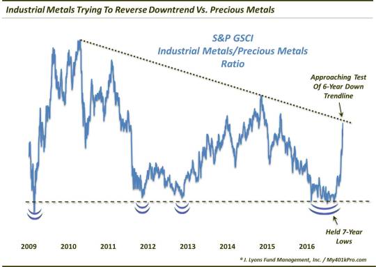
Another beneficiary of the post-election Trump Trade was anything related to construction and infrastructure resources, including industrial metals. This was a big topic since industrial metals are said to be a barometer of economic demand. And as we’ve discovered in past studies, there appears to be some validity to that notion as it applies to both the economy and the stock market. Shown here as the ratio of industrial metals to precious metals, the industrial metals skyrocketed on a relative basis following the election. This was following a key hold of support for the 4th time since 2009 earlier in the year. The ratio did find resistance at the post-2010 Down trendline, however, which has since put a halt to the rally in industrial metals. If the ratio can’t surmount the trendline, it could potentially serve as a warning sign for the growth in stocks and the economy. If, on the other hand, the sharp rally in Industrial Metals is for real and durable, then perhaps the ratio will break out – and take stocks and the economy along for the ride.
Forget 20K – THIS Is The Stock Market Level To Watch – December 14
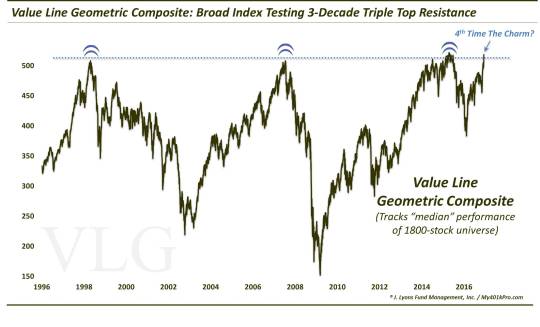
With all of the stock index breakouts following the election, it may be difficult to imagine that one index – perhaps the most important – has not yet broken to new high ground. The Value Line Geometric Composite (VLG), which tracks the median stock performance among a universe of 1800 stocks, formed a tri-decadal triple top near the 520 level In 1998, 2007 and 2014-2015. Just recently, the VLG again approached that level but was repelled. Despite that recent failure, the fact that the VLG has clawed its way from a seemingly irrecoverable drop back to its former highs should be a source of optimism for bulls. Like the non-confirmation in the Advance-Decline Line, the VLG’s 2015 divergence and subsequent rout was another piece of evidence that led us to believe that a cyclical market top was at hand. That evidence is now immaterial with the VLG back at its former highs. And should the VLG succeed in breaking decisively above its former peaks, its significance probably cannot be overstated. This would be an extremely broad market gauge breaking out above 18-year, triple top peaks to new all-time highs. The short-term, and quite possibly long-term, ramifications could be exceedingly bullish.
Euro Going To Parity Like It’s 1999 – December 16
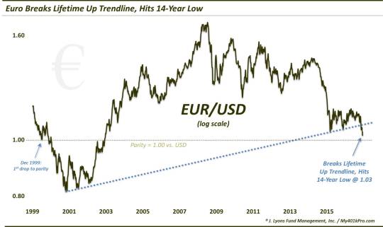
This one wins our in-house award for Headline Of The Year. The flip side of the U.S. Dollar breakout is the Euro’s recent break of support and drop to 14-year lows near 103. In the process, the currency broke its post-2000 Up trendline that had held it in 2001 and twice in 2015. With sentiment that is not overly bearish, including Euro futures positioning, a drop to parity versus the Dollar would not seem like too tall of a task at this point. Such an event would mark the only time other than 1999 that saw the Euro drop down to parity from above.
The 2016 Chart Of The Year:
Investors (Over?-)Prepared For Election Volatility – November 1
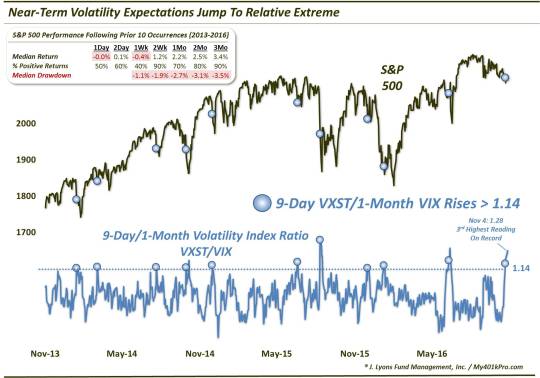
Looking back upon the year in the financial markets, over all of the research and the 100’s of posts and charts we published, our #1 market theme for 2016 was: BTBTD, i.e., “Back To Buying The Dip”. After a rocky 2015, this year saw behavior more reminiscent of the 2013-2014 V-bottom days. And our Chart Of The Year helps explain why. It goes back to the term structure of the volatility indices.
It seemed that in 2016, volatility instruments were the vehicle du jour for equity market hedging purposes. When investors got nervous, they bid up the near-term volatility expectations relative to those further out. And they did it regardless of how much weakness had already transpired in the equity market. 3 of the highest readings ever recorded in the ratio of the 8-Day Volatility Index (VXST) to the 1-Month VIX occurred in 2016. The first occurred, understandably, into the market rout in January. The other 2, representing the 2nd and 3rd highest readings ever, occurred prior to Brexit and the U.S. election. The odd thing about these readings is that they were registered despite very little stock market weakness to speak of.
Obviously, traders were nervous about the 2 exogenous events and their potential impact on the markets. Now, normally our inclination upon seeing a sentiment reading at an extreme would be to fade it. After all, the crowd is notoriously wrong at extremes. However, the funny thing about this VXST/VIX indicator (and much of the volatility trade in general) is that the extremes are often warranted, at least in the short-term. That is, these traders are often correct, at least briefly. So too were they briefly correct following the Brexit vote and the U.S. election. However, they would have had to cash in quickly in order for any payoff. Within days following Brexit, the market had turned around and started shooting higher. And even quicker, following a wicked U.S. election night selloff, stocks began to scream higher by the open of the following day.
Why did the weakness fail to hold following these events? Probably partially because of the (over-)preparedness of the volatility traders as we stated. Their substantial hedging going into the events significantly cushioned the damage incurred in their aftermath. Without the pain being felt, there was little reason for stocks to continue to sell off. Then it became a mad rush for the volatility exits as BTBTD took over.
Thank you again to everyone for reading. Here’s to another interesting and prosperous year in 2017!
________
More from Dana Lyons, JLFMI and My401kPro.
The commentary included in this blog is provided for informational purposes only. It does not constitute a recommendation to invest in any specific investment product or service. Proper due diligence should be performed before investing in any investment vehicle. There is a risk of loss involved in all investments.