Are Large-Cap Growth Stocks Set To Surge?

A potentially very bullish chart pattern has formed in the large-cap growth segment of the market.
Strategists seem to be split in terms of the stock market’s posture at this time. One contingent views the recent consolidation as a healthy digestion of the post-election rally prior to the next leg of advance. The other side views it as a tired market rolling over following a Trump rally that was misplaced and overdone. Which (if any?) of the 2 scenarios is correct? We may find out shortly. In any event, it is interesting to note how folks using the exact same inputs can come to completely opposite conclusions.
So it is with financial charts. Most technical analysts and chartists can reasonably contrive both a bullish and bearish assessment of almost any chart they peruse. It truly is in the eye of the beholder. A good example comes in today’s Chart Of The Day on an index of large-cap growth stocks.
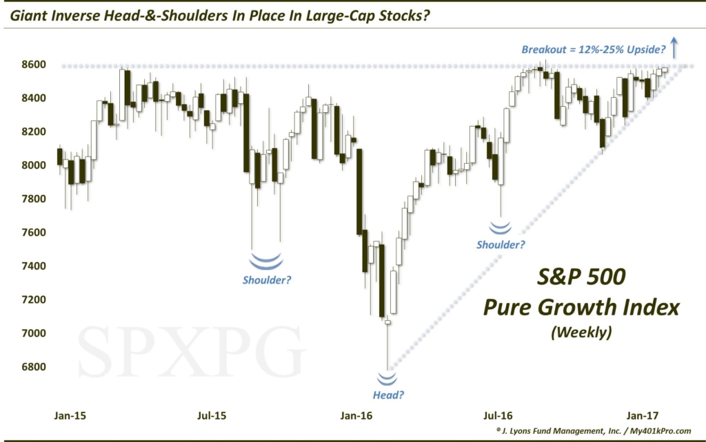
The S&P 500 Large-Cap Pure Growth Index (SPXPG) includes just those stocks in the S&P 500 that demonstrate true growth characteristics. The index itself has been stuck in a sideways range for over 2 years now. Well, at least its upper bound has not been expanded in 2 years. The SPXPG first topped out near 8600 in March 2015. It bounced off that level, more or less, over the next 5 months before suffering serious damage in the August 2015-February 2016 selloff.
As the market recovered last year, the index found its way back to the 8600 area. From July to September, the SPXPG was rejected multiple times by that level. And again over the past month, the index has repeatedly tested the area but has been unable to break through.
The skeptic would argue that the index’s inability to break out to new highs after years of testing demonstrates an underlying weakness. This is an especially compelling argument considering that most U.S. indices have managed to register new highs over the past 6 months.
However, as we mentioned, beauty is in the eye of the chart beholder. And there is an equally compelling bullish argument. Most folks have probably heard of a head-&-shoulders pattern. This is a pattern containing a top (head), flanked by two lower, proximate highs (shoulders). Historically, this has been a reliably bearish formation. Once prices break below the lows (i.e., neckline) established during the time frame of the pattern, the downside becomes most vulnerable, and potentially extensive.
Some folks may not realize that there is a bullish inverse to this pattern. It is called, not surprisingly, an inverse head-&-shoulders pattern. As you may infer, it consists of a major low (head) flanked by 2 higher, proximate lows, e.g., the shoulders. The neckline is represented by the tops established within the period of the pattern. Once that neckline is cleared, prices have the potential to shoot significantly higher.
As labeled on the chart, the spike lower in the SPXPG during the January-February 2016 rout represents a potential head of an inverted head-&-shoulders pattern. The selloffs in August-September 2015 and June 2016 represent the potential shoulders. And the roof near 8600 is the hypothetical neckline. Should this read on the chart be accurate, a successful breakout above the 8600 neckline could open up substantial upside for the index. A variety of measurements would suggest a resultant gain of between 12% and 25% following a breakout.
Of course, should that interpretation be erroneous, the index could perhaps continue to get rejected by the 8600 level until it eventually breaks down. Or, the SPXPG could very well break out only to subsequently fall back below the neckline, causing a false breakout. These scenarios would inherently be bearish.
Which will it be? Once again, we do not have a crystal ball. Therefore, we will continue to watch the next best thing: prices. Presently, prices are being squeezed by the neckline on the upside and the post-February 2016 Up trendline (connecting the pre-election low) on the down side. At this point, this (potentially bullish) ascending triangle may be as good of a direction determinant as anything.
Thus, waiting for one of the two lines to be broken seems to be the prudent strategy. And while the break may always prove to be a “false” one, we do not like to anticipate a breakout or breakdown. It is especially true in this case as, whichever way the break occurs, there should be ample room for the SPXPG to run and, thus, ample opportunity to profit.
_____________
More from Dana Lyons, JLFMI and My401kPro.
The commentary included in this blog is provided for informational purposes only. It does not constitute a recommendation to invest in any specific investment product or service. Proper due diligence should be performed before investing in any investment vehicle. There is a risk of loss involved in all investments.