
Indian Stocks In Position For Next Big Advance?
The Indian stock market is forming a potentially long-term bullish chart pattern.
The Indian stock market has been an interesting, and potentially profitable, one to track technically over the past few years. Three years ago, in March 2014, we posted a chart noting the breakout to all-time highs in the Indian Sensex Index above a series of peaks stemming back six years. Over the next year following the breakout, the index rallied by more than 40%. Exactly 2 years ago to this day, on February 24, 2015, we noted that while the breakout to all-time highs was perhaps the beginning of a much longer-term advance, in the immediate-term, the Sensex was facing several layers of potential resistance (e.g., key Fibonacci Projections and Extensions) on the chart. Indeed, the index would top out within days and proceed to lose ¼ its value over the subsequent 12 months.
That pullback retraced 88.6% (also a Fibonacci figure) of the rally following the 2014 breakout. While we would have liked to have seen the Sensex retrace the entire rally and test the breakout point, that was not to be. Instead, a year ago, the market formed a textbook double bottom and proceeded to rally back to its former highs by September. Half of that rally was retraced over the following few months before the index formed another textbook double bottom that would launch its back towards its highs again. That brings us to today.
While the Sensex remains just shy of its 2015 and 2016 highs, another popular Indian index has returned to essentially match the peaks of its own. As such, the Indian Nifty 50 Index is the subject of today’s Chart Of The Day. The impetus is the very possible interpretation of the Nifty’s chart since the 2015 peak of a cup-and-handle formation.
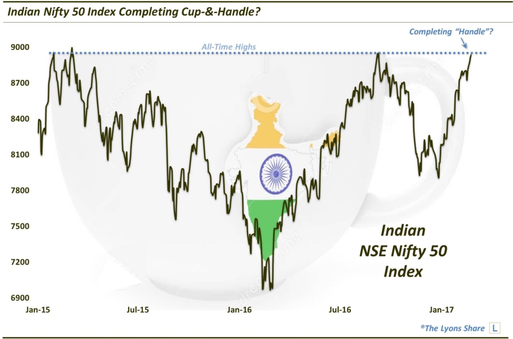
As we have mentioned many times, a cup-and-handle pattern is typically a very bullish one. As a refresher, a cup-&-handle pattern involves 2 parts:
- The Cup (March 2015-September 2016, in this case): This phase includes an initial high on the left side of a chart followed by a relatively long retrenchment before a return to the initial high.
- The Handle (September to the present): This phase involves a shorter, shallower dip in the security and subsequent recovery to the prior highs.
The bullish theory is predicated on the idea that after taking a long time for a stock to return to its initial high during the “cup” phase, the “handle” phase is much briefer and shallower. This theoretically indicates an increased eagerness on the part of investors to buy since they did not allow it to pull back nearly as long or as deep as occurred in the cup phase. Regardless of the theory, the chart pattern has often been effective in forecasting an eventual breakout and advance above the former highs.
Given the roughly 14% bounce over the past two months, a considerable pause and digestion near the highs here would be a healthy and welcomed development. Following this potential pause, should the Nifty succeed in convincingly exceeding the 2015-2016 peaks, there is no guarantee but a new, major leg of advance could be a real possibility.
_____________

Like our charts and research? Get an all-access pass to our complete macro market analysis at our new site, The Lyons Share (plus, sign up by February 28 to take advantage of our special launch deal).
Disclaimer: JLFMI’s actual investment decisions are based on our proprietary models. The conclusions based on the study in this letter may or may not be consistent with JLFMI’s actual investment posture at any given time. Additionally, the commentary provided here is for informational purposes only and should not be taken as a recommendation to invest in any specific securities or according to any specific methodologies. Proper due diligence should be performed before investing in any investment vehicle. There is a risk of loss involved in all investments.

1 Comment