Did Volatility Traders Freak Out Enough To Bottom? (PREMIUM-UNLOCKED)
*The following post was originally issued to TLS members on August 11.*
Yesterday saw a huge spike in stock volatility expectations — but was it enough for a bottom?
One of the great, unintended benefits of financial innovation is the creation of additional market indicators based on the new streams of data. A perfect example is the explosion of stock market-based volatility products. While even the purveyors of such volatility products would likely concede there are enormous potential pockets of risk bubbling up based on investors’ behavior related to the products, that behavior can serve as a valuable indication of investor sentiment — especially when it pertains to fear.
Given the subdued volatility over the past few years, selling volatility has been a profitable strategy probably 95% of the time. It has made for long periods of comfort and complacency for volatility sellers. The problem is, when volatility, i.e., risk, does appear, volatility expectations tend to rise infinitely faster than they dropped. And the theoretically unlimited upside means that those folks who are short volatility are forced to cover, or risk losing everything. These high-fear events are often indicative of some type of a market bottom. Take yesterday’s action, for example.
For the last 6 weeks, we’ve witnessed a historically low level of volatility expectations in the stock market. Thus, staggered throughout those 6 weeks, there were countless numbers of traders taking the opportunity to short volatility. However, when stock market volatility struck yesterday, most all of those traders who sidled into volatility shorts at different times all rushed for the exit at the same time. That’s why the signals are more obvious related to the fear side. If 1000 folks sneak past you one at a time, you may not notice them; however, if they all run by at once, it sets off alarm bells.
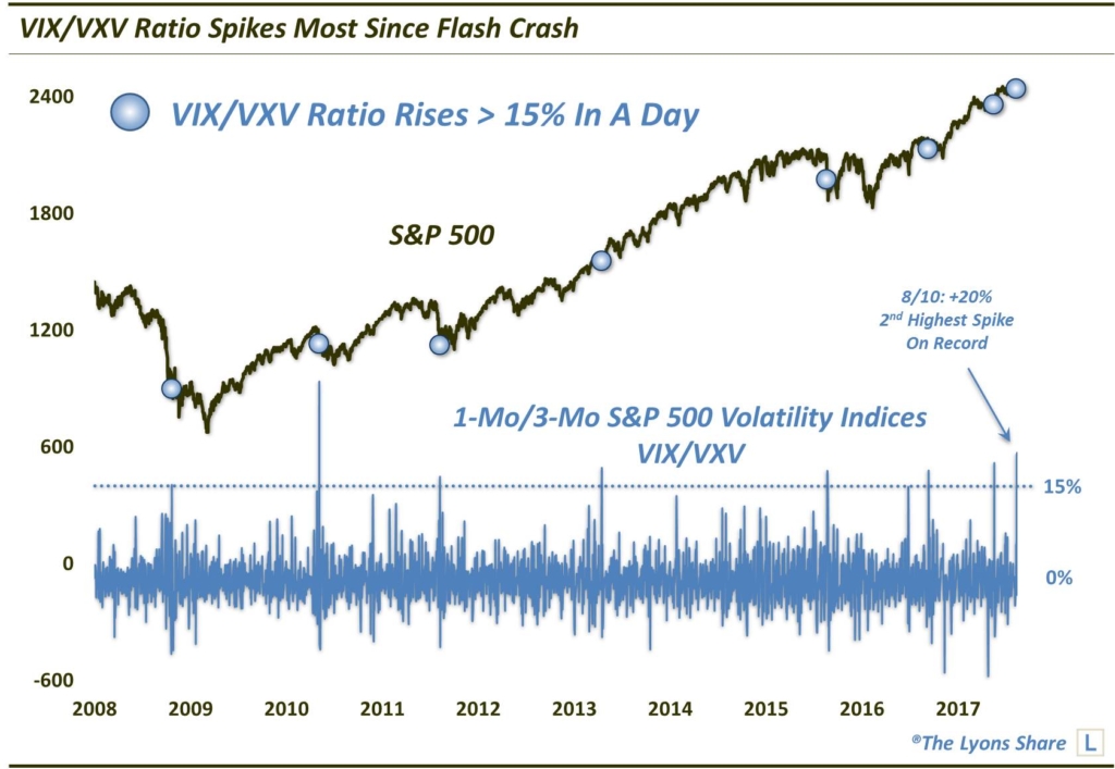
Let’s put graphical context to this. The term structure of the S&P 500 Volatility Indices refers to the varying durations involved. For example, the indicator of expectations over the next month is called the VIX. And the 3-month indicator is called the VXV.
During good, calm markets, near-term volatility expectations usually remain low, even at an extreme, versus those longer out. In the case of the VIX:VXV ratio, a reading below 0.8 is typically considered a calm or complacent environment. When volatility rises, traders tend to flock to the near-term contracts faster than those further out. Thus, the VIX:VXV ratio typically jumps. A reading over 1.0 is often considered extreme.
Yesterday, the VIX:VXV ratio jumped from 0.82 to 0.99, i.e., from near a low extreme to near a high extreme. That is an indication of everybody running for the exit at the same time. In this case, it was a historically large jump. More specifically, at 20%, it was the 2nd largest jump in the history of the VIX:VXV ratio, trailing only the day of the 2010 Flash Crash (VXV inception was in 2007).
Here are the daily changes in the VIX:VXV ratio for the last 10 years versus the S&P 500, highlighting those daily jumps of more than 15%.
So is this 20% jump in the VIX term structure an all-clear sign for stocks? If spikes in volatility expectations are reliable indicators of fear — and potentially market bottoms — this should be a step in the right direction. But is it enough?
One hallmark of these high percentage jumps — and a sticking point for some critics — is from where they usually originate. Naturally, it is easier to get large percentage gains when coming from a low level. We don’t agree with the critics that this causes bias. If you look at the chart above, you’ll notice a clear delineation between these relatively few spikes and basically the rest of the data. The fact is, spikes simply tend to occur when the ratio is low, rather than merely accentuating the percentage move because of the low level.
Moving on — so when do we see these low levels of the VIX:VXV ratio? Obviously when stocks are at or near highs. Therefore, it should not surprise you to find out that most of the historical spikes of at least 15% occurred when the S&P 500 was fairly close to its 52-week high. Here are all of the former occurrences and the S&P 500’s subsequent performance.
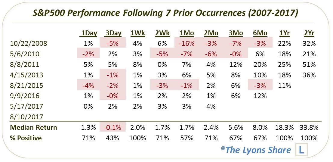
If most spikes occur with stocks near their highs and we are wanting the VIX:VXV spike to coincide with a bottom, then it is obviously going to have to be some sort of a V-bottom. Indeed, the incidents in 2013 and May of this year came just off of a 52-week high like our present case. Those 2 did indeed lead to a V-bottom and higher, sustainable prices almost immediately. The 2016 occurrence also came just off of a high and led to an immediate bounce, before a re-test about 2 months later.
Speaking of re-tests, that is precisely the roadmap of the other incidents in the table. However, rather than a V-bottom, several of the other events led to more immediate-term weakness, followed soon after by an initial low. Subsequently, the S&P 500 rallied temporarily before re-testing that initial low.
Certainly the 2008 and 2011 occurrences are the exceptions in terms of the proximity of the S&P 500 to its 52-week high. Both of those spikes occurred while the index had already sold off quite a bit. The 2011 event led to a near-term low, followed by a bounce, and subsequently a re-test of the initial low. The 2008 occurrence saw a bit more weakness in the near-term prior to a bounce, then a subsequent re-test.
Separately, the 2010 Flash Crash episode and the 2015 occurrence were a bit different in their setup, but similar in their aftermath. They each began with the S&P 500 about 4% off of its high and preceded a little more weakness in the very near-term. After about a week-long bounce, each proceeded to drop again and at least re-test the initial lows before rallying.
So, if we can put all of these historical precedents into our navi-computer, what likely scenario would it spit out for our present case. Given our present circumstances, combined with the most common historical trends, there seems to be a suggested path for stocks here. First off, we should not be surprised to see a bit more weakness in the very near-term, i.e., days. However, the initial low, if it has not already come, should arrive soon on a time basis.
That should be followed by a short-term bounce, e.g., each of the prior occurrences saw the S&P 500 higher a week later. Once that bounce has run its course, we should not, however, be surprised to see a re-test of the recent or imminent lows.
So, long story short, traders appeared to have freaked out enough to be conducive to a near-term initial bottom. However, we should not be surprised to see a re-test of that low at some point in the next few weeks or months.
_____________
Disclaimer: JLFMI’s actual investment decisions are based on our proprietary models. The conclusions based on the study in this letter may or may not be consistent with JLFMI’s actual investment posture at any given time. Additionally, the commentary provided here is for informational purposes only and should not be taken as a recommendation to invest in any specific securities or according to any specific methodologies. Proper due diligence should be performed before investing in any investment vehicle. There is a risk of loss involved in all investments.