
Bears Starting To Throw Some Weight Around (PREMIUM-UNLOCKED)
The following post was originally issued to TLS subscribers on July 27, 2018.
On a equal-weight basis, the recent stock rally looks less impressive.
Stock bulls have had a nice run of it over the past 4 months. Despite the normal protestations by perma-bears, there was not a whole lot to complain about during the recent rally, until perhaps this week. As we’ve looked at the past few days, a few potential red flags have popped up in terms of lagging small-caps and thinning breadth. Today, we take a peak at one more less-than-ideal recent development. This one has to do with the equal-weight version of the S&P 500.
As the name implies, the equal-weight average weighs each of the S&P’s components the same, in contrast to the popular cap-weighted S&P 500 which places more weight on larger stocks. Cap-weighted averages can give one a distorted view of the health of the broad market at times if they are being unduly influenced by a relatively small number of stocks. On the other hand, an equally-weighted index can give us a better sense of the level of participation across the entire index.
So how does the level of participation look currently? According to most measures, we don’t have many complaints. According to the equal weight S&P 500, specifically the Guggenheim S&P 500 Equal Weight ETF (ticker, RSP), we find a potential chink in the armor.
That’s because, on a relative basis, RSP just dropped to a 5 1/2 year low vs. its cap-weighted counterpart, the S&P 500 SPDR ETF (SPY).
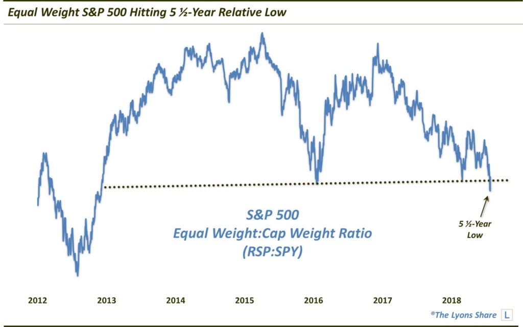
So how much of a concern is this? It certainly is not ideal, as we prefer the equal-weight average to be leading the way as a show of broad participation. However, sometimes the cap-weighted average is simply outperforming due to particularly strong action in the largest stocks. And as long as the absolute price series of the RSP is holding up well, it may not be a huge concern yet.
Of course, this type of analysis is highly subjective. And as you know, that runs counter to the type analysis that we prefer — cold, hard quantifiable and objective facts. So perhaps there is no “right or wrong” here. However, if we zoom out a bit we do get a look at the chart that, while not a quantifiable statistic, may be the most useful in helping us decode the message being sent by the behavior of the equal-weight index.
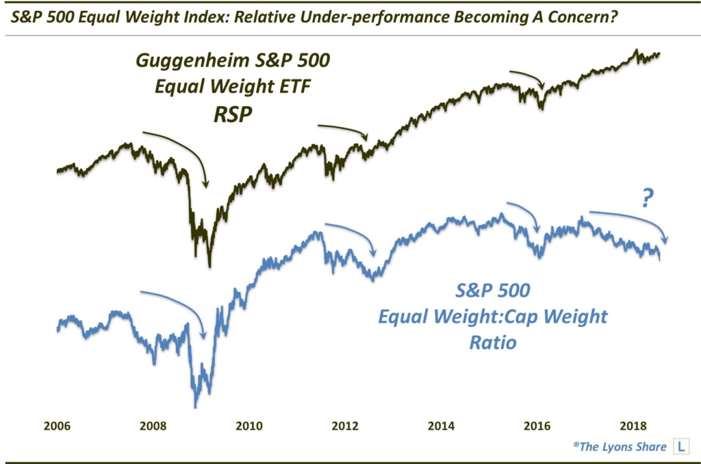
As this chart indicates, historically, the stock market has tended to struggle when the ratio of the equal-weight RSP was trending lower vs. the cap-weighted S&P 500. It was the case in 2007-2009, 2011-2012, 2015-2016 and again today. Certainly this analysis is not geared for precise timing or triggers. Indeed, the ratio has been trending downward for more than a year, without much in the way of negative ramifications. However, the historical correlation is pretty clear. Therefore, we are taking its message under more serious consideration now — especially in light of the various other red flags that have popped up recently.
_____________
Disclaimer: JLFMI’s actual investment decisions are based on our proprietary models. The conclusions based on the study in this letter may or may not be consistent with JLFMI’s actual investment posture at any given time. Additionally, the commentary provided here is for informational purposes only and should not be taken as a recommendation to invest in any specific securities or according to any specific methodologies. Proper due diligence should be performed before investing in any investment vehicle. There is a risk of loss involved in all investments.