Charts Of The Week: Why Recent Index Highs *LOOK* Like Fitting Tops On The Charts
This week we presented a series of charts outlining how recent index highs pass the so-called market top “look test”. By that we mean that these indices reached, or are reaching, approximate levels that based on various backward and forward-looking charting analysis (primarily Fibonacci) project as logical topping areas. While markets rarely conform to such convenient behavior, given the convergence of multiple key levels on multiple indices, we thought it worthwhile to at least mention. In this era, it probably does not go without saying that we are not “calling” a top necessarily. We are merely pointing out the presence of these significant levels on various indices:
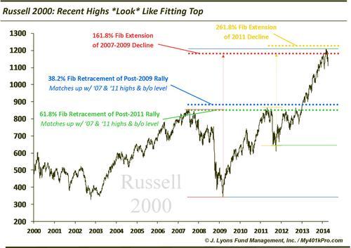
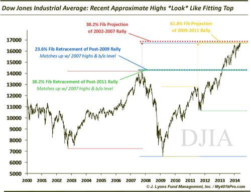
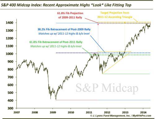
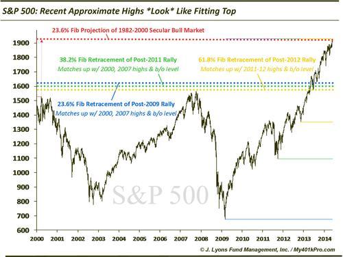
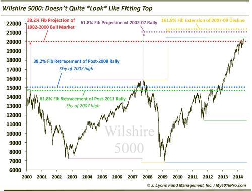
Again, we will reiterate that we are not calling a top. We are merely pointing out the convergence of very key levels near or based off of recent highs in these indices. That said, given the multitude of concerning developments in the market recently, we would certainly not be surprised if a top does develop in this approximate area, despite the convenient and telegraphed nature of this analysis.