What To Expect After A Sharp Selloff From 52-Week Highs
The stock market should underperform in the short-term but outperform longer-term…or is it the reverse?
Everyone seems to be opining about the significance of yesterday’s sharp selloff. Is it another dip to be bought, the beginning of a 5-10% correction or something more serious? A number of folks have also contributed informative studies relating to the market’s historical reaction following a steep decline. We thought we would throw our 2 cents into the discussion from a slightly different angle. Specifically, how has the market reacted following a sharp selloff originating from near a 52-week high?
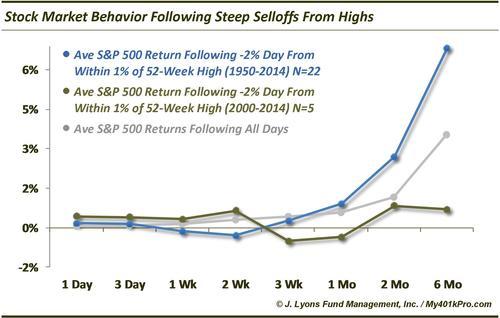
First the criteria. Every study needs to have a specific set of parameters applied in order to pinpoint relevant comparisons. Parameters set too wide negate the (potential) usefulness of the study and too narrow risks data-mining. For this study, selecting the parameters was straightforward given the action yesterday. The S&P 500 dropped 2% from a level that was 0.9% from its 52-week high. Therefore, we looked at all 2% daily drops in the S&P 500 since 1950 that began within 1% of a 52-week high.
Following those parameters yields 22 results. Looking at the average performance going forward from 1 day to 6 months, we see that the market tends to continue weak in the short-term before resuming its prior strong performance that had it at a 52-week high to begin with.
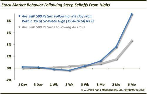
The worst absolute and relative performance following these such selloff days comes at the 2-week mark when the average return is -0.28% (-7% ann), over half a percent worse than the average 2-week return following all days of +0.28%. After that, things turn around. By 2 months out, the average return following these days is +2.70% (+16% ann), far better than the average following all days of 1.16%. And 6 months out, the average return following these days is +6.85%, almost double the average of all days of +3.53%. So, on average, investors have had to put up with a little more pain before getting far better than average longer-term gains.
It’s not quite that easy, though.
It is always smart to break down these studies to smaller periods to see if the overall trend has changed at all throughout time, i.e., has the trend changed at all recently in a way that is more relevant to present circumstances. Thus, if we look at just the instances occurring since 2000 (there were 5), we get a different picture.

Since 2000, the market has reacted in an opposite fashion, bouncing in the short-term before badly lagging out to 6 months. Unlike the average from all selloff days since 1950 that we looked at above, the 2-week mark actually showed the strongest performance since 2000 with stocks up +0.66% on average. However, they tended to drop off after 2 weeks, showing negative average returns for 3 weeks and 1 month. The average 6-month return following selloff days since 2000 was a mere 0.70% versus 3.53% following all days (the dates since 2000 are ¼/2000, 2/27/2007, 4/27/2010, 2/22/2011 and 4/15/2013).
So which will it be, short-term pain then long-term gain? Or vice-versa? With the weakness today, the market is starting to follow the pre-1950 trend of selling off further in the short-term before bouncing back strongly.
Of course, these are just averages and there is always the possibility that the present case does not follow either path.
Combined chart: