The Ugliest Chart In Equity Land: Small Cap Growth
One great thing about markets is that at any given time you’ll find no shortage of constructive looking charts and suspect looking charts. This is especially true given the inverse relationship between currencies and their interplay with commodities. A list of the ugliest charts of the year would be dominated by weak currencies like the yen and some of the European currencies and especially by soft commodities like sugar, cotton and any of the grains. As far as equity charts go, our vote for the ugliest chart goes to the ratio between small cap growth stocks and the S&P 500.
While small cap growth stocks have not been subjected to the pounding that the yen or soybeans have, it is the potential damage suggested by the current setup that has our attention. For unlike, say wheat which is down 30% this year, the weakness in small cap growth stocks – and perhaps the rest of the stock market – may just be starting.
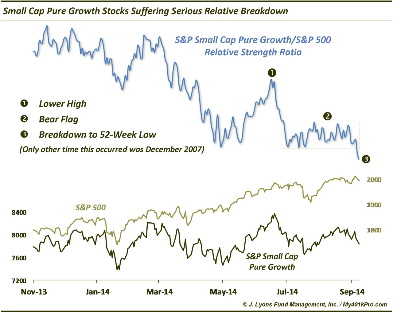
The index we are using is the S&P Small Cap Pure Growth Index. This is a composite of only the small caps in the S&P 600 that meet the strict criteria of a “growth” stock (similarly, the S&P Small Cap Pure Value Index includes only those meeting the criteria of “value". This may sound obvious, but many indexes divide up all of the stocks from the main index, i.e., the S&P 600, into either the growth or the value segment, even if a stock does not fully fit the criteria. In fact, various constituents may be included in both the growth and value indexes.
So what makes the chart of the S&P Small Cap Pure Growth Index so ugly? (By the way, Small Cap Pure Value does not look much better.) When we measure it relative to the S&P 500, three factors contribute to make the recent action look particularly bad. First, after hitting a high late last year, the ratio has made a number of lower highs now. Most egregiously, when the Small Cap Pure Growth Index hit a new high in early July, the ratio distinctly failed to do so. Secondly, after the early July failure, the ratio dropped to the lows it hit in May when small caps were getting punished. In the last 2 months, the ratio has failed to mount even a meager bounce off of those lows, forming what we call a bear flag. This pattern typically leads to a breakdown and further lower prices. Sure enough, and thirdly, the ratio did indeed break down in the past 2 days to not only a new low but a 52-week low. We would add that the clean, textbook manner in which this chart has unfolded makes us like it even more as it gives us confidence that it is conforming to what it “should be” doing.
One might argue that much of the damage has been done, given the ratio is at a 52-week low. However, that is often the benefit of using such “relative” analysis – it can provide forewarning of impending absolute weakness in the underlying index. The S&P Small Cap Pure Growth Index has actually suffered little in the way of actual losses so far, having traded in a range for the past 10 months. If absolute damage is to follow, there is ample room to drop should the index break below the bottom of the range. This is why we say it is the ugliest chart due to the potential risks.
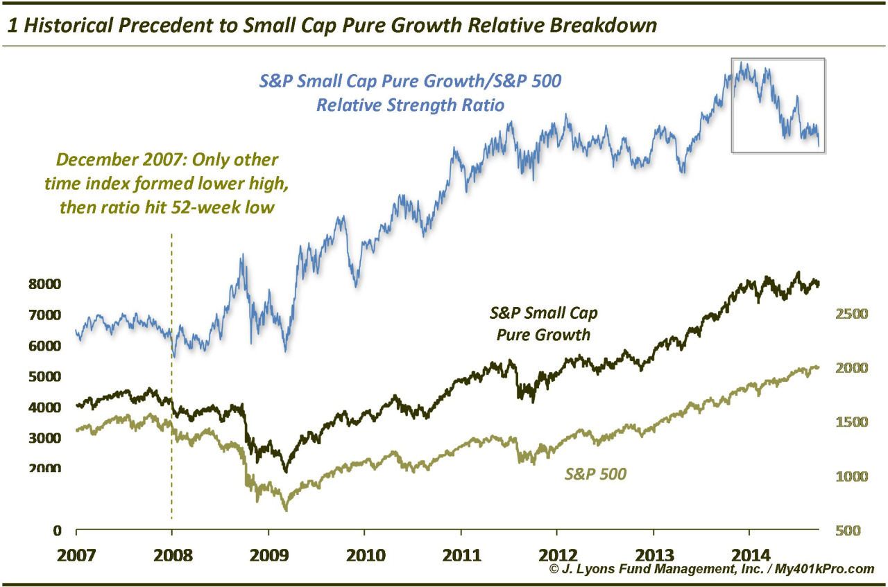
Furthermore, while the S&P 500 has held up well over this time (obviously contributing mightily to the ratio’s weakness being that it is the denominator), there is precedent for this ratio breakdown leading to weakness in the broad market. There is only one other occasion historically where we find a similar setup of the index making a lower high followed by a drop in the ratio to a 52-week low. That was December 2007. Like the present time, that period had seen little in the way of weakness among large cap indexes, like the S&P 500. However, the breakdown preceded a major cyclical bear market. If this development threatens to lead to a similar broad market decline, then the damage has certainly not been done. The S&P 500 is literally 2 days removed from an all-time high!
Now even if a similar scenario unfolds leading to a major broad market selloff, it most certainly won’t happen in a straight shot. Again, the major indexes are practically still at their highs. Additionally, the ratio may not continue to drop, if the S&P 500 starts to play “catch up” to the downside. (The ratio could even rise as a result of the small cap growth stocks resuming an uptrend, although that would not be our bet).
However, this ratio breakdown is more evidence of the bigger picture thinning of the rally. Fewer stocks and sectors are participating in the gains. We are obviously not the only ones to point out the relative weakness in small cap stocks and we have been alerting readers of this condition for several months now. However, the awareness of this condition does not bulletproof the market from the ramifications. Sometimes, particularly in hindsight, the warnings are as clear as they are in this chart. Therefore, while the timing is always tricky, the result of the current thinning condition should ultimately be a correction of some magnitude.
_________
More from Dana Lyons, JLFMI and My401kPro.