2014 Charts Of The Year
As we wrap up our first “real” year among the financial social media/blogger ranks, we look back on what we consider to be our most noteworthy charts of 2014. They aren’t necessarily our most popular charts (see The 5 Most Viewed Charts Of 2014 for those). Consider them our “editor’s picks”. They also don’t necessarily include all the big movers of the year – you won’t see any “after” shots of the Yen or Ruble or Crude Oil, for example. However, you will see “before” shots of many of the big movers. After all, we are money managers and the objective behind these charts is to identify potentially profitable moves before they happen.
The charts range from those that had the most impact on the markets in 2014 to those that may have the most impact on 2015. There are charts whose impact is totally unknown to us and others that may have no impact at all, more trivial stuff. There are bullish charts and (more) bearish charts and even some economic charts (how’d those get in there?) Finally, there is our chart of the year for 2014 at the end.
We would love to know which charts you feel should have been included so feel free to send along your feedback. We thank you very much for your viewership this year and wish you all a very healthy and prosperous 2015.
Without further adieu, here are our 2014 Charts Of The Year (in chronological order – click on the titles to visit the respective posts):
30-Yr Yield: THE Most Notorious Trendline of Era Under Attack – December 6 (2013)
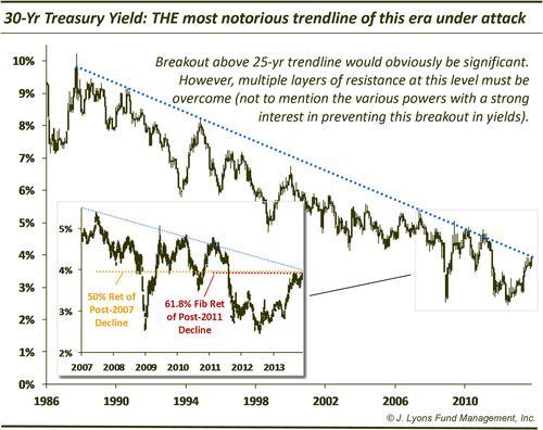
Against all odds (at least the unanimous consensus of economists, anyway), the trendline – and the 4% level – held as resistance in 2014. The U.S. 30-Year Bond was one of the best performing assets of the year, closing 2014 below 3%. You can bet we’ll have follow-up posts to this one.
Biotech – One of 2013’s leaders…stalling or reloading? – December 11 (2013)
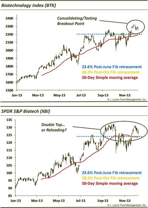
The answer was an emphatic “reloading” for biotech at the end of 2013 as it started out 2014 on fire. After a collapse that had the looks of a blow-off top, biotechs rebounding strongly to close the year up close to 50% and, like 2013, push for sector-of-the-year honors.
The S&P 500 prints a Negative YTD Return for 1st time in over 2 years – January 3
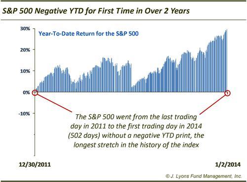
It was so long ago that we almost forgot that, as good as 2014 was for stocks, neither 2012 or 2013 ever saw the S&P 500 trade lower on the year at any point. It didn’t take long for 2014 to blow that streak (as if it could have been maintained) as it traded down on the first day of the year. That didn’t stop stocks from having another solid year.
NYSE Margin Debt: new record High; Net Worth: new record Low – January 29
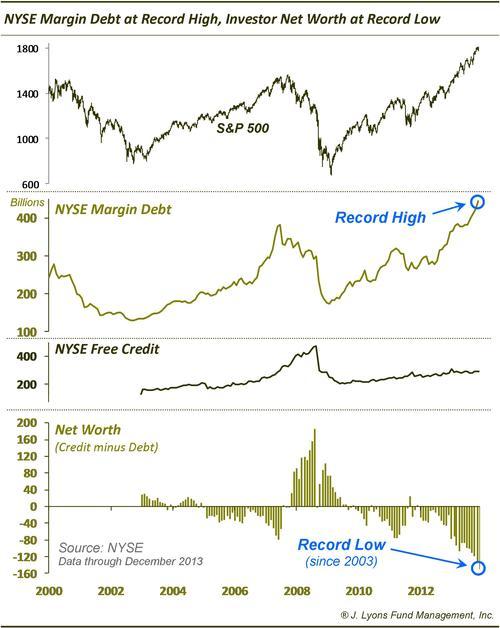
One long-term concern falling in the “froth” category for stocks is the amount of margin debt (a record high) and investor net worth (a record low). While this condition has corrected a small amount, it poses a potentially significant risk when the “gig is up” and the unwind begins.
U.S. Dollar: Basing? Pennant Formation? Other? – (Mystery Chart) February 28
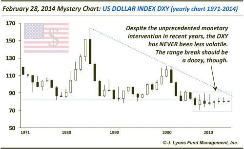
The range break in the U.S. Dollar was indeed a doozy as it jumped close to 15% in the 2nd half of the year. That is a big move for the currency and is certainly one of the stories of the year in the markets.
India BSE Sensex Index: This emerging mkt closed @ an all-time high yesterday…believe it – March 7
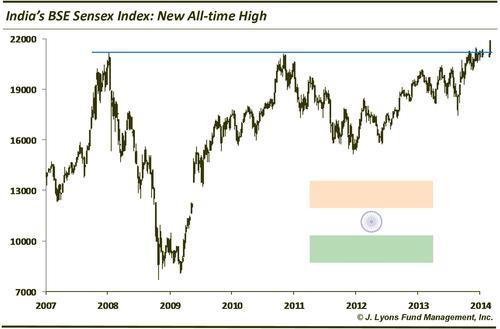
The award for foreign market of the year (at least on the positive side of the ledger) goes to India. After breaking out in March, it kept going and going, closing up some 30% for the year.
Cyclically Adjusted Price Earnings Ratio (CAPE) @ Secular Market Extremes – April 24
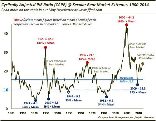
Another concern of a long-term nature regarding the stock market is valuation. Judging by the Cyclically Adjusted Price/Earnings Ratio, the market has only been more expensive around the peaks in 1929, 2007 and 2000.
Labor Pains: Employment:Population Ratio vs Unemployment Rate 2007-2014 – May 2
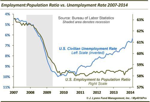
There was plenty of good news in the labor front in terms of the most publicized data like the Unemployment Rate, especially in the back half of the year. However, this chart offers a bit of a sober reminder that when viewed via a more comprehensive measure like the Employment:Population Ratio, there has been frustratingly slow improvement since 2009.
Historic Divergence Between NYSE, Nasdaq Advance/Decline Lines – May 8
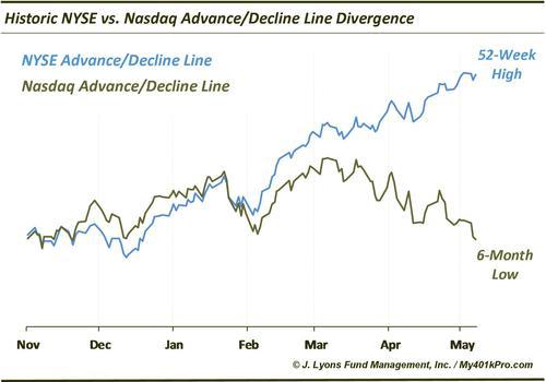
This was one (amazing) example of a prevailing and growing trend throughout 2014: divergences. Some areas on the market did very well while others lagged.
Greek Stock Market: Another Greek Tragedy Forthcoming? – May 14
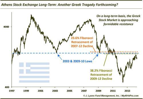
The global market had its share of scares during the course of the year, as it always does. And while the U.S. market was able to shrug it all off, some markets like Greece could not. The long-term resistance we identified did indeed repel the Greek market, as it proceeded to drop some 45% from its March high through the end of the year.
Margin Debt Has Historically Popped Along w/ The Bubble Du Jour – May 22
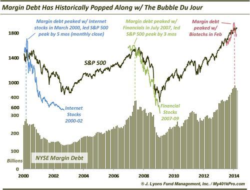
As of October, this chart is still in effect as NYSE Margin Debt still has yet to surpass its February high. We just picked the wrong sector. Perhaps we should have gone with the Social Media stocks instead of Biotechs as the canary. We will see if the canary leads to another cyclical market peak.
Core CapEx Vs. Stock Buybacks – May 30
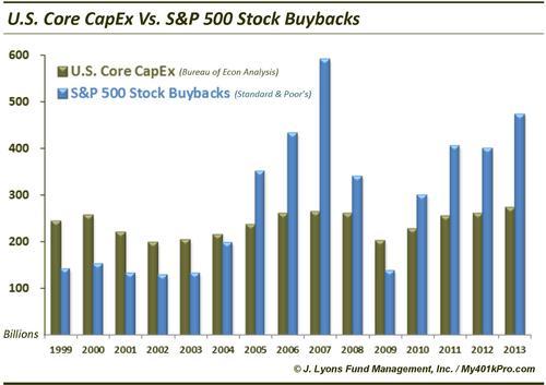
A continued major beneficiary of corporate profits was corporate stocks. Companies continued to pour money into buybacks in 2014 (not shown) in lieu of CapEx, which amazingly has not increased materially since 1999, dollar-wise. The trillion-dollar question is how much is this buoying the stock market?
VIX:10-Yr Yield: Rate-Adjusted VIX @ At Extreme Low – June 12
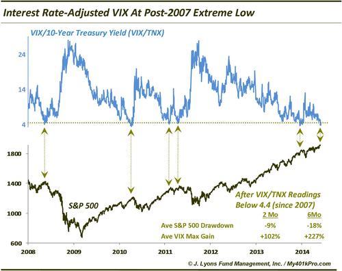
Low volatility was one of the themes of 2014. Even adjusted for low rates, the Volatility Index (VIX) hit one of its lowest levels of the post-crisis low-rate environment. Other readings came at tops in 2008, 2010 and 2011.
China Shanghai Composite: Volatility Lowest Since 2001 (big move pending?) – June 20
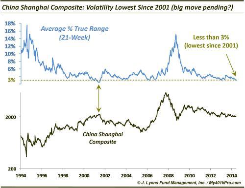
The U.S. was not the only market exhibiting minuscule volatility throughout the year. The Shanghai Composite shrank to its lowest trading range since 2001. The “big move” did indeed transpire afterward, as the Composite jumped a staggering 50% into year-end (we’re sticking with India as the foreign market of the year due to its all-time high and less psychotic rally).
U.S. Real GDP: -2.96% Ann Rate Almost Twice As Bad As Worst Ever Print Not Accompanied By Recession – June 25
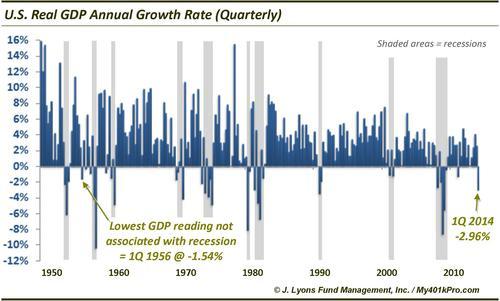
The “pundits” told us not to worry about the unprecedentedly poor Q1 GDP figure – you know, because of the cold weather. We say “unprecedented” as a figure that weak has never come unaccompanied by a recession…until now. Who knew that economists were such good meteorologists? (We reserve the right to check back in 80 years when the BEA is finished revising the figure. h/t Andrew Kassen)
The Value Line Composite Tri-Decadal Top: The Most Significant Chart Event Of This Era? – July 2
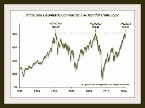
This is perhaps our favorite chart of the year. We posted the headline tongue-in-cheek because how can one possibly call a “chart of the era” in real-time. Besides, the Value Line did not top out on July 1. But it did top on July 3! You never know…
Crude Oil Commitment Of Traders: Large Speculator Net-Long To Obscene Extreme – July 3
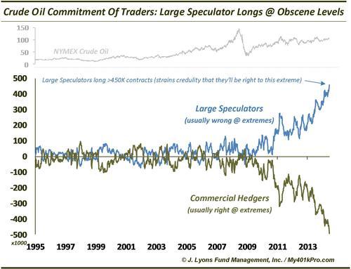
This was in the running for chart of the year. It was speculated (no pun intended) that there was something structurally different with the COT data since the spread had been widening continuously for almost 4 years. However, a precisely 50% drop in the price of Crude Oil since June tells us that indeed it was incredulous to think the large speculators would be right in the end.
High Yield:Treasury Bond Ratio @ New 52-Week Low – July 18
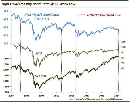
Another theme in 2014 was the below-the-surface de-risking among assets. One example was in the high yield bond market which hit a 52-week low versus the long bond in July prior to dropping roughly 10% into December.
PIIGS Relative Strength In Jeopardy; Breakdown could be red flag – July 21
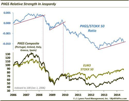
Another example of the stealth de-risking was seen in the selling of the PIIGS markets. Like the afforementioned Greek market, Portugal and Ireland came unglued and Italy and Spain saw their struggles. The “whatever it takes” honeymoon appears to be over and that is not a good sign.
United States Oil Fund $USO: At Multiple Resistance Level ~38.35 – July 23
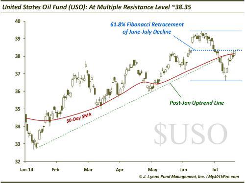
Somewhat of a pat on the back here. For while we did identify some possible (ill-fated) support levels on the way down in oil, at least we targeted the top side as well. The USO topped at 38.30 on July 23 and proceeded to fall 48%.
Nasdaq 100: Narrowest 52-Week High In History – July 25
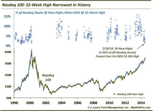
Another of the many examples we could have included demonstrating the weakening internals accompanying the rally. While this condition has not produced anything more than a temporary hiccup, it is not sustainable.
It’s now or never for Russian stocks – August 6
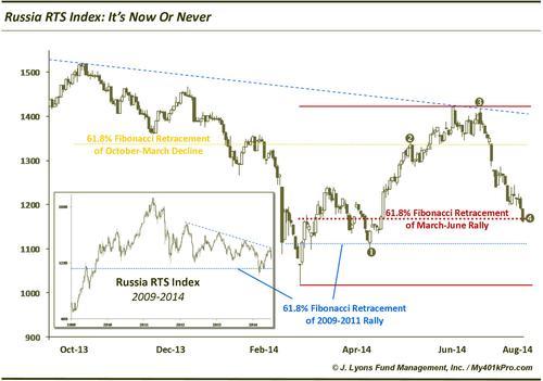
We had to include a chart on Russia. The RTS Index did bounce 10% from that day, before dropping 50%. So it was now, and then never for Russian stocks.
Percentage of Stocks in a Bear Market: Nasdaq vs. S&P 100 – September 16
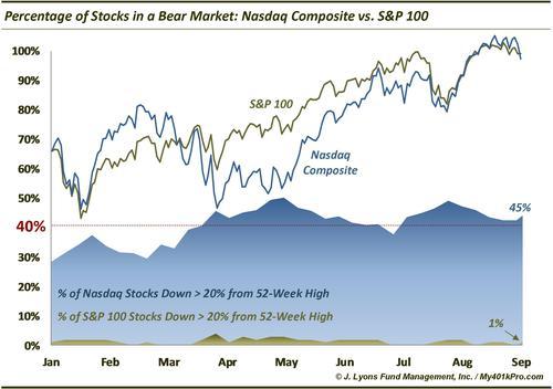
Yet another example of the haves versus the have-nots in the market this year. Though, this one was an especially egregious example – and hard to believe had we not run the figures ourselves.
U.S. Households Are The Most Heavily Invested In Stocks Since 2000 – September 19
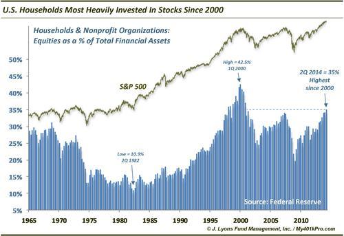
Another long-term concern of ours. The investing public (contrary to many popular accounts) is getting overexposed to stocks, from a historical perspective. Although, obviously there’s no reason why this can’t get more extreme.
Social Media Bubble Fails To Reinflate – September 22
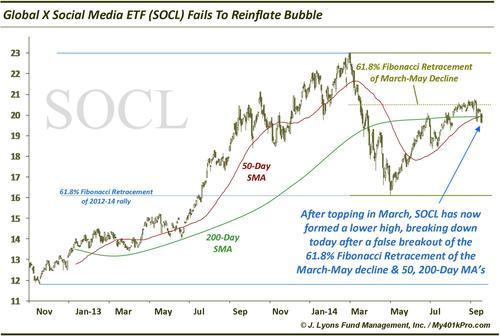
Perhaps Social Media will ultimately be the poster child for the excess embedded in the current market cycle. If so, it is bad news that the sector could not even approach its March highs.
Small vs. Large Cap Quarterly Divergence Last Seen in 3Q 2007 – October 1
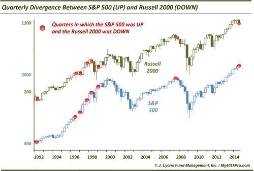
One of many 2014 charts pointing out the divergence between the large and small cap stocks. As the big caps continued to make new highs throughout the year, the small caps topped in March, unable to surpass that high until just a few days ago. This is another concern if the small caps can’t sustain a break out.
New Highs-New Lows: The Most Significant Trendline In Equity Land = BROKEN – October 16
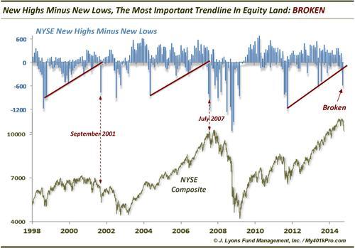
Another long-term concern among the market internals. Historically, this indicator has shown well-defined up-trends – and eventual market trouble upon breaking the trends.
Record spike in Inverse ETF Volume one sign of a bottom – October 17
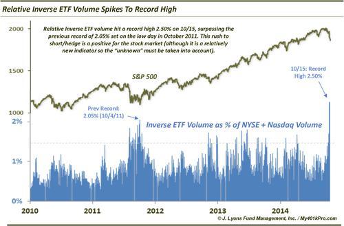
We include this chart for the simple reason that this has become one of our favorite new indicators for identifying short-term highs and lows in the market during the recent low-volatility period. There was no better example of this than the record high relative volume in inverse ETF’s at the very bottom in October.
Largest Monthly Reversals In Stock Market History – October 29
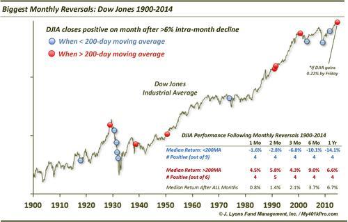
October, as it has shown the propensity to do, reversed its considerable mid-month losses to end the month higher. This served as a springboard for gains over the final few months of the year, keeping the up-trend intact.
It’s Make Or Break Time For Commodities – October 30
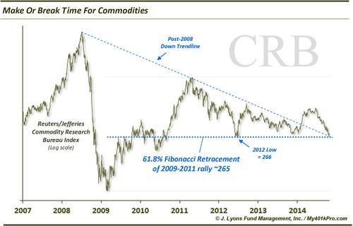
It was “break” as this key technical point did not hold. The breakdown in commodities (oil in particular) accelerated over the past few months, giving rise to deflationary concerns.
Stick a fork in the Nikkei’s 20-year downtrend – November 3
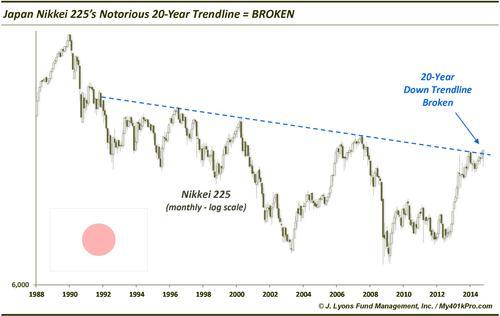
The epic 30-Year Treasury Bond down trendline remains intact; however, the era’s other most notorious trendline – the Nikkei – was broken. This doesn’t mean Japan is off to the races, but it is a monkey off its back.
Gold Stocks Back To 2008 Lows – November 3
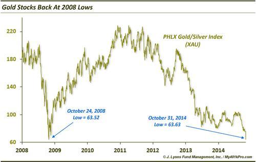
What is there to say? The whipping boy of the past few years remained so as gold stocks unbelievably dropped all the way back to their 2008 lows.
Dubai: Another Desert Storm Brewing? – November 11
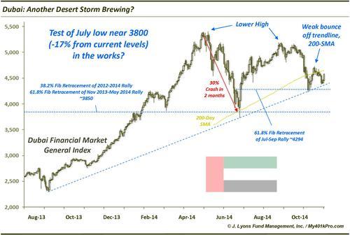
This was a tip-off to the oil decimation that was to come. To us, the Dubai chart suggested more downside was imminent and boy did it materialize – down -35% over the course of the following month.
Is The Rampant Bullish Sentiment Really A Bad Thing?: II and AAII Bullish Sentiment At Extremes – November 13
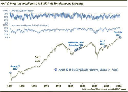
Another intermediate to long-term concern is the excessive bullish sentiment. This is exemplified by the combined readings of the Investors Intelligence and AAII surveys being in the top 1% of bullish readings in history.
U.S. Stocks are 2nd Most Overbought In History – November 21
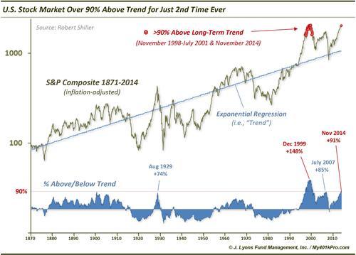
This was the most viewed chart on our blog this year. It is another manifestation of the long-term excessive conditions being built up in the market. And also another reminder that these things can persist for awhile.
Rydex Bullish Fund Assets Double Bears For 1st Time Since 2001 – November 26
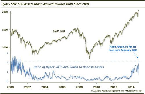
Yet another sign of the excessive bullishness present, as traders have all but shunned hedges like the Rydex inverse mutual funds.
Foreign Stocks Have Never Been Weaker Relative To The U.S. – December 6
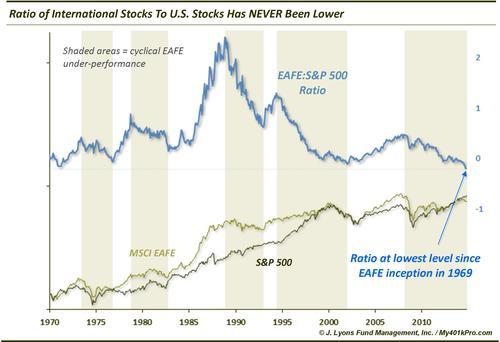
Not much else to say about this one. It is probably the best illustration of the dominance of the U.S. market versus the rest of the world in 2014 and recent years.
This Signal Has Perfect Record Of Forecasting Year-End Gains – December 10
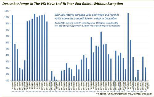
VIX spikes in December had led to year-end gains 52 out of 52 days, historically. You can now make that 61 out of 62 days.
Internal Cracks Threaten Stock Market’s Foundation: New Lows Expanding Despite Market Hitting Highs – December 12
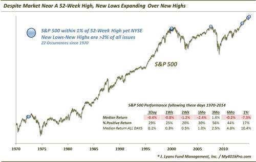
Another brilliant example of the weakening foundation among the market internals. Despite the market’s highs, the number of 52-Week Lows recently soared to levels seen only near previous major tops.
An Unprecedented Rally – Part 2: 2 Consecutive 2% Rallies Near 52-Week Highs – December 19
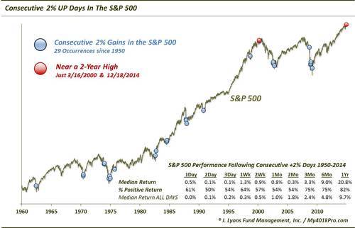
Just one example of the unusual action we witnessed in the market this year. This chart was actually part of a 4-part series on the unprecedented moonshot rally off of the mid-December lows.
2014: The Most SKEWed Year On Record For Stocks – December 24
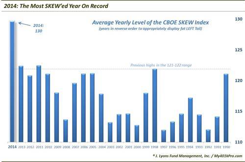
This is one of those developments that we aren’t quite sure what to make of. However, the unprecedented action in the CBOE SKEW tail risk indicator this year may make this one of the charts we look back on years from now as one of 2014’s most significant.
And our choice for the 2014 Chart Of The Year goes to…
The Ubiquitous V-Bottom – post from October 31, one of several on the topic
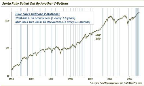
There is perhaps no better symbol of both the unusual nature of the year’s market action, as well as its relentless bid, than the “V-Bottom”. Eventually there will be an actual correction, but for now the “V” remains the dominant force in the market.
Happy New Year!
________
More from Dana Lyons
Asset Management: jlfmi.com
401(k)/IRA Investment Guidance: My401kPro.com
Free Email Newsletter: Sign-Up