5 Most Viewed Charts Of 2014
As we wrap up 2014, we are looking back at the key moments, trends, stats and, of course, charts that defined the year in the financial markets. While the equity indexes have basically scored slightly above average gains on the year (at least the large caps – see chart #2 below), there has been no shortage of noteworthy and record-setting developments in 2014, as we have noted recently. So while years from now, historians may glance at the return of the S&P 500 and yawn, in the moment we certainly know better. Furthermore, there have been major moves in bonds, commodities and currencies this year. We will touch on more of that material in an upcoming post on our Charts Of The Year.
Meanwhile, here are the charts that were the most popular among viewers during our first year on Tumblr. We recognize that the clicks and views are largely a function of those outlets, such as YahooFinance Contributors and others, that have generously shared our charts and research throughout the year. We greatly appreciate everyone’s efforts in that regard…thank you all.
Here are the Top 5 Most Viewed Charts of 2014 (click on the titles to read the posts):
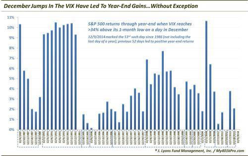
#5) This Signal Has Perfect Record Of Forecasting Year-End Gains (December 10)
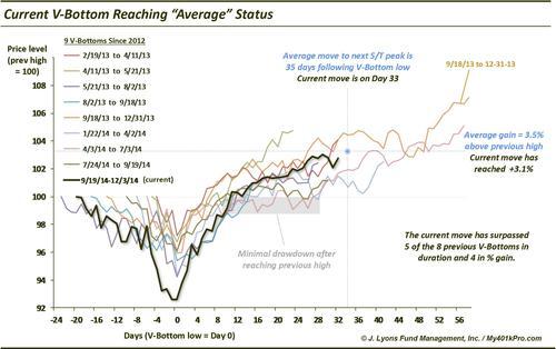
#4) Just Your Average V-Bottom (December 3)
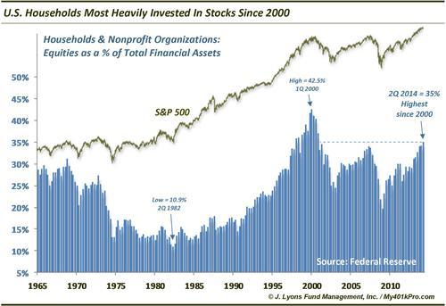
3) U.S. Households Are The Most Heavily Invested In Stocks Since 2000 (September 19)
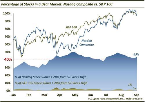
2) Percentage of Stocks in a Bear Market: Nasdaq vs. S&P 100 (September 16)
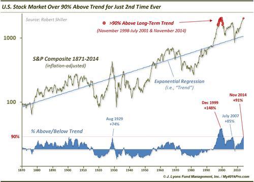
#1 Most Viewed Chart Of 2014) U.S. Stocks are 2nd Most Overbought In History (November 21)
________
More from Dana Lyons, JLFMI and My401kPro.