Internal Cracks Threaten Stock Market’s Foundation

Market technicians are often accused of data manipulation when implementing historical tests. Through data-mining, curve-fitting, goal-seeking and the like, the complaint is that, intentionally or not, the tests too often arrive at either a pre-determined conclusion and/or a random one. There is no doubt that this is a major challenge when running historical tests. However, what is also often missed by those making the data-mining accusations, and at times by the testers themselves, is the general message contained within testing results, i.e., they miss the forest for the trees.
Of course, expecting the market to follow in lockstep with previous incidents displaying similar conditions is foolish. However, the presence of such conditions can inform one of an overall market environment that is similar to the present. There can be value in uncovering such information, not necessarily in generating specific signals, but in assessing the overall risk:reward picture.
Take today’s Chart Of The Day, for example. When we do studies like this, we are not processing historical data until it spits out random market stats that line up with the current conditions. We start out first by observing what the current conditions are, generally speaking. Then we search historically for periods when conditions were similar in some way. In order to conduct a search, we must first define what exactly we are looking for. However, it is the general message in the data’s results that is most important to us. So we’ll present the results of today’s ChOTD in 2 ways: “strictly defined” and “in general”. First, the chart:
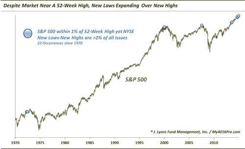
Specifically, we see that in recent days, the market has met the following criteria for only the 22nd time since 1970:
- The S&P 500 was within 1% of its 52-week high.
- NYSE New Lows were greater than New Highs.
- The differential between the New Lows and New Highs was equal to more than 2% of all issues traded on the NYSE.
In general, this is the message we take away from this study:
- The market is near a high.
- There are many more stocks making New Lows than Highs.
- The amount of New Lows that are exceeding New Highs is a substantial percentage of the overall market.
As one can see clearly from the chart, many of the prior occurrences marking these conditions came near cyclical market tops. Not including two occurrences this month, here are the specific results following the prior 20:
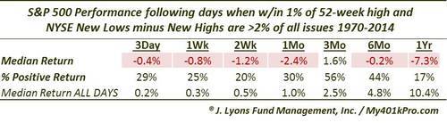
We are not suggesting, by presenting these results, that the market necessarily needs to follow these prior incidents. However, we do glean perhaps very helpful information regarding the overall foundation of the market and its present risk:reward prospects. The dots on the chart are not a result of goal-seeking scary comparisons. They represent market conditions that are in some form similar to those which we initially observed to be present today. Therefore, in our view, they are not merely random or coincidental.
Our ultimate takeaway from the study is not the performance numbers necessarily in the table. It is that the internal foundation of the market is weakening here. The fact that the market is near its 52-week high, let alone on a 5-year bull market, means that there is more room to fall, should the weakening internals crack the uptrend.
________
More from Dana Lyons, JLFMI and My401kPro.