Is The Abundance Of New Highs AND New Lows A Bad Omen For Stocks?

Maiden voyage of the USS Akron
Market analysts sometimes like to attach colorful names to an indicator or set of financial conditions. This is likely in an attempt to create more alarm or garner more attention. Considering the human natural impact that story-telling can have on people, it’s probably an effective tactic for those in hunt for publicity.
One of the most notorious examples of this in the stock world is the “Hindenburg Omen”. This ominous sounding indicator, named after the high-profile zeppelin disaster, is supposedly a portent of negative things to come for stocks. Attention-grabbing name aside, the proof is always in the statistics. So what do the stats say?
The Hindenburg Omen’s criteria involves a number of conditions, and not always unanimously agreed upon. Therefore, we’re not going to delve into the literal indicator as it is somewhat subjective and highly subject to curve-fitting, in our view. We like to keep things as simple as possible. Therefore, we focused on the general tenet of the indicator which is based on the presence of a large number (generally considered 2.8%) of both New 52-Week Highs and New 52-Week lows.
Why is that particularly relevant to present market conditions? Yesterday (December 8) and December 1 marked just the 2nd and 3rd days since 1970 that saw the number of NYSE New Highs and New Lows each exceed more than 7.5% of all issues traded on the day. The other day was June 9, 2008. Since we can’t glean much from 1 prior occurrence, let’s expand the net a little and look at all days in which the number of New Highs and New Lows each represented more than 4% of all issues traded. We found 27 such days since 1970, or 0.24% of all days. 6 of them occurred in just the past 2 weeks.
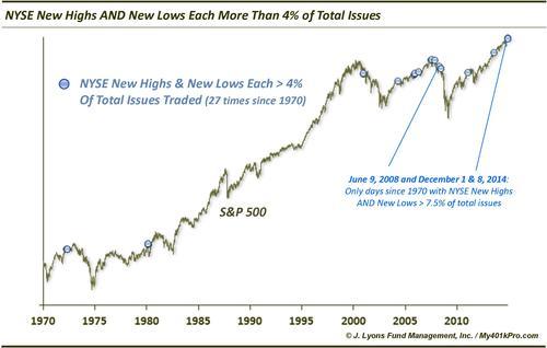
So what did the market do following such days? Was the aftermath worthy of the “omen” moniker? Actually, the returns were consistently pretty poor. The average returns were negative from 1 day to 1 year following. Median returns were negative from 2 days to 6 months out. Here are the returns for select periods following those days:
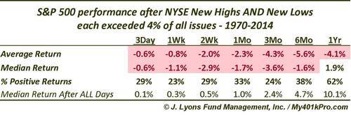
We will note that for those looking for seasonal year-end strength, the one incident among the sample above that occurred in December (2000), resulted in the strongest gains of any of the occurrences out to 1 month.
So many times on Wall Street, platitudes and rules of thumb become guides for investment decisions without actually vetting them. In this case, while we didn’t test the actual Hindenburg Omen criteria, the general idea behind it appears to have statistical merit. Whatever the dynamic is that results in a high number of New Highs and New Lows being a detriment to the market, historical precedents suggest that it is indeed so. Therefore, on the flip side, those who scoff at the indicator, or at least its basis, may want to reconsider.
We are not fans of the alarmist tactics used by some to gain either attention or assets. Such tactics, it may be argued, include attaching ominous names like the Hindenburg Omen to indicators. What we are fans of is doing the statistical leg-work to see if such indicators actually have any merit. In this case, history tells us that a high number of both New Highs and New Lows has led to consistently poor returns, from the short-term to the long-term.
Therefore, we should probably heed the warning being sent by present market conditions, even if we are loathe to attach an alarmist name to it. In that spirit, we thought we might name the indicator containing our 4% criteria the Akron Omen. It sounds less sinister, although it still denotes caution and it pays respect to a lesser-known disaster. The USS Akron was a U.S. Navy helium-filled airship that crashed in April 1933 killing 73 airmen, twice the number of Hindenburg casualties. At the time, it was the greatest loss of life of any airship crash.
By the way, it was not my intention to end the post with the word “crash”.
________
More from Dana Lyons, JLFMI and My401kPro.