For Once, A POSITIVE Small Cap Divergence

We spent a lot of “ink” last year talking about the negative divergences among small cap stocks (i.e., small caps struggled while large caps or other indexes performed well). This was the case both on a single day basis at times, as well as over longer durations. The takeaway (if there was one) from most of these observations suggested negative connotations for the market.
Yesterday, the tables were turned a bit as the Russell 2000 Small Cap Index (RUT) lost just 0.5% even as the Nasdaq 100 (NDX) dropped more than 2.5%. So is this rare positive small cap divergence a good sign for the market? We looked historically at similar divergences to see what conclusions (if any) we could glean from it.
As it turns out, since 1991 this was the 41st time (seems like a lot) we have seen such a divergence, i.e., the NDX down over 2.5% and the RUT down 0.5% or less. Here is how the NDX and RUT performed following the previous 40 events:
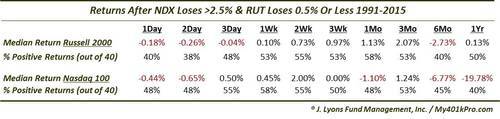
Ugh. Apparently, a positive small cap divergence didn’t result in any more positive returns than the studies we looked at into negative divergences. Perhaps the market simply does not like divergences period. That makes some sense. As you may know, we are big proponents of strong breadth as an indicator of a healthy market. The more stocks that are going up, the healthier the rally.
However…
Looking closer at the timing of many of the 40 previous divergences contributing to the figures in the table above, we noticed a bit of a skew. 24 of them, or over half, occurred during the aftermath of the Nasdaq bubble from 2000-2002.
I don’t care which 24 dates you pick between 2000-2002, you’re going to end up with some horrific intermediate to long-term returns in a market that dropped some 80% over that period. So using that sample distorts the negative returns quite a bit.
One way to parse the data without arbitrarily removing the 2000-2002 period is to identify those occurrences most similar to the present example. One way to do this is to identify those divergences that occurred while the indexes were relatively close to 52-week highs, which is the case presently. Therefore, we whittled the 40 historical precedents down to just those occurring when the NDX and the RUT were each within 10% of their respective 52-week highs. Here are the returns following the resulting list of 10 precedents.
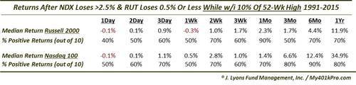
Well, that’s more like it. The returns when near 52-week highs at the time of these divergences were much better than the list of 40. After some ups and downs out to 1 week, the post 2-week returns generally saw at least 70% positive returns. And the returns in the NDX were especially robust.
However…
This picture isn’t without its skew either. A look at these 10 precedents finds 8 of them occurring between 1995 and 1999.

You can pick any 8 dates you want in that time period, they are going to yield pretty positive returns in the intermediate to long-term, especially in the NDX given its 1000% rise over that time.
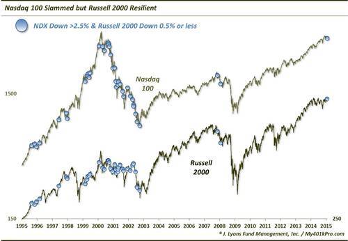
Excluding that 1995-1999 period, the remaining 2 precedents are interesting, and inauspicious. Obviously, with close to 8 of the 10 events in the 2nd table showing positive returns from 1 month to 1 year out, we can easily identify the 2 regular culprits among the losers: the last 2 occurrences. Those occurred in January 2000 and November 2007. From a cursory glance at the chart, or a casual knowledge of recent market history, you know that those 2 periods coincided with the buildup or beginning of the last 2 cyclical market tops.
It is always dangerous to attempt to extrapolate these types of market idiosyncrasies into something exploitable. If there is not an obvious and consistent pattern of behavior following the entire sample of events, it is tempting to parse the data further until one finds “something”. And while there may be sound reason to parse, such as identifying similar periods in a market cycle, it can result in mere data-mining.
Nevertheless, if we had to form a conclusion from this positive small cap divergence, it would lean more heavily on the 2 most recent precedents near the tops in 2000 and 2007. Those two cycle junctures are more similar, in our view, to the current market. Certainly, they are more similar than the post-bubble Nasdaq crash. And while we can understand the late-1990’s comparison, we don’t agree with it. That occurred at the end of a long secular bull market. While the market is reaching epic lengths in this cyclical bull market, it is not the same. We could envision a blowoff to the upside on a smaller scale but we don’t see a market-wide bubble in the offing.
Thus, ultimately as much as we’d like to take something from this study positive or negative, we can’t put too much stock into it either way.
________
More from and about Dana Lyons, JLFMI and My401kPro.