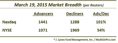
An Odd Breadth Situation

We’ve written about divergences in breadth (i.e., advancing issues vs. declining issues) on several occasions in the past. These such posts have included breadth divergences between the NYSE and Nasdaq exchanges, with the Nasdaq showing the poor breadth probably 4 out of 5 times. Today’s Chart Of The Day flips the tables on that trend, and in a historic fashion. Yesterday, the breadth on the Nasdaq exchange was positive, i.e., there were more advancing issues than decliners. However, on the NYSE, there were nearly 2 times as many declining issues than advancing issues (1.8:1 to be exact).
How unusual is this divergence? Consider this: The last time NYSE breadth was so poor on a day that Nasdaq breadth was positive was October 13, 2005. And before that? January 10, 1996. So, two incidents now in the past 19 years. That is pretty rare. Going back to the beginning of our Nasdaq breadth data in 1988, we find 3 more for a total of 6 over 27 years
What is the meaning behind this strange set of circumstances, if anything? Like a lot of the studies we’ve looked at in the past 6 months or so, the sample size is so small (strange things are happening indeed) that it is hard to make too much of it. For what it’s worth, looking at the prior 5 examples, the markets tended to do poorly in the short-term, especially the Nasdaq, strangely enough. Here are the results following the previous 5 days that saw Nasdaq breadth positive with advancers on the NYSE less than 55% of decliners.
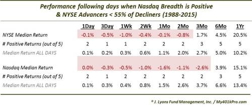
Again, as you can see in the table, for what it’s worth, prior occurrences were met with weakness in the short-term. However, the longer-term returns were not effected, as one might suspect from merely a 1-day data point.
Expanding the net a bit and looking at days when Nasdaq breadth was positive and NYSE advancers were less than 75% of decliners yields 52 prior occasions. Just counting the days when the Nasdaq was within .5% of an all-time high, such as yesterday, brings the number down to 21. And what were the after effects? Strangely enough, stocks tended to do a little better in the short-term than the first sample – but worse in the long-term.
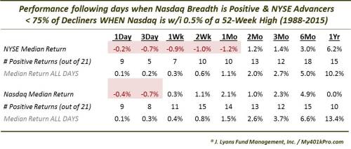
The Nasdaq numbers in particular are again interesting. The short-term results are much better than in the first sample. But look at the 1-year median return at 0.0%. One reason may be the inauspicious location of a few incidents near the highs in 2000 and in July of 2007. While we don’t want to place too much weight into the occurrence of those days near cyclical peaks, we can’t completely dismiss them as random.
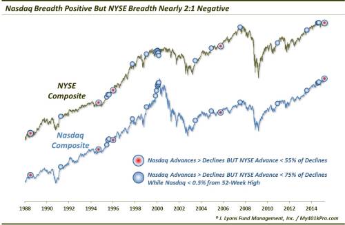
Here is a chart showing all of the dates of the two studies since 1988.
Again, this may be just another of the many quirky developments we’ve seen over the past 6 months. That is probably what we are going to take away from it. If there was a message, perhaps it would be to watch for short-term weakness, especially – and surprisingly – in the Nasdaq. Given today’s rally, however, maybe it’s best to just log this one away in the “strange but true” file.
__________
“Breath of Life” photo by Ian Iott.
More from Dana Lyons, JLFMI and My401kPro.
The commentary included in this blog is provided for informational purposes only. It does not constitute a recommendation to invest in any specific investment product or service. Proper due diligence should be performed before investing in any investment vehicle. There is a risk of loss involved in all investments.