Risk Has Begun To Rein

The following piece was originally posted in J. Lyons Fund Management Inc.’s February Newsletter at www.jlfmi.com.
Investment in the riskiest assets has been on a relative decline, a development which has preceded previous major tops.
“For the moment all discipline seems painful rather than pleasant, but later it yields the peaceful fruit of righteousness to those who have been trained by it." – Hebrews 12:11
About 4000 years ago, the world experienced its most significant “risk-off” event of all time. Angered by the peoples’ wicked behavior, God flooded the earth, wiping out the entire human race, save for Noah and his family. One might consider Noah the original risk manager. Rather than dismiss the risk of rain – an event that supposedly had never occurred up to that point – he built an ark that would provide protection in the event of a flood.
It certainly helped having an advisor with inside information like God who not only warned Noah of the flood, but was also in charge of its implementation. Even so, it must have taken some serious faith and fortitude on Noah’s part to continue executing his risk strategy considering how lengthy the effort was before it finally revealed any benefit. From start to finish, it took Noah 100 years to build the ark. Can you imagine the taunting he must have endured (e.g., the “perma-bear” accusations in the social media circles)? To his credit, none of that interfered with the implementation of his risk management process. And in the end, the man lived for another 300 years while everyone else ended up under water, literally.
We have been implementing our risk management process to manage investments for over 40 years. Over the course of that time, we have seen all kinds of markets. However, never have we seen anything like the recent environment. While storm clouds in the market have been accumulating for the past few years, there has hardly been any rain, save for an occasional drizzle (June 2013, October 2014). So while we have not been shy in pointing out the growing potential risk in the market (we are active risk managers after all), this risk has not yet mattered. In fact, it has been just the opposite: a nearly unprecedented 2-year increase in asset prices with hardly any drawdown along the way. For a risk manager, these 2 years may have felt like those 100 that Noah spent building his ark.
Now, this is not to say we have been hiding out inside a boat on a dry river bed. Though it has gyrated quite a bit, our risk model has been positive for the majority of the past 2 years. Additionally, our fund selection model has found no dearth of attractive investment options during this time. However, examples of potential risks associated with the stock market have now accumulated to the point that they could fill an ark. The question is, when will this potential risk be manifested? Well, in Noah’s day, the manifestation of risk occurred when it began to rain. In the present market environment, the manifestation of risk is in the rein. And the evidence suggests it is already reining.
The Risk Of Rein
What do we mean when we say that the true investment risk is in the “rein”? Markets are simply a matter of supply and demand. In an environment of rising asset prices, buyers are more eager than sellers. This elevated “demand” is what causes prices to increase. What these buyers are doing in purchasing an asset is taking on risk, presumably in anticipation of getting rewarded through further appreciation of the price of the asset. And the more demand that enters the market, the greater the rise in prices. And the more that is at potential risk.
Now there is nothing wrong with potential risk. That is the basis of the entire financial market system. People must take on risk in order to reap potential reward (we will avoid the discussion at this time of the effects of government-imposed bailouts, cramdowns, etc. on the risk:reward equation). Indeed, as we stated, the accumulation of risk is what spurs a rally in asset prices. It is when investors begin to remove, or rein in, their demand that the potential risk becomes manifested risk. When sellers are more motivated than buyers, prices drop and risk is unleashed.
The amount of potential risk in a market is tied to the heights to which it has been driven. The higher prices go, the more money that has been put into it. And the more potential risk there is should that money be pulled out, or reined in. The problem with present circumstances is the height to which many stock market metrics have been driven. The adoption of risk has reached a point of excess almost unprecedented in U.S. history, from valuation, allocation and appreciation standpoints. That means that the potential risk, in the event of “rein” has rarely ever been greater.
The level of potential risk can also be seen in the location of investors’ purchases. The traditionally higher-beta areas of the market can deliver more bang for one’s buck. Like we noted in our June 2014 Newsletter, when these high-volatility segments of the market are accumulating investment (or trading) dollars, they can supercharge a rally. However, they are a double-edged sword. When assets in those areas begin to be reined in, it can exacerbate a decline as there is greater potential risk embedded in them. Ominously, there is ample evidence that assets in such areas are already being reined in.
Signs Of Rein
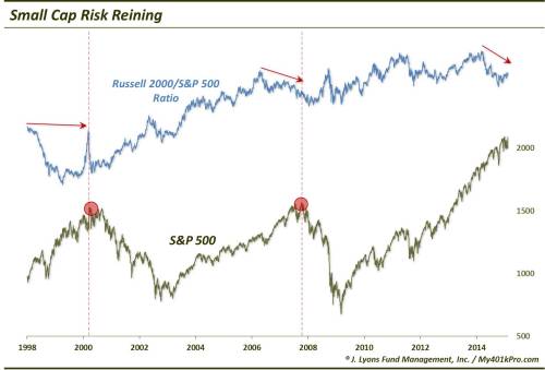
Small Caps
With the major averages at all-time highs, it is easy to miss the signs of risk being reined in. The first – and most obvious and talked about – example is small cap stocks. Using the Russell 2000 index as a proxy, small caps have gone sideways ever since hitting an initial top in the first week of March last year. A market that cannot make any progress at all for 11 months is not a bull market.
One might argue that the index has merely been consolidating the previous 15 months of gains setting up the next leg higher. That is possible, as the index is moving to new highs now. However, small caps have certainly had every opportunity over the prior 11 months to surge to new highs and have not. Consider that the S&P 500 large-cap index has made no less than 50 daily 52-week highs during that time. For whatever reason, investors have been unwilling to wade back into the higher-beta, risk-on small cap space.
Speaking of the S&P 500, most ominous has been the relative performance of the small caps versus the large cap index. Since also topping in March of last year, the relative performance of the Russell 2000 to S&P 500 has trended downward, making lower highs. And while the small caps do not have to lead in a bull market, this was a pattern we saw before the market tops in 2000 and 2007. And though this condition can persist for awhile, this subtle sign of reining risk may be a bad omen for the broad market.
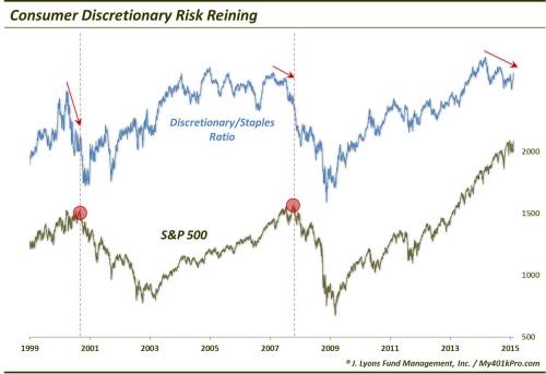
Discretionary Stocks
Another group that often leads both the market and the economy during favorable periods is the consumer discretionary sector. As the name implies, these stocks represent companies that benefit from consumer spending on non-essential goods and services. When they are leading the way, it can be a sign that the economy is doing well and income and confidence is high among consumers.
It has also historically been a good sign for the broader market when these stocks are leading the way. They are typically higher-beta and more growth oriented than the defensive-minded consumer staples sector. When discretionary stocks are outperforming staples stocks, it suggests consumers are spending (or investing) in areas where they “want to” instead of where they “need to”. I.e., they are taking more risk.
What goes up must come down, however. Therefore, when that trend fades, it can be a bad sign for both the economy and the market. Similar to the small caps, historically when we see the discretionary sector begin to lag the consumer staples, it has been a negative harbinger for the broader market. And indeed, we are seeing signs of such lagging in discretionary stocks. The relative ratio of discretionary to staples stocks (as calculated using the SPDR ETF’s XLY and XLP), also topped last March and has been making lower highs since. This manifestation of risk subtly being reined in was also evident before the 2000 and 2007 tops.
European PIIGS
Though they are not a part of the domestic U.S. equity market, perhaps no other space in the financial markets have symbolized the “risk-on, risk-off” trade in recent years like the PIIGS. The PIIGS (Portugal, Ireland, Italy, Greece and Spain) of course are the peripheral, debt-burdened European countries whose economic woes have threatened the stability of the European Union.
Over the past 8 years, risk-on rallies have taken place when the PIIGS’ travails appeared to be behind them, or at least comfortably on the back burner. During such periods, the equity markets in the PIIGS countries have ripped higher and provided the cover for rallies in the core European markets as well as the U.S. Conversely, when the PIIGS’ issues once again returned to the fore, risk-off forces have taken hold. Not only have investors fled the PIIGS in such circumstances but the risk-off, or risk-rein, leaked over to core Europe and the U.S. as well. At least before now.
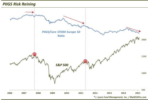
As the chart shows, since 2007 underperformance by the PIIGS Composite on a relative basis versus the core European STOXX 50 Index preceded tops in the S&P 500 in both 2007 and 2011. The PIIGS’ underperformance has at times persisted for awhile before spilling over to the U.S. And indeed, since the PIIGS began underperforming last April, the S&P 500 (and core Europe) has managed to avoid any major damage. Again, however, considering investors’ urgency to rein in their risk in the most risky areas, it may not be long before that trend leeks to the core, broad market as well. After all, this reining in of the riskiest assets removes one of the “buffers” to a broad stock market decline. In the event that they need to raise cash, investors may not be able to raise enough by selling high-risk areas like the PIIGS if they have already done so. That’s why when the next major decline unfolds, the most risk may be in areas like the S&P 500 and core Europe.
High Yield Bonds
It is not part of the equity market, but high yield bonds in the past have been a decent barometer of investors’ risk appetite. When they are eager to invest heavily in the high yield space, other risk assets like stocks have tended to perform well. When they have reined in their investments in high yield, it has often been a precursor to a general risk-off attitude across markets.
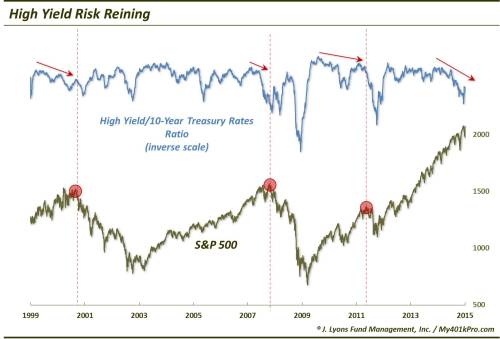
As seen in the chart, when the ratio of high yield bonds to treasury bonds has been in an uptrend, stocks, as represented again by the S&P 500, have tended to perform well. However, when the ratio has begun to trend lower (i.e., high yield bonds are being sold), it has been an indication of risk being reined in. And this reining of risk has spread to stocks as well, as the S&P 500 has often peaked following bouts of reining risk in high yield bonds.
Conclusion
So does this mean the market is on the verge of collapse? No. Like other variations of divergences, these these types of warnings can be early, sometimes very early. Recall the "great divergence” that began in the spring of 1998. It took a full 2 years before the major averages topped. However, these types of analyses are supposed to be early. That is the point – to provide advance warning before a storm actually hits. One cautionary sign is that these alarm bells, as shown in the charts, have been going off now for nearly a year aleady. And while we mentioned the 2-year great divergence, we would not expect another divergence of such prolonged duration to manifest itself in such close cyclical proximity. In other words, the 1998-2000 divergence was monumental in its duration, likely owing to the fact that it marked the end of a secular bull market. We would not expect another divergence of such magnitude so soon after it.
So does the “relative” weakness in the areas mentioned in the charts outweigh their absolute performance? No…at least not yet. In particular, in the case of the Russell 2000 and the consumer discretionary stocks (i.e., XLY), recent new highs are certainly a bullish sign in the immediate-term. Nothing is more bullish than all-time highs, as a matter of fact. That said, the relative declines suggest that risk has subtly been reining in for almost a year now. The fact that this dynamic has preceded major market tops in the past should not be ignored. The message may very well be that while these new highs are a tailwind at the moment, they are not likely to be sustainable.
The past few years have been extraordinary, even unprecedented. Despite an abundance of accumulating potential risks, the equity market has been on an unfettered upward trajectory. And with the major averages hitting all-time highs again, it would be tempting to think it’s all clear skies. However, the subtle relative underperformance of “risk-on” areas like small caps, discretionary stocks, high yield bonds and the PIIGS is a sign of atmospheric disturbance. We can’t be sure whether this development is the result of concerted efforts on the part of investors to rein in their risk tied to these assets or whether it is a more subtle and evolutionary dynamic that naturally and necesarilly occurs in the lead up to a top. However, we do know that historically the process of reining in risky assets has occurred prior to major tops.
Should you sell everything and go hide out inside an ark? That’s a bit excessive. Not even Noah hid out in his ark until it was time for the flood. However, Noah did have God to inform him on when to get defensive. So unless you have the same advisor as Noah, you might at least consider adopting a risk-management strategy now for your investments. For, just as in Noah’s day, it was too late to seek protection once it stopped raining, it may be too late when risk stops reining in this market. By that point, your portfolio may already be well under water.
Dana Lyons
Partner, JLFMI
__________
More from Dana Lyons, JLFMI and My401kPro.
Disclaimer: While this study is a useful exercise, JLFMI’s actual investment decisions are based on our proprietary models. Therefore, the conclusions based on the study in this newsletter may or may not be consistent with JLFMI’s actual investment posture at any given time. Additionally, the commentary here should not be taken as a recommendation to invest in any specific securities or according to any specific methodologies. Proper due diligence should be performed before investing in any investment vehicle. There is a risk of loss involved in all investments.
Copyright © 2015 J. Lyons Fund Management, Inc. All rights reserved.