Bull Market Dealt A Significant Blow?

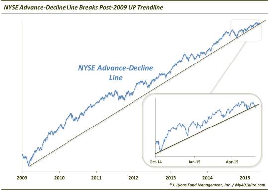
In January, we wrote a post titled “Are Bears Missing The Forest For The Trees?”. The gist of it was that while there were certainly concerning bits of evidence piling up regarding the longer-term fate of U.S. stocks, the most important factors in the immediate-term – such as the continued confirmation of new highs by the NYSE Advance-Decline Line – continued to support the bull market. That may be starting to change.
Regarding the NYSE A-D Line, we noted last week that for the first time in awhile, it failed to match the new highs set earlier this month by the S&P 500 and other large cap indices. As a refresher, the A-D Line is a cumulative total of daily advancing issues minus declining issues on the NYSE. In our view, it is an important gauge of the health of the stock market as it measures the level of strength among all stocks. The more stocks there are advancing, the more robust and resilient a rally is likely to be. Therefore, when the A-D Line failed to confirm the new high in the indices, it was an indication that fewer stocks were still participating in the rally.
Yesterday, we saw more confirmation of that. The UP trendline of the NYSE Advance-Decline Line since the beginning of the cyclical bull market in 2009 was broken to the downside with yesterday’s poor breadth.
Now, a few things about this development. Yes, it is only a measure of the internals of the stock market, rather than price itself. A break of the long-term price trend would obviously be of more concern. However, just as the indicator has peaked before cyclical market tops in price, a break in its trend has also been a harbinger of downturns in price during the prior 2 cyclical market tops.
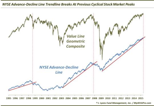
As the chart shows, trendline breaks in the A-D Line coincided with market tops in the Value Line Geometric Composite in 1998 and 2007, each leading to cyclical bear markets. As we’ve mentioned in the past, the Value Line is an unweighted average of roughly 1700 stocks. So while you may note that the major averages did not top out until 2000 in the former instance, the majority of stocks did actually peak in 1998. Therefore, unless one was invested just in large-cap growth stocks, they were likely impacted negatively during the 1998-2000 period. The same story applies today. While the S&P 500′s uptrend may still be intact, it does not mean that the broad market of stocks is in as healthy a position.
A few notes about trendlines and their utilization. As we have stated in the past, trendlines are one of the misused of all charting tools. For one, our rule of thumb is that there must be at least 3 points of contact in order for a trendline to be valid. A line can arbitrarily be drawn between any 2 points. It is that 3rd touch, however, that renders the trendline connecting the first two relevant. Thus, a break of that line means a genuine change of character. In this case, the trendline connecting the 2009 low and the October 2014 low proved relevant, i.e., provided a bounce, at the December 2014 low as well as the low earlier this month. Therefore, yesterday’s break of that trendline marks a change in character.
Here is another pet peeve with the use of trendlines. Often times, when a trendline is broken, folks simply draw a new line wherever the new low happens to be, as if there was no significance whatsoever to the original line. A new line may be appropriate but if one isn’t going to respect the break of the original line, why bother even drawing it. This is especially true if one is going to continue to draw more and more new trendlines with each successive trend break. Thus, it is important to be honest about one’s use of trendlines. Either respect their signals or do not use them.
Lastly, as a trendline persists, it is not uncommon for prices to begin to touch the line with more frequency. This is a sign of a weakening trend and a head’s up that the trendline is more apt to be broken. That is the case with the NYSE A-D Line. The trendline had been tested several times in recent months, increasing its vulnerability to a break. Another way of looking at it is that, trendline aside, the slope of the price series is getting shallower. Note that since the October touch of the trendline, the A-D Line’s ascent has been much less steep than it had been during most of the post-2009 period. This is merely indicative of a trend that is losing strength.
Over the past year and a half or so, we have nit-picked the equity rally quite a bit. That said, those forces most vital to the perpetuation of the bull market have been pretty steadfastly positive. One such force has been the NYSE Advance-Decline Line. However, following its divergence at the early May equity high and now yesterday’s break of its post-2009 up trendline, the A-D Line looks much less constructive for the market. Thus, while we previously cautioned stock market bears to focus on the forest rather than the trees, this is one falling tree that might make a sound.
_____________
“Silent drama” tree photo by Bosc d’Anjou.
More from Dana Lyons, JLFMI and My401kPro.
The commentary included in this blog is provided for informational purposes only. It does not constitute a recommendation to invest in any specific investment product or service. Proper due diligence should be performed before investing in any investment vehicle. There is a risk of loss involved in all investments.