Will Yesterday’s Shooting Star Make Bears’ Wishes Come True?

Like it’s bullish counterpart, the hammer, this bearish reversal pattern has been inconsistent in its forecasting abilities, except under certain conditions.
We’ve covered the “hammer” candlestick chart pattern on a couple occasions over the past few years, most extensively in this October 2014 post. The pattern, which involves a significant selloff from the open followed by a full recovery and close up near the open, is supposed to carry bullish ramifications. Yet, while that may be more true of other securities, we found the evidence very underwhelming when applied to the S&P 500 since 1950. The hammer’s bearish opposite – the shooting star – made an appearance on the chart yesterday. Therefore, we thought we’d examine its history to see if it was any more reliable as a (bearish) harbinger.
Like any study, we first need to define the conditions we are looking for. This is especially important here as there is some room for interpretation with candlestick patterns. Here is the specific criteria we searched for:
- An intraday rally of at least 1%
- A lower close on the day
- A close that was less than 0.5% below the open.
Additionally, as we wanted to search for instances that were somewhat similar to current conditions, we also required that
- The intraday high must set at least a 3-week high.
Since 1950, we found 33 days matching this description in the S&P 500, prior to yesterday. Here is the performance of the index following such days.
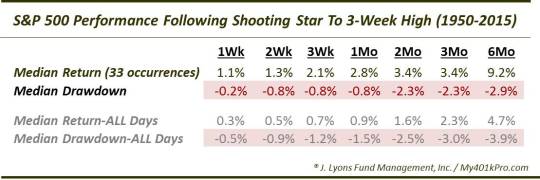
Uh, consider us underwhelmed again. Like the “hammer” on the upside, the shooting star has not typically been any indication of impending doom. In fact, the median returns and the median drawdowns following these days have been better than those following any average day. Again, this is why it pays to study “accepted” rules, or rules of thumb, instead of blindly accepting them as truth.
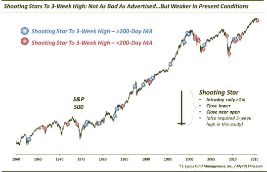
So are there any specific conditions in which these shooting stars are more apt to lead to bearish returns. Well, one way to test it is to separate the instances between those when the S&P 500 was in an uptrend vs. those when the index was in a downtrend. While that too is subjective, an easy way to parse the events accordingly is by their proximity to the 200-day simple moving average. When the S&P 500 above the 200-day SMA, it may be considered to be in an uptrend. Conversely, below the 200-day SMA, as in the current case, we’ll call it a downtrend.
As it turns out, 18 of the prior occurrences since 1950 took place with the S&P 500 above the 200-day SMA and, now, 16 have occurred below the 200-day SMA. Here are the events on the chart.
So how much of a difference did the distinction between being above versus below the 200-day SMA make? Actually, quite a bit. This is a fairly smallish sample size, however, the results when in a downtrend, like yesterday’s example, have led to noticeably weaker returns, historically. Witness:
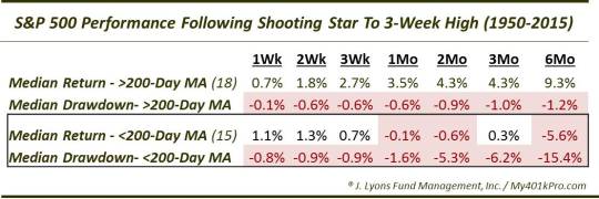
When occurring above the 200-day SMA, shooting stars in the S&P 500 have led to positive returns, on a median basis, on all time frames out to 6 months, Furthermore, the median drawdown, or max gain, was negligible at less than 1% out to 2 months.
On the other hand, the shooting stars occurring below the S&P 500 200-day SMA have not been so kind. After decent performance in the short-term, median returns were negative on a 1-month, 2-month and 6-month basis. Additionally, the median drawdown on a 2-month basis was weak at -5.3% and nasty on a 6-month basis at -15.3%.
Therefore, this study has a little bit for everyone. Overall since 1950, shooting stars in the S&P 500 to 3-week highs have been pretty tame as an indicator of future weakness. However, when occurring in a downtrend, i.e., below the 200-day simple moving average, these shooting stars have been more accurate as bearish signals. And considering the fact that the S&P 500 is now in a downtrend, at least according to this study’s parameters, stock bears seemingly stand a better chance of their wish for lower prices coming true.
______
“Perseid at Terhune” photo by Sean Molin.
More from Dana Lyons, JLFMI and My401kPro.
The commentary included in this blog is provided for informational purposes only. It does not constitute a recommendation to invest in any specific investment product or service. Proper due diligence should be performed before investing in any investment vehicle. There is a risk of loss involved in all investments.