2015 Charts Of The Year

This post originally appeared as the J.Lyons Fund Management, Inc.
December 2015 Newsletter at jlfmi.com.
As we wrap up 2015, we again pause to reflect on the noteworthy events that took place across the financial markets this year. First, however, we want to pause to reflect on what has been a monumental year of growth among the social media ranks for us here at J. Lyons Fund Management, Inc. To consider how far we have grown our online presence in just 2 years is astounding to us. A few years ago, we didn’t even have an online presence. This blog did not exist nor did our Twitter account. Or, if it did, maybe it had 3 followers. Now, just a few years later, @JlyonsFundMgmt, was recently named one of Marketwatch.com’s Must-Follow Twitter Accounts For 2016.
None of this would have been possible without the many folks that generously helped us along the way, our financial social media colleagues who have inspired us with their offerings, and – especially – our tremendous collection of followers and readers. To all of you, we offer our sincere thanks. And we look forward to providing even bigger and better market-related value in 2016.
So, without further ado, here are our 2015 Charts Of The Year. It is a fairly extensive list which really serves as a recap of the entire year. These charts aren’t necessarily our most popular ones (see The 5 Most Viewed Charts Of 2015 for those). Consider these our “editor’s picks”. The charts range from those that had the most impact on the markets in 2015 to those that may have the most impact on 2016 to those whose impact is totally unknown to us. They don’t necessarily include after-shots of the big movers of the year. However, you will see “before” shots of many of the big movers. After all, we are money managers and the objective behind these charts is to identify potentially profitable moves before they happen. Like last year, there are bullish charts but more bearish charts. Finally, there is our chart of the year for 2015. We would love to know which charts you think were the most noteworthy so feel free to send along your feedback.
We thank you again very much for your viewership this year and wish you all a very healthy and prosperous 2016.
Disclaimer: While this study is a useful exercise, JLFMI’s actual investment decisions are based on our proprietary models. Therefore, the conclusions based on the study in this newsletter may or may not be consistent with JLFMI’s actual investment posture at any given time. Additionally, the commentary here should not be taken as a recommendation to invest in any specific securities or according to any specific methodologies.
2015 Charts Of The Year
(in chronological order – click on the titles to visit the respective posts):
Speculators Hold Massive Record Long Position in the U.S. Dollar – January 12
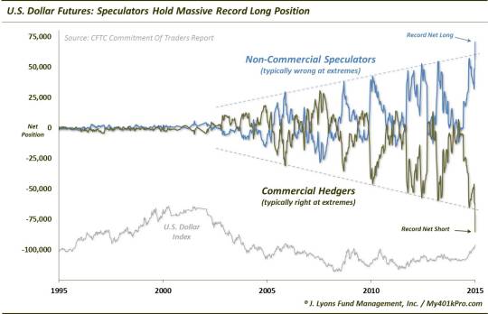
At the beginning of the year, Speculators held a record net long position in U.S. Dollar futures. While the currency had been on a tear, we surmised that given the position of the Speculators, who are typically on the wrong side of markets at major turning points, the U.S. Dollar rally could be in danger at some point soon thereafter. While the Dollar was able to continue its advance for another 2 months, and extend the Speculators record long position, it has stalled over the past 9 months. During this time, the Speculators’ net long position has dropped considerably, perhaps allowing for another advance to come in the Dollar? This one will obviously be an important development to track going forward.
Bearish Fund Bets Hit All-Time Low – January 15
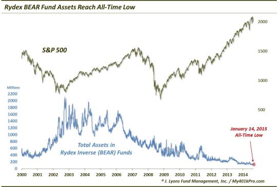
While there has been a structural trend away from inverse mutual funds and toward inverse ETF’s, January still marked a milestone all-time low in the amount of assets in Rydex bear funds. This was an indication that investors were ill-equipped to withstand a significant decline and dispelled the still-perpetuated notion of “the most-hated bull market in history”. And while the stock market would not suffer a significant decline for another 7 months, it was unable to make any upside progress either.
Swiss Market Index Goes From 52-Wk High To 52-Wk Low In Same Week! – January 16
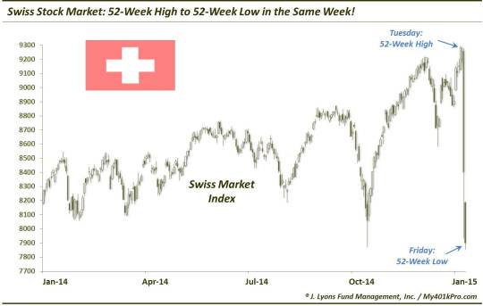
What kinds of things tend to happen when your central bank is heavily involved in currency intervention? How about your stock market going from a 52-week high on Tuesday to a 52-week low on Friday. That happened to the Swiss stock market following the Swiss National Bank’s decision to remove the Swiss Franc’s cap versus the Euro.
European Stocks Set To Blast Higher? – January 20
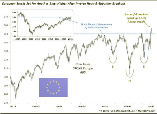
One lesson that is reinforced on a daily basis across the globe is that a stock market is not necessarily representative of the economy at any given time. So it was across Europe in January as the broad Dow Jones STOXX 600 broke out of a bullish inverse head-&-shoulder pattern. Based on the pattern, a successful breakout suggested potential upside targets of 9%-18% higher. The breakout was indeed successful and European equities were the stars of the 1st quarter. By April, the 18% rally target was achieved – and the rally hit a brick wall. Stopped by a combination of a 100% extension of the inverse head-&-shoulder pattern as well as the 2000 and 2007 highs, the STOXX 600 has trended downward since.
How Ominous Is The S&P 500 Monthly MACD Sell Signal? – February 2
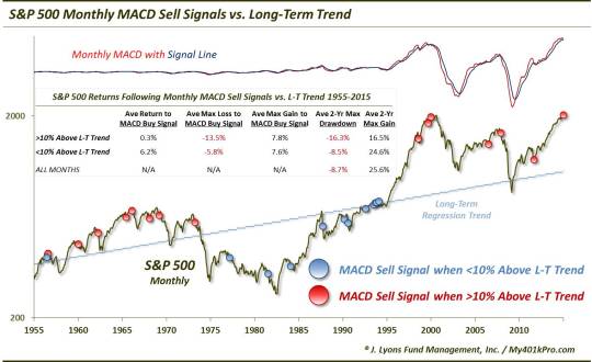
One popular tool in technical analysis for gauging momentum (and change in momentum) is the MACD. Used on a monthly time frame, MACD sell signals have often, though not perfectly, signaled cyclical peaks and downturns. The signals have been especially helpful when the S&P 500 is both overvalued (via CAPE) and extended versus its long-term price trend. This was the case upon the January sell signal in the indicator. So, while the technical signal has not been perfect historically (what has?), the loss of momentum signaled by the MACD, in conjunction with other concerns, was another unwelcomed development for a market as stretched as it was.
Unemployment Hits 6-Year Low; Bad News For Stocks? – March 6
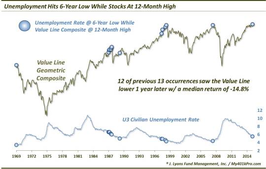
No, we do not bemoan the vast improvement in the U3 Unemployment Rate in recent years (though, we have serious doubts as to whether it’s the best measure of the strength of the labor market). This chart provides lessons regarding market cycle proximity as well as psychology. Historically, bull markets do not end amidst bad news. Rather, they end when stocks fail to advance on good news. That message is driven home here by the fact that since 1969, when the U.S. U3 unemployment rate has hit a 6-year low while the stock market (Value Line Geometric Composite) is at a 12-month high, the market has been lower 1 year later 12 out of 13 times by a median -14.8%.
Volatility Has Not Expanded With Recent Euro Plunge – March 13
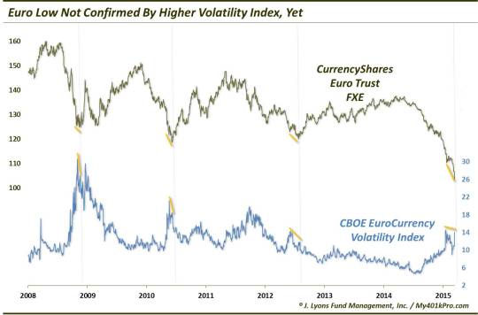
Typically, when the price of (most) assets drops, their expected volatility, as expressed by a volatility index, rises. This has generally been the case with the Euro as well. Interestingly, however, despite the Euro plunge to new lows in March, its volatility index (EVZ) did not make a higher high above its January peak. This non-confirmation was seen at other significant lows in the currency over the past 7 years. Indeed again, March 13 proved to be the low for the year in the Euro.
Signs of Froth in the Biotech Sector – March 23
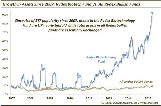
The hottest sector over the past few years has been biotech. And while there is a debate about whether it is or is not a bubble, there have certainly been signs of froth related to the sector’s recent extraordinary gains. For example, while total assets in Rydex’ “bullish”-oriented index funds have been essentially flat since 2007, the Rydex Biotechnology Fund is a different story. In 8 years as of March 20, assets in the fund increased from around $58 million to $567 million, a nearly ten-fold jump in assets. That struck us as a little bit bubbly. As it happens, March 20 marked the top in the biotech sector for the year, outside of a 2-week span in July.
One-Way Market Due For A U-Turn? – April 28
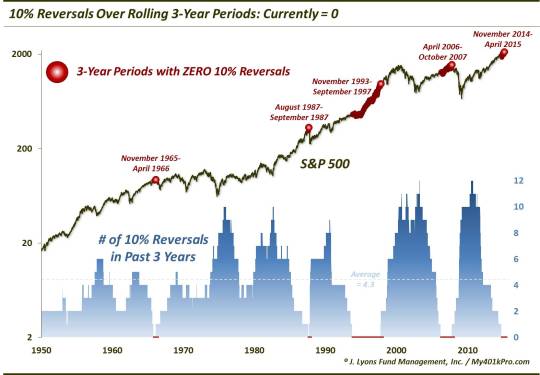
If there is one thing that characterized the stock market’s run from 2012 to 2015, it is the lack of volatility. As it turns out, this period was truly historic in that regard. Since 1950, this was just the 5th time that the S&P 500 had gone 3 years without a single 10% reversal in prices. Well, that streak ended in August. And despite the bounce back thus far in prices, if the current market tracks previous such streak-enders, the market may not be out of the woods just yet.
May Has Become The “Toppiest” Month – April 30
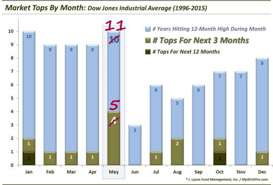
As we laid out in this April post, the month of May has recently become the toppiest month for stocks in the short-term, i.e., 3 months. Perhaps it corresponds with the “Sell in May and Go Away” phenomenon. Whatever the reason, since 1996, there had been twice as many 3-month tops in the Dow Jones Industrial Average (DJIA) in May as any other month. Well, you can now add one more to the tally as the DJIA still has not surpassed its peak from this past May.
Despite Historic Compression, Stocks Remain Range-Bound – May 6
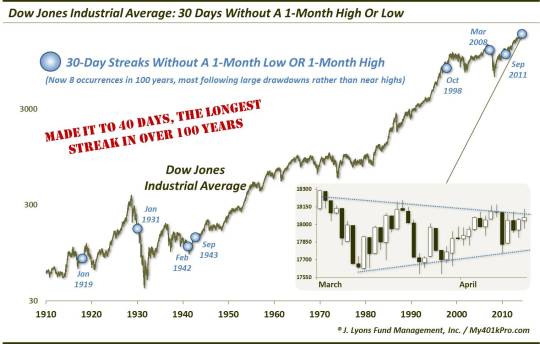
May was a busy month in terms of important stock market developments and, as such, produced many noteworthy charts. The DJIA entered the month stuck in a month-long trading range. Eventually, the DJIA would last 40 days without making a 1-month high or low, its longest such streak in more than 100 years.
Final Pillar Of Bull Market Showing Cracks? – May 8
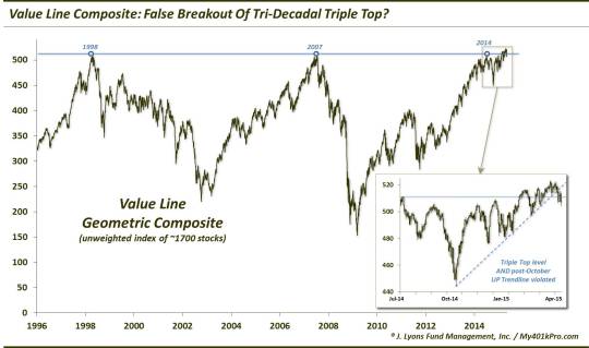
One of the major themes in 2015 was the extensive deterioration in the market’s underlying internals. It was a trend that started in mid-2014 and really accelerated during this past spring. While that was occurring, however, the prices of the major averages continued to score new highs. One of the first signs of an actual price breakdown occurred in the Value Line Geometric Composite (VLGC). As we’ve mentioned many times, since the VLGC is an unweighted index of some 1700 stocks, it is a favorite of ours as a measure of overall market health. That’s why we considered it a warning sign in early May when the VLGC was unable to sustain its breakout above its tri-decadal triple top.
Stock Indicator Suggests Big Move (Lower?) Coming – May 12
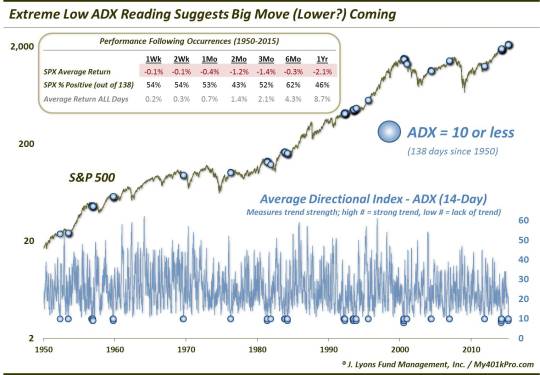
Another indication of the stock market’s spring range-bound trade came from the ADX, or Average Directional Index. The ADX is essentially an indicator of the strength (or lack of strength) of the prevailing trend over a specified period, regardless of the trend’s direction. In May, the ADX of the S&P 500 recorded one of the lowest readings of the last 65 years, indicating an extremely “trendless” market. Specifically, on several days in early May, the ADX hit a level of 9, a reading reached on just 42 total days – or ¼ of 1% – since 1950. As periods of compression are followed by periods of expansion, an out-sized move emanating from this condition was expected. And our bet, based on the aforementioned one-way market was that it would be lower.
The Grand-Daddy Of All Divergences Strikes – May 21
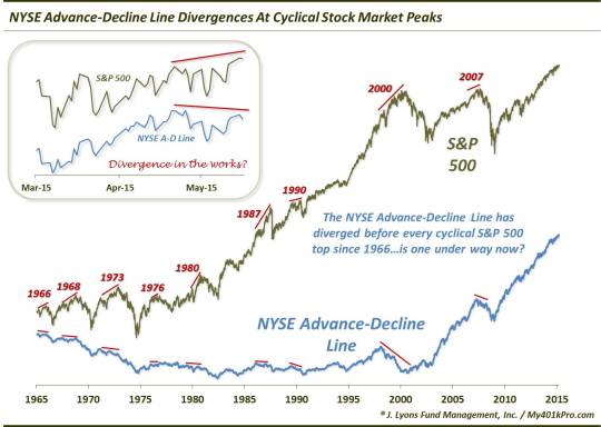
As the aforementioned breakdown in the market’s internals accelerated, more divergences began to crop up. That is, while the S&P 500 continued to score new highs, other key averages or metrics failed to make concurrent new highs as well. That was the case in mid-May with what we refer to as the “grand-daddy of divergences”. While many divergences can occur and persist without much damage, a failure to confirm new highs by the NYSE Advance-Decline Line is of the utmost gravity in our view. A glance at the chart reveals that a divergence by the NYSE A-D Line has preceded every cyclical market top of the past 50 years. This was one of the most consequential stock market developments in 2015.
Bull Market Dealt Significant Blow?: NYSE A-D Line Breaks Post-2009 Uptrend – May 27
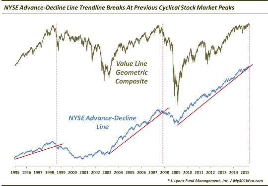
As you can see, the breakdown in the market’s internals began to unfold fast and furiously in May. Following the divergence in the NYSE Advance-Decline Line, another red flag was raised when the A-D Line broke its post-2009 Up trendline. One might want to argue that trendlines on indicators are meaningless, but we disagree. Look on the chart at the last two occasions that the A-D Line broke its uptrend line. Each marked the end of cyclical bull markets for stocks.
Household Stock Investment Hits 2007 Levels – June 11
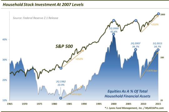
While folks still try to foment the “most hated bull market” rhetoric, the data unanimously disputes the notion. Sure, short-term sentiment can shift with the wind, but longer-term “real money” measures like the Fed’s “Equities as a % of Household Financial Assets” paint the true picture. And while some of these types of measures have not reached the 2000 levels, why should they? That period marked the most froth-laden point in U.S. stock market history. Therefore, it should not serve as a reasonable or attainable barometer of investment level. The facts that A) Household investment never got truly “oversold” following that top, and B) in the 1st quarter, it matched the 2nd highest level ever attained, in 2007, are the most pertinent conclusions from the data series, in our view. If you’re interested in reading more on the topic, we took a very balanced approach in the June 11 link above.
Dow Divergences Reaching Historic Levels – June 18
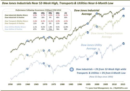
On the topic of divergences, one of the oft-mentioned examples refers to the “Dow Theory” whereby the DJIA and the Dow Jones Transportation Average (DJT) diverge from each other. While people too often blindly follow such market platitudes, we prefer to test their veracity. In doing so, we actually found less relevance to DJIA divergences with Transports than we did with Dow Jones Utilities (DJU). And when the DJT and the DJU diverged from the DJIA by as much as they did in June, it has often spelled trouble for the stock market. As shown by the blue markers in the chart, outside of a false alarm in the mid-90’s, such divergences have strictly occurred near cyclical market tops over the past 60 years.
July 20: The Thinnest New High In Stock Market History – July 21
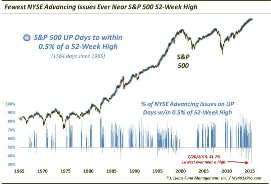
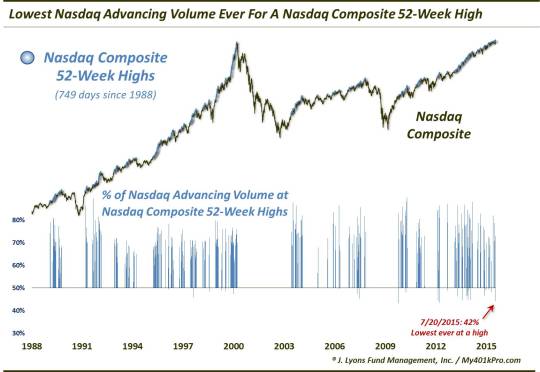
The divergence between deteriorating market internals and the resilient stock averages hit a crescendo on July 20. The Nasdaq Composite hit a new all-time high on the date while the S&P 500 came within 2 points of its all-time high. However, those feats were accomplished amid the worst breadth, the worst volume and worst new high-new low differentials of any such day in our recorded history. The 2 charts above are examples of the “thin” nature of the high. And while we did not know for sure if the day would turn out to be the high for the rest of the year (it was), there was no escaping the historically inadequate breadth statistics as we reported in real-time.
Even The Stronger Areas Of The Market Are Starting To Weaken – July 22
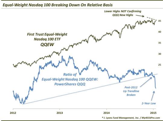
Another area where we monitored the deteriorating breadth situation over the spring-summer months was in the “equal-weight” averages. Cap-weighted averages weight the largest stocks the most heavily and, thus, a few strong-performing larger stocks can mask softness among the larger group. Conversely, equal-weight averages weight each component equally so you get a truer sense of the health of the entire sector or market. As the chart shows, at the July highs, even the stronger areas of the market like the Nasdaq 100 were beginning to show weakness among their broader ranks.
Add Junk Bonds To The Growing Pile Of Concerns – July 23
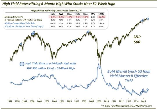
In addition to the deteriorating breadth situation, other concerns began to pop up as well during the summer. Chief among them was the substantial weakness in the high yield bond market, despite the stock market being near its highs. This combination has historically occurred near stock market tops of some significance, as the chart shows. And as we know now, it was merely the beginning of the carnage that would befall the junk bond market.
The Summation Of All Fears – July 30
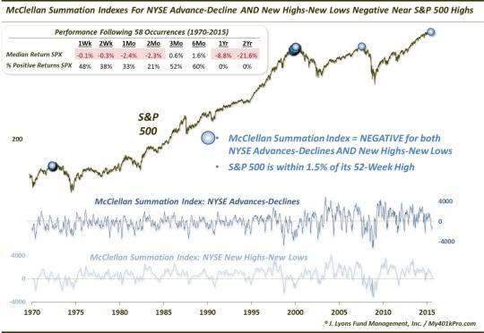
With more than 170,000 hits, this was the most viewed post on our blog in 2015. It is fitting because, as much as any chart, this one portrays the historically weak state of the breadth and new high-new low situation this summer, even as the S&P 500 remained near its high. Ominously, as the chart indicates, similar conditions have been present on just 58 days since 1970. Each of those days was in close proximity to a cyclical top and each of them showed negative returns over the subsequent 1 and 2 years.
Pfff…The Post-2009 Commodity Gains Are Gone – August 3
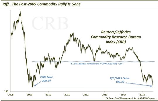
One theme from 2014 that continued into 2015 is deflation. This year brought multi-year or all-time lows in the 5-Year Breakeven Rate, the Baltic Dry Index, and commodities across the board. Evidence of the latter is seen in this August chart showing that the broad basket of commodities represented by the CRB Index actually wiped out its entire post-2009 gains. Incidentally, the deflation trend has not stopped as the CRB has continued to drop into year-end.
The Junkie Market – Too Many Highs & Lows – August 7
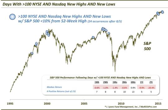
Another manifestation of the developing concern over the market’s internals was seen in the proliferation of New Highs AND New Lows with the market near its highs. As the chart demonstrates, this variation of the “Hindenburg Omen” has historically occurred near tops of intermediate-term or cyclical importance, thus the -20% median 2-year return. One did not have to wait too long following this post before a substantial decline unfolded.
“Smart Money” Ready To Bet On Gold? – August 7
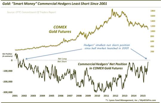
Given the events of the past 4 years, perhaps the most downtrodden investors right now are the “gold bugs”. With the metal working on its 3rd straight losing year, not to mention gold stocks near all-time lows, the pessimism is understandable. However, that is a good thing. Considering gold rallied for the 12 years prior, there was way too much bullishness built up. That has finally waned, as evidenced by the “smart money” Commercial Hedgers’ largest net long position in gold futures since the beginning of gold’s bull market in 2001. The metal was able to bounce for 3 months following this signal in August before dropping to new lows again. So, it might not quite be time for gold to shine again, but it’s getting there.
Was The Most Important Line In The Equity Market Just Broken? – August 21
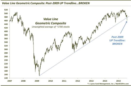
Following the significant deterioration in the market’s internals that we documented extensively, price eventually began to follow suit. This included a break of what we labeled as the “most important line in the equity market”: the post-2009 Up trendline on the Value Line Geometric Composite. As we’ve indicated, we view the VLG as the most important index as it essentially reflects the median stock across the broad market. Thus, the break below its bull market uptrend in August was a serious development.
August 24 – A True Market Washout – August 25
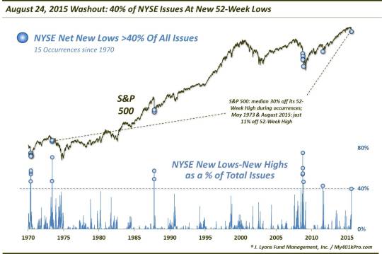
Following a systematic breakdown of key levels on the various indices in July-August, the market’s decline devolved into a near crash-like cascade in late August. The decline culminated on August 24 in what we referred to as a true “wash-out”, or capitulation. While the July 20 top raised numerous alarm bells based on its internal structure, August 24 did the same in the opposite manner. Various metrics related to trading on that day, including this chart showing 40% of all NYSE stocks closing at new 52-week lows, hit levels seen (almost) unanimously at major market lows. These circumstances suggested that a bounce of some magnitude was likely imminent.
Volatility Of Volatility Flies Off The Charts – August 27
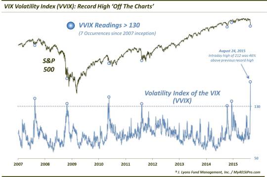
As testimony to the wild action in the stock market towards the end of August, the VVIX soared well into record territory. This indicator that we have just recently begun to track is literally the Volatility Index OF the S&P 500 Volatility Index, or VIX. As the chart shows, since the inception of the VVIX, it has generally registered its extreme high readings following substantial market declines. However, it has also occurred following lesser weakness that came on the heels of an extremely calm market. This appears to reflect the recent circumstances and does not guarantee that a longer-term bottom has been put in.
What Happens After A Crash? – September 4
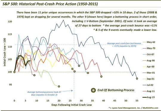
While the term “crash” is subjective, the circumstances surrounding the August plunge in stocks have been seen on only a limited number of occasions (9) since 1950. We looked at the 9 precedents for guidance on what we might expect in the way of a potential bottoming process in the aftermath of the crash. While each incident was unique, they did follow a similar template along the lines of A) a dead-cat bounce for a few weeks, followed by B) a re-test of the original crash low after roughly a month, followed by C) a more substantial rally. This was a template we monitored as September trading unfolded.
Global Equity Index Hanging On Precipice – September 8
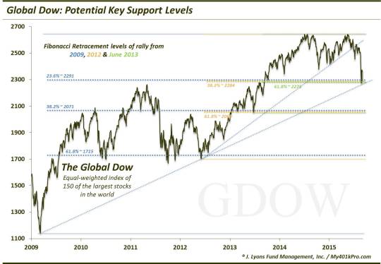
Besides the Value Line Geometric Composite, another key index garnering our focus in 2015 was the Global Dow. Despite the fact that not much money is directly tied to the index, it has been very instructive because it tracks 150 of the largest stocks in the world on an equal-weight basis and it has conformed very closely to technical chart analyses. For example, its break of its well-defined post-2012 Up trendline in June preceded the July-August global equity selloff. As it happens, the selloff took the Global Dow down to its post-2009 Up trendline, along with some key Fibonacci Retracement levels. After a brief false breakdown in late September, this level held and prompted a months-long rally. Just recently, the index tested the trendline again, so this will be a situation to monitor into 2016.
Even Biotech Bulls Should Be Watching This Level – September 17
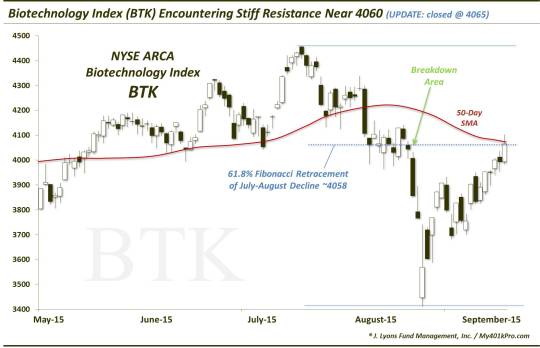
While the post-crash bounce progressed, we remained mindful of the strong possibility of a re-test. Thus, were watchful for areas of potential resistance in the various indices and sectors. On September 17, a day which included a Fed meeting, we identified many market segments as reaching such resistance levels. One example was in the highly watched biotech sector. We identified on the Biotech Index (BTK) chart several layers of potential resistance in close proximity to where the index was trading. Sure enough, the BTK topped that very day and proceeded to drop some 20% over the next 8 days. They don’t all work out this well, but the evidence was certainly compelling.
U.S. Stocks Facing Their Biggest Test In 8 Years? – September 29
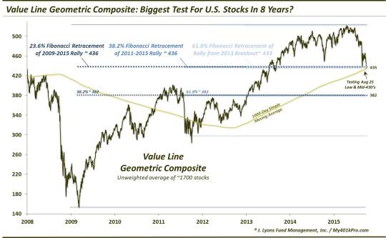
As I said, our “calls” and analysis don’t always work out perfectly, but this post was another one that, looking back, was right on the screws. During the late-September stock market re-test, the Value Line Geometric Composite dropped down to an area of critical consequence, in our mind. As the VLG was hitting the major Fibonacci Retracement lines of the post-2009 bull market era, we labeled this a “pass-fail” test for stocks. It was perhaps as simple as pass=post-2009 bull market could continue and fail=bull market was likely done. Well, stocks did pass this test as they put in a bottom for the year on that very day, launching a strong 4th quarter rally.
Can The 4th Quarter Save 140-Year “Year 5″ Streak In Stocks? – September 30
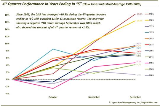
At the beginning of the year, we noted that years ending in “5” have not had a losing year in the stock market since 1875. And while these kinds of statistics are more trivia than useful to us, 140 years is a long time. So at the end of September, with the S&P 500 down over 7%, the streak looked to be in serious jeopardy. On plus side, looking back to 1905, it would merely take an average “year 5” 4th quarter to get the S&P 500 back into positive territory. That’s because all 11 “year 5’s” since 1905 have had positive returns during the 4th quarter, at an average of +10%. As of this writing, the S&P 500 is up 8% for the quarter and back into the green for 2015. So, trivial or not, this is another trend that has continued to play out according to precedent.
Stock Market Reaches Key Post-Crash Milestone – October 2
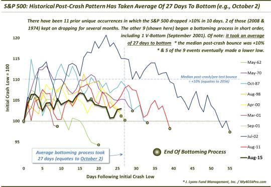
As an update to the post-crash post from September 4, we looked at how the market had traded since the late-August lows in comparison to the similar historical post-crash events. We chose October 2 to update it as it marked the average time (27 days) that it took the previous crashes to complete their re-test. As it turns out, while the re-test had already completed its process 3 days earlier, the basic pattern from the August crash to the late-September re-test held fairly close to historical form. Thus, this study was a useful one in guiding our expectations during the volatile aftermath of the August decline.
Bearish Fund Assets Hit 3-Year High…AFTER Big Rally – October 7
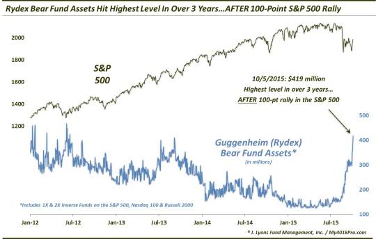
Following a 6-day rally off of the late-September lows that took the S&P 500 up over 100 points, or 6%, we took measure of the “quality” of the rally, as we always do. We always want to attempt to discern whether a rally is merely another dead-cat bounce or if it has legs. One clue that more upside was likely came from the behavior of traders in Rydex mutual funds. Interestingly, assets in Rydex’ bearish funds jumped to a 3- year high after the 100-point S&P 500 rally. This was one suggestion that there was considerable skepticism about the rally, a condition that, per contrarian thinking, argued for further extension of the rally.
Relatively Few Big Stocks Bearing Weight Of This Rally – October 28
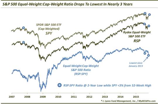
As we continued to take stock of the quality of the post-September stock rally, we began to notice some of the same concerns from earlier in the year related to relatively weak internals and lack of broad participation. Evidence of this was seen in this October chart comparing the relative strength of the Rydex Equal-Weight S&P 500 ETF (RSP) vs. the cap-weighted S&P 500 SPDR (SPY). In late October, as the chart shows, the ratio of the RSP to the SPY actually dropped to a 3-year low. This was an indication that the broad market was lagging badly behind a relatively few mega-cap names. It was also a situation seen only in July 2015 and October 2007.
Corporate Junk-It: When Stocks AND Bonds Sell Off – November 4
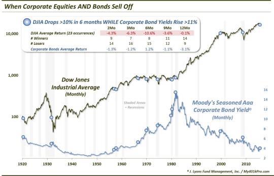
This was a retrospective post, looking at the carnage that had taken place in the corporate financial markets over the summer. Specifically, we looked back 100 years at similar examples when corporate bonds AND stocks both suffered significant declines as they did during the 6 months into the late summer lows. The point was to try to discern whether there was possibly a larger, longer-term message being sent by the weakness in the 2 asset classes. As it turns out, it has historically been the case that, at least for stocks, more challenges remained in store in the intermediate to longer-term. Thus, despite the 4th quarter rally, stocks may not be out of the woods.
Short-Term Rates Break Out: Another Rising Rates “Set-Up”? – November 6
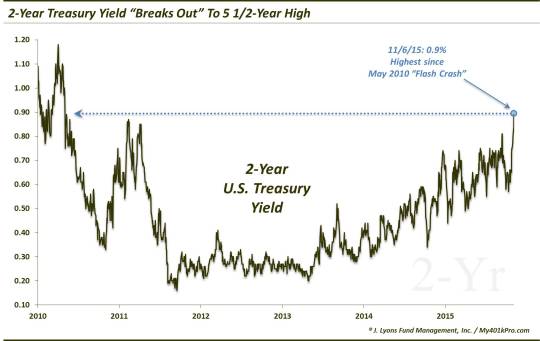
For probably 10 years we’ve been hearing about the impending “rising interest rate” environment. Yet, rates have continued to remain low during this time. Of course, ZIRP has had something to do with this. Yet, every time rates threatened to break higher, it has proven to be a fake-out. In November, when the 2-Year Treasury Yield broke out to its highest level in over 5 years, we had to ask “is this another set-up?” In this case, it was probably in anticipation of the Fed’s rate hike in December and it has held its gains thus far (though longer-term rates have remained subdued). Maybe “this time, it’s different?”
Is It Too Late To Sink Your Teeth Into F.A.N.G. Stocks? – November 25
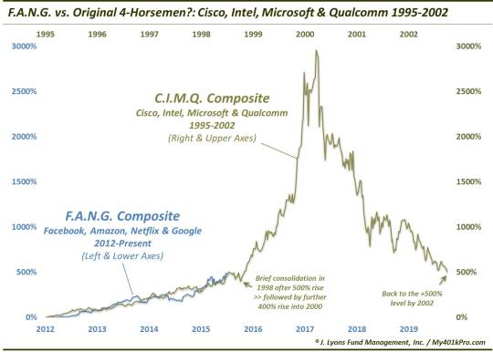
Every year, the stock market provides new themes that a year earlier hadn’t even been considered. This year it was F.A.N.G., an acronym created to extoll the prodigious gains in the stocks of Facebook, Amazon, Netflix and Google (now Alphabet). The F.A.N.G. concept has served to drive home the reality that any gains in the market this year were for the most part concentrated in a limited number of mega-cap stocks – stocks, by the way, that were in position to keep the major large-cap indices near their all-time highs. In this chart, which turned out to be our most popular on Twitter this year, we compared the strikingly similar F.A.N.G. performance of the past 3 years to the performance of Cisco, Intel, Microsoft and Qualcomm (C.I.M.Q.) in the mid-1990’s. While this was not a prediction, the point was to show that, despite the out-sized gains, further upside was possible in F.A.N.G., based on what C.I.M.Q. did in the 2 years following 1998. Of course, then there was the post-2000 period.
A Whole Lot Of New Lows For A “Market” Near Its High – December 9
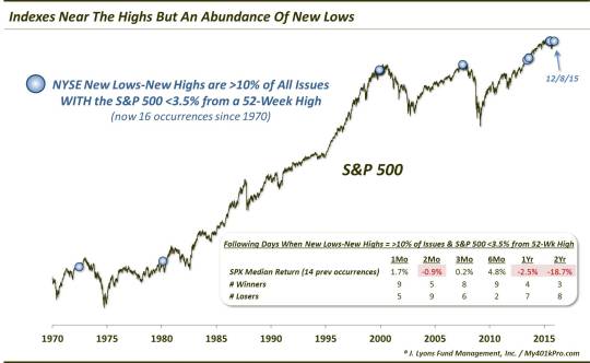
If there has been one persistent theme this year, it’s been the weak internals for a market so close to its all-time highs, at least as judged by the S&P 500. This trend continued into year-end as we saw on December 8 when the number of NYSE New Lows minus New Highs amounted to over 10% of all issues. This was despite the fact that the S&P 500 was within 3.5% of its all-time high. In the past 45 years, this situation has almost exclusively occurred near major, cyclical market tops.
U.S. Stocks Back At The Pass/Fail Line – December 14
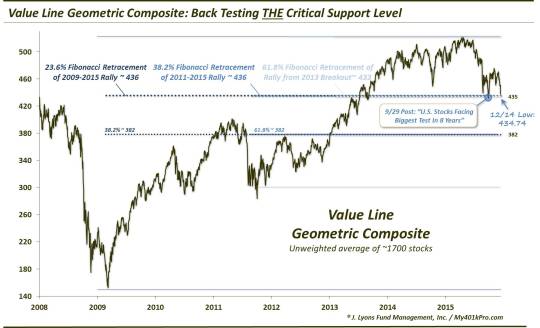
Following a mid-December swoon, the Value Line Geometric Composite found itself back testing the “pass-fail” we pointed out at the end of September. Once again, the VLG was up to the task and passed the test. However, the more times this line gets tested, the greater the odds are that it will eventually fail. That would open up another 10% downside and, as we noted previously, put the post-2009 uptrend in stocks in jeopardy.
“Smart Money” Options Indicator Has Never Been More Bearish – December 21
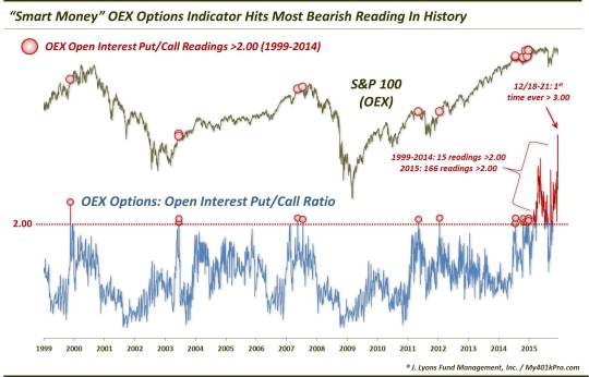
Most of the sentiment metrics that we monitor are viewed as contrary indicators. That is, once they reach an extreme, investors or traders would be wise to act “contrary” to the extreme. One exception can be found in the traders of S&P 100, or OEX, options. Historically, this group has been on the right side of the market more times than not when their collective options position is at an extreme. And though OEX volume is much lower than it used to be, this market may be something to take note of as OEX traders have never held more put options relative to call options than they do right now.
The 2015 Chart Of The Year:
S&P 500 Higher In 2015 While Most Stocks Suck Wind – December 31
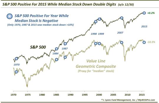
As good an illustration as any this year of the divergence between the major indices and the majority of stocks comes in our final chart of 2015. It shows that, through December 30, the S&P 500 was positive for 2015, albeit barely. Meanwhile, the median stock, as represented by the Value Line Geometric Composite (VLG), was actually down double digits. This is a rare situation over the past 45 years. And, considering the likely location of stocks within the cyclical market cycle, this serious deterioration in the market’s internals is a major warning sign for the stock market.
Thank you again to everyone for reading. Here’s to another interesting and prosperous year in 2016!
________
More from Dana Lyons, JLFMI and My401kPro.
The commentary included in this blog is provided for informational purposes only. It does not constitute a recommendation to invest in any specific investment product or service. Proper due diligence should be performed before investing in any investment vehicle. There is a risk of loss involved in all investments.