A Whole Lot Of New Lows For A “Market” Near Its High

While the major indexes remain within arm’s length of their 52-week high, the number of stocks hitting new lows is piling up.
Another day, another piece of evidence that the stock “market” is not what it may appear to be by looking at the major averages. I place the quotes around market as the word has a very different meaning to us than it seems to have for the superficial market observer – or at least mainstream financial media types. When you hear on TV, etc., what the “market” did on a particular day, it usually involves a quote of the S&P 500 or Dow Jones Industrial Average. In our view, it is extremely short-sighted to quote an index with 30 or even 500 constituents (and heavily weighted toward the largest ones at that) as representative of what the “market” did on a particular day. Such tactics dismiss the action in the other 6000 or so stocks trading. Granted, it is not conducive to headline writing to say, for example, that “the Value Line Geometric Composite, an equally-weighted index of approximately 1700 stocks, was down 1% today”. Nevertheless, quoting a large-cap index that is heavily weighted toward a relatively small number of stocks mis-represents what the “market” is really doing.
This is true with regards to the longer-term posture of the market as well – especially in recent months. Take yesterday (December 8), for instance. The S&P 500 closed lower on the day by a pedestrian -0.6%. Even with the drop, the S&P 500 stood just 3.16% away from its 52-week (and all-time) high. Despite that fact, 370 stocks on the NYSE closed at a 52-week low versus just 28 new highs. The net difference of 342 more New Lows than New Highs represented 10.7% of all stocks traded on the NYSE. If you think that sounds like a lot, you’re right.
Since 1970, the S&P 500 has closed within 3.5% of its 52-week high on more than 5500 days. This is the 15th time on such days that the number of net New Lows totaled more than 10% of all stocks trading on the NYSE.
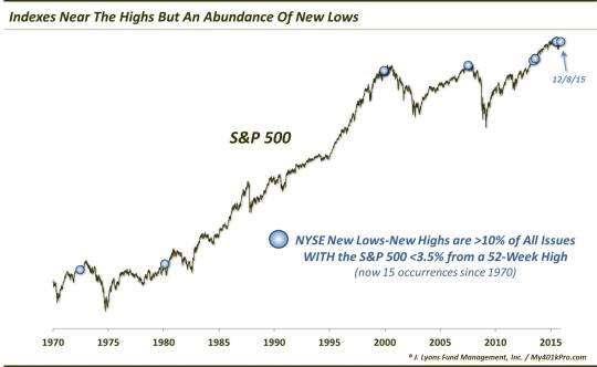
Here are the dates of each instance (shown by the blue dots in the chart):
6/29/1972
2/22/1980
12/13/1999
12/14/1999
12/15/1999
12/16/1999
7/24/2007
7/25/2007
6/12/2013
8/15/2013
8/16/2013
6/29/2015
7/24/2015
7/27/2015
12/8/2015
Obviously, there were a few instances which occurred in clusters. That makes this signal even that much rarer.
Glancing at the dates, or the chart, you may notice that several of the previous 14 occurrences came at rather inauspicious times, from a longer-term stock market cycle perspective. Here is the collective performance of the S&P 500 following the signals.
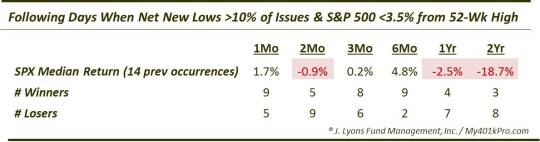
In the short-term, the performance of the S&P 500 was mixed. A few of the events (e.g., 1980, 2007 and this past July) saw the S&P 500 drop immediately over the next month to few months. Other ones (e.g., 1972, 1999 and 2013) saw the S&P 500 maintain its ongoing rally for several weeks to months. Interestingly, on a 6-month time frame, 9 of the prior 11 (this past June-July doesn’t register a 6-month figure yet) instances saw the S&P 500 record gains, and pretty impressive ones at that with a median return of about 5%. Only the days in 2007 did not result in positive 6-month returns.
Speaking of 2007, the most compelling results occur in the longer-term. And the results have not been good. One year later, 7 of the 11 events saw negative returns, with a median return of -2.5%. The only one besides the 2013 occurrences that was up was 1980 which managed to claw back to positive territory after suffering a hefty drawdown in the interim.
Moving to a 2-year time frame, the results get even worse. Out
of the 11 events, just the 3 in 2013 were positive. The median 2-year return was a horrid -18.7%. Outside of the 2013 instances, the average return was -21%. Furthermore, the 1980 occurrence (-3%) was the only one that did not drop at least 19% in the following 2 years.
Now, with only 15 occurrences in 45 years, one might argue the subsequent returns cannot be considered anything but random. And thus, the consistently poor longer-term returns are a mere coincidence. While statistically speaking, that may be true, we don’t buy it. We believe it is another example of the types of conditions that are commonly seen in the latter stages of a cyclical bull market cycle. That is, a deterioration in the broader “market” of stocks, even as the major averages remain buoyant, presenting a superficial portrayal of strength.
In reality, with so many stocks already having broken down, it is only a matter of time before the relatively few leaders fail to support the weight of the market. Then the market will be susceptible to the type of poor longer-term returns seen in this study. It doesn’t necessarily have to be immediately, as the 6-month returns above point out. However, the conditions shown in the chart above are products of several years in the making. Don’t expect them to be magically repaired without some serious corrective action first.
_____________
More from Dana Lyons, JLFMI and My401kPro.
The commentary included in this blog is provided for informational purposes only. It does not constitute a recommendation to invest in any specific investment product or service. Proper due diligence should be performed before investing in any investment vehicle. There is a risk of loss involved in all investments.