S&P 500 Higher In 2015 While Most Stocks Suck Wind

While the major averages managed to hold up OK for 2015, most stocks had a tough year.
(1/1/2016 edit: Due to the decline on December 31, the S&P 500 actually closed down 0.7% for 2015…however, the underlying message in this post remains relevant.)
As stock-centric money managers, the major theme in the markets for us in 2015 was the divergence between the major indices and the majority of stocks. You’ve seen that message strewn across countless posts this year, especially since May. The market’s internals have steadily declined since then while the cap-weighted, large-cap averages, like the S&P 500, held up fairly well.
As good an illustration as any this year comes in our final Chart Of The Day for 2015. It shows that, through December 30, the S&P 500 was positive for 2015, albeit barely. Meanwhile, the median stock, as represented by the Value Line Geometric Composite (VLG), was actually down double digits. (To refresh, the VLG is an unweighted average of roughly 1700 stocks).
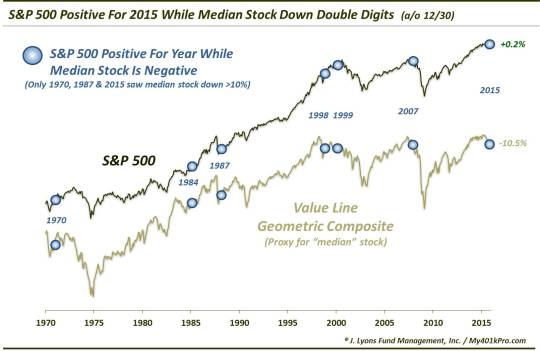
Such a divergence has been a rarity. In fact, since the inception of the VLG, this is just the 7th year that has seen the S&P 500 up for the year while the median stock was lower. The previous 6 years were 1970, 1984, 1987, 1998, 1999 and 2007. The only such years prior to 2015 that saw the median stock down over 10% were 1970 and 1987. While the aftermath of those 2 years actually saw decent returns in the subsequent few years, we wouldn’t necessarily take a lot of comfort in that.
Rather, the most recent examples of this divergence may represent circumstances closer to our present situation. The 1998-1999 and 2007 events occurred following several years of relatively unabated gains in the market. They also represented cyclical tops in the stock market. 6 years into a cyclical bull market, we view these circumstances as a warning. Now, these few precedents don’t guarantee that a cyclical stock market top is imminent, although, we think it may be. Furthermore, based on this chart, a developing top for most stocks has quite possibly been in the works for some time now.
The way we see it is that the 6-year bull market is running out of steam, the steam being the number of stocks contributing to its advance. This occurs at the end of cyclical bull markets, ala 1999 and 2007. Once the relatively few stocks that are still propping up the market roll over, there is no foundation of support left to prevent a significant decline. This isn’t doom and gloom propaganda. It’s just part of the market cycle and should be something to monitor closely as we enter 2016.
Speaking of 2016, we’d like to offer our sincere thanks to everyone who has followed this blog and read our posts and charts this year. We wish you a very happy and prosperous New Year!
________
More from Dana Lyons, JLFMI and My401kPro.
The commentary included in this blog is provided for informational purposes only. It does not constitute a recommendation to invest in any specific investment product or service. Proper due diligence should be performed before investing in any investment vehicle. There is a risk of loss involved in all investments.