Stocks’ Trading Range Now Beyond Compare
Over the past 40 days, the Dow has traded in its tightest range in at least 100 years.
About 2 months ago, the large cap U.S. stock indices finally managed to break out to new highs following more than a year of trying. After several days of follow through, the averages settled into a trading range. This was not an unexpected development, nor an unhealthy one. However, it would develop into an unusually tight trading range. And after a couple weeks, we began to publish some charts and posts detailing just how historically narrow the trading range had been. Well, we had hoped that each of the posts would be the last in reference to the range. However, we could not envision that some 30 days out, the averages would still be constrained to essentially the same tight range. Therefore, we make no apologies for (hopefully) just one more look at this historic range.
In today’s Chart Of The Day, we note that, unbelievably, the high to low range in the Dow Jones Industrial Average (DJIA) over the past 40 days is a mere 2.27%. For context, that is the tightest 40-day range in at least the last 100 years. And in fact, the next tightest range – at 2.53%, occurring from December 1922 to February 1923 –
is not really even close.
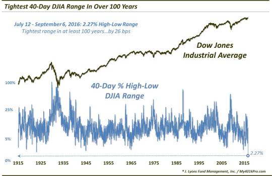
We say “at least” 100 years because we don’t have reliable daily high-low data on the DJIA prior to 1915. So it’s possible that this record range extends back even further – or perhaps to the DJIA’s inception. However, the point is made: the stock market is in the midst of a historically tight trading range.
So what will become of stocks due to this range? We don’t have any real insight on the potential resolution or ramifications beyond the obvious. That is, many of the market averages are like a tightly coiled spring right now. And a breakout of this range could be explosive. However, we don’t know which way that will be, nor when it will occur.
Our look at the tight 2-week range in the S&P 500 back in July revealed that similar ranges led to…roughly the same forward returns as any average day. We will say that our hunch continues to be that the interpretation of the present range should be that of a digestion of the July breakout, i.e., a continuation pattern. If accurate, the trading range *should be* resolved to the upside. We also have a hunch that such a breakout may turn out to be of the false variety, leading to an eventual drop back below the range.
However, that is mere speculation. All those hunches and a dime will get you a coffee (actually, you’ll probably need at least a dozen more dimes for that coffee). We will continue to follow prices and our quantitative models to guide us. If that false breakout scenario transpires, so be it. If it doesn’t, so be it.
At a minimum, hopefully this will be our final range-inspired post.
_____________
More from Dana Lyons, JLFMI and My401kPro.
The commentary included in this blog is provided for informational purposes only. It does not constitute a recommendation to invest in any specific investment product or service. Proper due diligence should be performed before investing in any investment vehicle. There is a risk of loss involved in all investments.