Spotless Indicator Signaling “BTD”?…Or Has Its Luck Run Out?

This ratio has a flawless track record of bottom-picking the S&P 500 since 2009; is it signaling another “buy the dip”, or breaking its 7-year run?
In the past, we’ve criticized the apparent recent trend among market technicians (or tourists) of “ratio chart” analysis. This is the technique whereby the performance of one security or index is measured versus another via a relative ratio price plot. This ratio line is often then subjected to all forms of technical analysis, as with a traditional security. We have no problem with relative strength analysis – indeed, it is the staple of our investment selection philosophy. However, we have a few misgivings about the proliferation of these ratio charts.
For one, we’re not sure they are prone to conform effectively to traditional technical analysis as with the underlying securities. Secondly, and most importantly, we’re far from sure that most of these ratios we see published have a logical or legitimate rationale behind their application. In other words, is there an actual purpose to comparing one security to the other? In the right context, the analysis is certainly valid. However, all too often we wonder about the point of such relative comparisons. I mean, do we really need to know that Facebook’s stock is forming a higher low relative to soybean meal?
Given that criticism, feel free to call us hypocrites based on today’s Chart Of The Day. It shows the relative performance ratio between the iShares High Yield Bond ETF (ticker, HYG) and the SPDR S&P 500 ETF (SPY). Why should the HYG:SPY be relevant? We’re not totally sure, though we could come up with reasons if we had to. It certainly is not the most far out ratio we’ve seen. However, the reason behind our including the HYG:SPY ratio as today’s ChOTD is that the line has conformed very closely to its trendline since 2009 – perfectly, in fact.
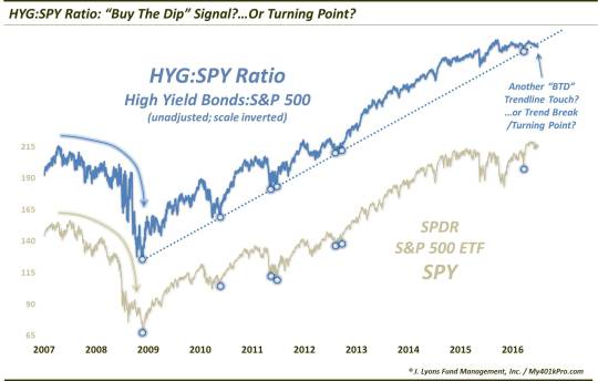
The blue line in the chart is the HYG:SPY ratio (we are using unadjusted data for both securities, FYI). The scale has been inverted so that it fits better on the chart with the beige SPY line, i.e., the actual HYG:SPY line has sloped downward since 2009.
So why are we showing this? Note the blue dotted trendline in HYG:SPY.
What caught our eye is that, since the March 2009 lows in the S&P 500, the HYG:SPY ratio has been
immediately
repelled upon each and every trendline test, 7 in all. Furthermore, the trendline touches have almost precisely corresponded with intermediate-term bottoms in the S&P 500. All 7 times. Here are the dates:
March 3, 2009
August 30, 2010
August 22, 2011
September 22, 2011
November 15, 2012
December 28, 2012
June 27, 2016
SPY returns following these trendline tests were, uh, pretty good:
- 1 Month later, the SPY was positive all 7 times by at least 6% and an average and median of 9%
-
3 Months later, the SPY was positive all 7 times by at least 8%, an average of 15% and a median of 13%
-
6 Months later, the SPY was positive all 6 times (June 2016 doesn’t qualify) by at least 13%, an average of 26% and a median of 24%
That’s why, despite our misgivings about ratio chart applications at times, this HYG:SPY ratio was our Chart Of The Day. We may not be able to present a compelling argument for constructing such a ratio; however, it is hard to argue with the results.
This ratio is interesting right now as it is arguably testing the trendline again. We say arguably because if we are really honest, the trendline was likely broken in early September. So if tests of the trendline were bullish, is this push through the trendline even more bullish? We’re not so sure.
For one, there has been a time within the lifeline of the HYG and SPY when this ratio did not trend upward (downward on the non-inverse scaled chart). That was from mid-2007 into the 2009 stock lows. Thus, to the extent that this ratio is indeed relevant, if a trend break is occurring it may not be good news for equities.
Secondly, if one was trying to argue that this present move amounted to a test of the trendline, it would certainly be a nontraditional one. Each of the previous 7 tests occurred mainly as a result of weakness in the SPY, rather than strength in the HYG. This time around, there has been relatively little SPY weakness outside of a few days in early September. Therefore, if there is a valid signal to the trendline tests, that validity may be lacking here. And again, if the trend is actually breaking, the signal being flashed may be of a negative variety.
In summary, there are often valid reasons for undertaking relative ratio analysis. All too often, however, it is difficult to find a compelling reason for those we see posted. Admittedly, we may be guilty of that in the HYG:SPY ratio chart here. However, the stunning technical conformity of the trendline and the overwhelmingly positive results following the signals make this ratio tough to ignore. If critics want to chalk the results up to luck, so be it. The more pressing consideration now, however, is whether the indicator’s flawless “luck” is flashing another buy signal – or whether the luck is running out.
_____________
More from Dana Lyons, JLFMI and My401kPro.
The commentary included in this blog is provided for informational purposes only. It does not constitute a recommendation to invest in any specific investment product or service. Proper due diligence should be performed before investing in any investment vehicle. There is a risk of loss involved in all investments.