More Evidence Trump Rally Is Thinning

Despite the major averages’ continued drift near all-time highs, volume moving into advancing stocks has been historically light.
About a month ago, we noted some technical evidence that the Trump Rally Was Starting To Thin Out. The evidence was a string of Nasdaq 100 52-week highs occurring on negative breadth on the Nasdaq exchange. In our view, this was a troubling but not alarming development vis-a-vis the post-election rally. As we stated, while it “is not a signal of health…we would stop short of labeling it a sign of major or long-term concern just yet.” As thinning goes, consider it the equivalent of finding 1 or 2 stray hairs in your sink. However, we are now seeing more evidence that this rally is thinning out.
The most recent case in point: yesterday saw all of the major large-cap averages close, or at least touch on an intra-day basis, their respective 52-week highs. Despite that, the % of volume going into advancing stocks on the NYSE was among the lowest in history on such days. Specifically, at 35.5%, the % of advancing volume was the 3rd lowest of any day since at least 1965 on which the S&P 500 touched a 52-week high and closed positive on the day.
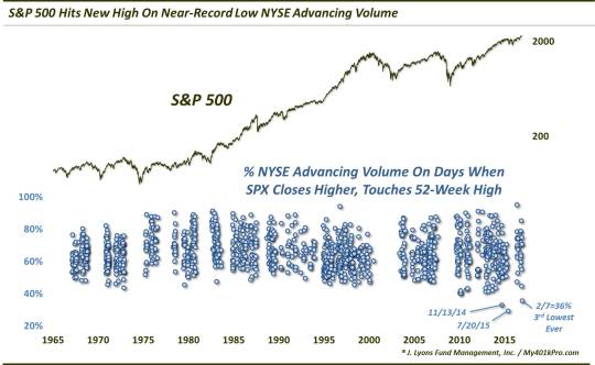
If you can tell on the chart, the only days in at least the past 52 years that saw worse advancing volume on such days were 2 notoriously thin days that we posted about at the time, November 13, 2014: “Yesterday Was One of the Ugliest “Up” Days in History” and July 20, 2015: “The Thinnest New High In Stock Market History”. For what it’s worth, in the former case, the S&P 500 continued to bounce for another 3 weeks before a quick and sharp 4% drop. The latter case marked the peak for the index for the next 50 weeks.
We also looked at the Dow Jones Industrial Average (DJIA) for another angle involving yesterday’s data. In the past 30 years, yesterday marked the 28th time that 40% or less of the NYSE volume went to advancing issues on a day that the DJIA touched a 52-week high and closed positive on the day. 24 of them have occurred in the past 10 years. Let’s take a look at those.
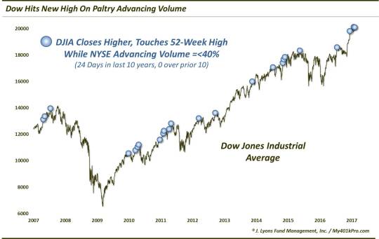
As the chart shows, while these instances were not all signals of impending trouble, more than enough of them marked at least intermediate-term tops to warrant concern. Here is how the DJIA fared, in aggregate, following these events in the past 10 years.
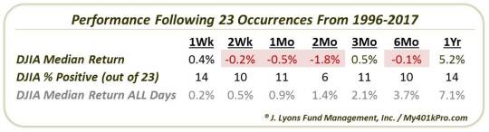
In the very short-term and long-term, returns were on par with normal. In the intermediate-term, however, there was consistent, if not severe weakness. the 2-month point was the “sweet spot”, at least for bears, as the median return was -1.8% with just 6 winners out of 21 dates having enough data.
Again, one data point alone may not be enough to sound the alarm. However, given the number of thinning examples now piling up in the post-election rally, the drain may be starting to clog with proverbial stray hairs.
_____________
More from Dana Lyons, JLFMI and My401kPro.
Disclaimer: JLFMI’s actual investment decisions are based on our proprietary models. The conclusions based on the study in this letter may or may not be consistent with JLFMI’s actual investment posture at any given time. Additionally, the commentary provided here is for informational purposes only and should not be taken as a recommendation to invest in any specific securities or according to any specific methodologies. Proper due diligence should be performed before investing in any investment vehicle. There is a risk of loss involved in all investments.