
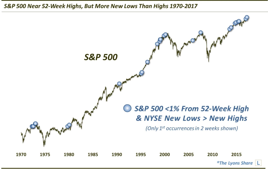
A High-ly Troubling Breadth Development?
Despite the averages’ close proximity to 52-week highs, the number of NYSE New Lows has recently surpassed that of New Highs.
Although the major stock averages remain within arm’s length of their highs, an increasing number of red flags has recently been popping up. As members of The Lyons Share are aware, we became increasingly bearish in the short-term during the latter stages of the recent melt up in prices. Our main concern stemmed from the wide array of indices hitting key Fibonacci Extensions of the 2015 and Fall 2016 declines. On top of that, investor sentiment has become uncomfortably bullish. And while sentiment is tricky from a timing standpoint, the exuberant extremes suggested that recent gains may not be sustainable. Lastly, while market breadth had been holding up quite well, some minor red flags had begun to pop up, especially pertaining to volume and small-cap stocks. However, as today’s Chart Of The Day reveals, the level of concern over breadth has now been ratcheted up.
As recently as last week, many market participants were abuzz over the jump in stocks making new 52-week highs. And while we have cautioned that the statistic can be quite noisy, an expansion in new highs is always welcome. However, while the stock averages remain fairly resilient, we have already seen the number of new highs plummet. On the NYSE, for example, new highs have plunged nearly 90% from their peak just a week ago. Furthermore, the number of new lows on the exchange has exceeded the number of new highs over the past three days. This is highly unusual given the averages’ relative close proximity to their 52-week highs.
Specifically, since 1970, the S&P 500 has closed within 1% of its 52-week high on nearly 3000 days. On just 78 of those days, or about 2.5%, did NYSE new lows exceed new highs. Many of those days were clustered together around roughly 27 unique occurrences.
Here is a close up of just the past 20 years:
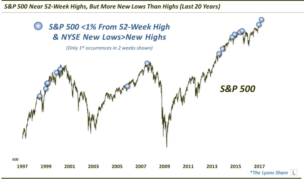
Not all of the events preceded trouble in the stock market. In fact, nearly half of them to place during the 1999 market melt-up. However, enough of them occurred in the vicinity of significant market tops that the concern appears to be legitimate rather than merely theoretical. Such tops include cyclical peaks in 1972, 2000 and 2007 as well as major intermediate-term tops in 1990, 1998 and 2015.
In aggregate, S&P 500 returns have been subpar following these events. Even when including the dozens of dates during the 1999 rally, median returns are negative through 2 months – and also at 2 years.

This troubling data point does not guarantee imminent trouble for stocks. However, the extended status of the major averages as well as bullish sentiment extremes make this a particularly noteworthy development in the near-term. Additionally, further out, it has historically occurred near enough major tops to give one pause regarding the market’s proximity in its long-term cycle.
_____________
Like our charts and research? Get an All-Access pass to our complete macro market analysis, every day, at our new site, The Lyons Share .
Disclaimer: JLFMI’s actual investment decisions are based on our proprietary models. The conclusions based on the study in this letter may or may not be consistent with JLFMI’s actual investment posture at any given time. Additionally, the commentary provided here is for informational purposes only and should not be taken as a recommendation to invest in any specific securities or according to any specific methodologies. Proper due diligence should be performed before investing in any investment vehicle. There is a risk of loss involved in all investments.