
It’s Getting Lowly At The Top (PREMIUM-UNLOCKED)
The number of stocks hitting new lows just saw a huge spike, especially considering the major indexes remain within arm’s length of their 52-week high.
As we mentioned yesterday, the drop in stocks to begin the week has really shaken things up in the market. It’s not that the decline has been that large. Rather, the relentless rally of late had conditioned investors in a way such that the moderate losses of the past 2 days served as a bit of a shock. And from the potential over-reaction by volatility traders to the profusion of both new highs and new lows on the NYSE on Monday, we are seeing some interesting developments in response. Yesterday brought another odd development among the new highs/new lows on the NYSE as we note in today’s Chart Of The Day.
To wit: yesterday’s drop in the S&P 500 (SPX) still left the index just 1.76% away from its 52-week (and all-time) high. Despite that, we saw 271 stocks on the NYSE closed at a 52-week low versus just 44 new highs. The net difference of 227 more new lows than new highs represented 7.4% of all stocks traded on the NYSE. If you think that sounds like a lot, you’re right.
Since 1970, the S&P 500 has closed within 2% of its 52-week high on more than 4500 days. This is just the 15th time on such days that the number of net new lows totaled more than 7% of all stocks trading on the NYSE. Loosening the parameters a little to include all days within 3% of a SPX 52-week high, the chart below shows that yesterday was just the 30th time that NYSE net new lows represented more than 7% of all issues traded.
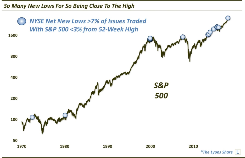
Glancing at the chart, it’s apparent that several of the previous 14 occurrences came at rather inauspicious times, including near cyclical tops in 1972, 2000 and 2007. However, there were also times in the past half decade that didn’t inflict much if any damage on the market. So is this “lowly” condition really something to worry about? Let’s take a peek at the collective performance of the S&P 500 following the prior 14 signals.
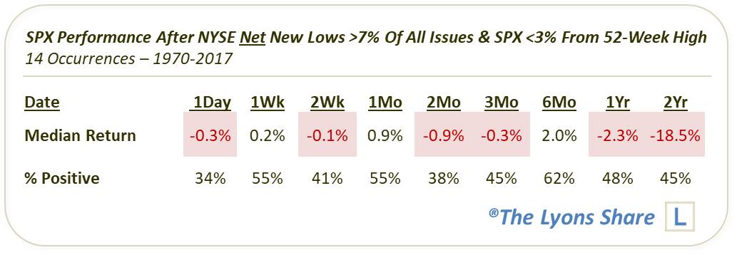
As the table reveals, aggregate returns were mixed across the board. A few of the events (e.g., 1980, 2007, 2014, 2015) saw the S&P 500 drop immediately over the next month to few months. Others (e.g., 1972, 1999, 2013) saw the S&P 500 maintain its ongoing rally for several weeks to months before rolling over (in the former 2 instances).
Considering the long-term incline in stock prices, a mixed bag is a minor victory for the bears as it is subpar performance relative to the norm. This is especially true for returns in the longer-term as it is more difficult to produce negative 1 and 2-year median returns like we see here. It is certainly not a slam dunk win for the bears, though.
As we’ve stated before, these types of conditions are commonly seen in the latter stages of a cyclical bull market cycle. They represent a deterioration in the broader “market” of stocks, even as the major averages remain buoyant, presenting a superficial portrayal of strength. Currently, we cannot say that we have seen the meaningful deterioration in breadth and internals like we often see at major tops, however. Even broad market averages are just off of their highs, for example. It may be that we are seeing an undue influence on the part of bonds and interest-sensitive issues on the NYSE new low list given the recent uptick in rates. However, that has not seemed to matter in the past and we’re not going to lean heavily on that factor at the moment.
Given the preponderance of positive technical measures still in effect in the stock market, we are not going to peg this as a major red flag yet. We would guess, therefore, that there at least remains a very good chance that another decent rally materializes prior to any meaningful top. However, this data point remains one to keep an eye on going forward considering its dubious history.
If you are interested in the Premium version of our charts and research, check out our “all-access” service, The Lyons Share. You can follow our investment process and posture every day — including insights into what we’re looking to buy and sell and when. Thanks for reading!
_____________
Disclaimer: JLFMI’s actual investment decisions are based on our proprietary models. The conclusions based on the study in this letter may or may not be consistent with JLFMI’s actual investment posture at any given time. Additionally, the commentary provided here is for informational purposes only and should not be taken as a recommendation to invest in any specific securities or according to any specific methodologies. Proper due diligence should be performed before investing in any investment vehicle. There is a risk of loss involved in all investments.