Amid heavy selling, a light at the end of the tunnel

On September 26, we wrote a post titled “90% Down Volume Days Have Been Good Buy Signals…With One Catch” looking at the phenomenon of 90% days. In this case, we looked at days in which at least 90% of volume on the NYSE occurred in declining stocks. Such days have often been signs of selling exhaustion and led to at least short-term, and often intermediate-term, rallies.
The one “catch” we pointed out was that the 90% Down Volume Day on September 25 occurred while the S&P 500 was within one percent of its 52-week high. A historical look at similar instances revealed that, not only were forward returns weaker than the traditional strong returns following 90% Down Days, they were much weaker than even the average returns following all days. The average 3-week return after such days was actually negative at -0.46%. Sure enough, 11 days later, the S&P 500 is down 2%.
The good news? Yesterday produced another 90% Down Volume Day on the NYSE. And if there has historically been anything more positive in the intermediate-term for stocks than a 90% Down Day, it’s been multiple 90% Down Days. Here is the chart of such multiple occurrences since 1965.
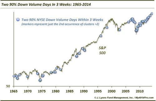
The blue dots represent instances of 2 90% Down Volume Days occurring on the NYSE within 3 weeks (there were several periods that saw more than 2 instances within that time frame; however, we only include the 2nd occurrence on the chart.) From a mere glance, it is easy to see that several of the instances occurred at or near market bottoms of some significance. Going forward, average returns were much better than typical.
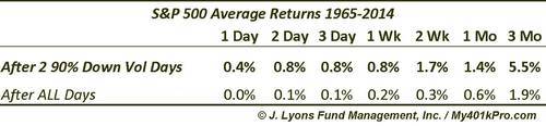
Most of these multiple 90% Down Volume Day occurrences led to positive returns. Two thirds of the instances were positive 2 weeks later and 77% were higher by 2 months later. However there were instances when the market continued to sell off in the short-term and that possibility certainly cannot be dismissed. Some markets even continued down for several months (e.g., 1974, 2008 and 2011). Most of those such markets were already weak and vulnerable before that specific bout of selling occurred, however. Thus, our guess is that the current circumstances are not akin to those precedents.
Another interesting thing that jumps out on the chart is the frequency in which these clusters have occurred since 2009. Remember, the dots on the chart are clusters of 2 90% Down Days, not singular instances. This observation lends evidence to the fact that we have been in an all-or-nothing, risk-on, risk-off type of environment in recent years – at least much more so than is historically normal.
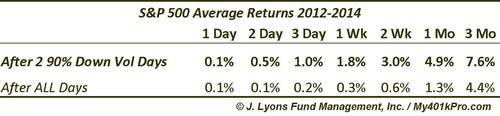
Speaking of recent history, instances of multiple 90% Down Volume Days since 2012 have led to especially positive returns, and with almost no drawdown. This probably should not be surprising since the market, for much of that time, has gone straight up.
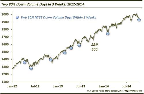
By 4 days later, 6 of the 7 instances saw the S&P 500 higher. The only occurrence that did not bounce immediately was in November 2012. However, it only took 6 days for the market to bottom following that instance and it never looked back after that. The only time the S&P 500 did not show positive intermediate-term returns (2-3 months) was following April 2012. However, the market did register a 3% gain over the 3 weeks following that instance before it resumed its decline. Here are the average returns since 2012.
If the 2012-2014 market playbook is still valid (we have serious reasons to doubt that), the market should bounce almost immediately. Even if that is not the case, however, history suggests there is still a light at the end of the tunnel. The tunnel just may be a little bit longer. A few months from now the market “should” be higher by a fair amount.
Although, as risk managers we cannot dismiss the possibility that the light is actually a train.
________
“Light at the end of the tunnel” photo by John McCullough.
More from Dana Lyons, JLFMI and My401kPro.