Dow Divergences Part 2: Utilities

This is part 2 of our series (or mini-series…TBD) on divergences. As we stated yesterday, divergences (in which one index achieves a new high whereas another does not) are generally over-cited as red flags. The problem is that the timing of their repercussions on the market – if any actually materialize – is extremely difficult to get right. Divergences can persist for a long time without any impact on the market. Furthermore, a lengthy divergence can result in an eventual confirmation, i.e., both indices reaching new highs, thus, eliminating any divergence relevance at all. Therefore, the winning percentage of most divergences in accurately warning of problems is pretty low.
We saw an example of this in yesterday’s post on perhaps the most widely followed index pair when it comes to tracking divergences: the Dow Jones Industrial Average (DJIA) and the Dow Jones Transportation Average (DJT). Divergences between these indices, which form the basis of the “Dow Theory”, are notorious for their effectiveness in warning of market declines. And while there are numerous examples of such divergences marking major tops, there are many more examples of false signals.
Today, we look at the other Dow Jones index, the Utility Average (DJU), as it relates to divergences with the DJIA. Yesterday, while the DJIA closed at a 52-week high, the DJU closed a hair shy of 10% below its own 52-week high. Based on the aftermath of similar historical divergences, perhaps the Dow Theory folks should be focusing on the Utilities rather than the Transports.
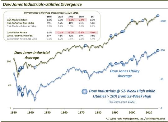
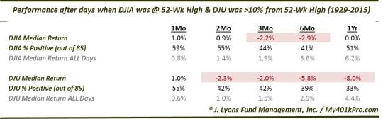
Since 1929, there have been 85 days prior to yesterday that met such divergence conditions, i.e., the DJIA at a high and the DJU more than 10% below its highs. Unlike the Transports divergences, which were more bark than bite, intermediate-term returns following these divergences in the Utilities have been significantly below average. 6 months following the divergences, the DJIA was lower 6 out of 10 times with a median loss of nearly -3%. Meanwhile, the DJU fared even worse. Two thirds of the occurrences saw the Utilities down a full year later, with a median loss of -8%. Here are the stats:
As the table illustrates, this is one divergence that has earned the right to be considered a potential red flag. That is especially the case in modern times. Looking only at the 57 occurrences since 1943 (there weren’t any between 1942 and 1972), returns have been especially atrocious.
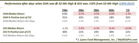
Less than 1 in 5 occurrences saw the DJIA higher 6 months later and less than 1 in 3 a year later. The DJU has fared worse again, with 4 in 5 instances producing losses a year later and a median return of -10.8%.
Accounting for the awful returns is the proximity of several of these divergences near major tops. These include 1972, 1987, 1990, 1993-94 and 1999-2000. In fact, there have been hardly any false signals in the past 70 years in this indicator.
If folks are going to use the “divergence argument” in warning of impending stock market trouble, they should at least endeavor to find examples with a track record to support their claims. We have done them a service here in that regard. Historically, when the Dow Jones Industrial Average has closed at a 52-week high when the Dow Jones Utility Average was 10% below its highs, intermediate to longer-term returns in the indices have been extremely poor, on average. These divergences have been especially accurate over the past 70 years in marking significant market tops. Therefore, this appears to be a legitimate divergence concern.
_____________
“diffuse station” photo by Hope Abrams.
More from Dana Lyons, JLFMI and My401kPro.
The commentary included in this blog is provided for informational purposes only. It does not constitute a recommendation to invest in any specific investment product or service. Proper due diligence should be performed before investing in any investment vehicle. There is a risk of loss involved in all investments.